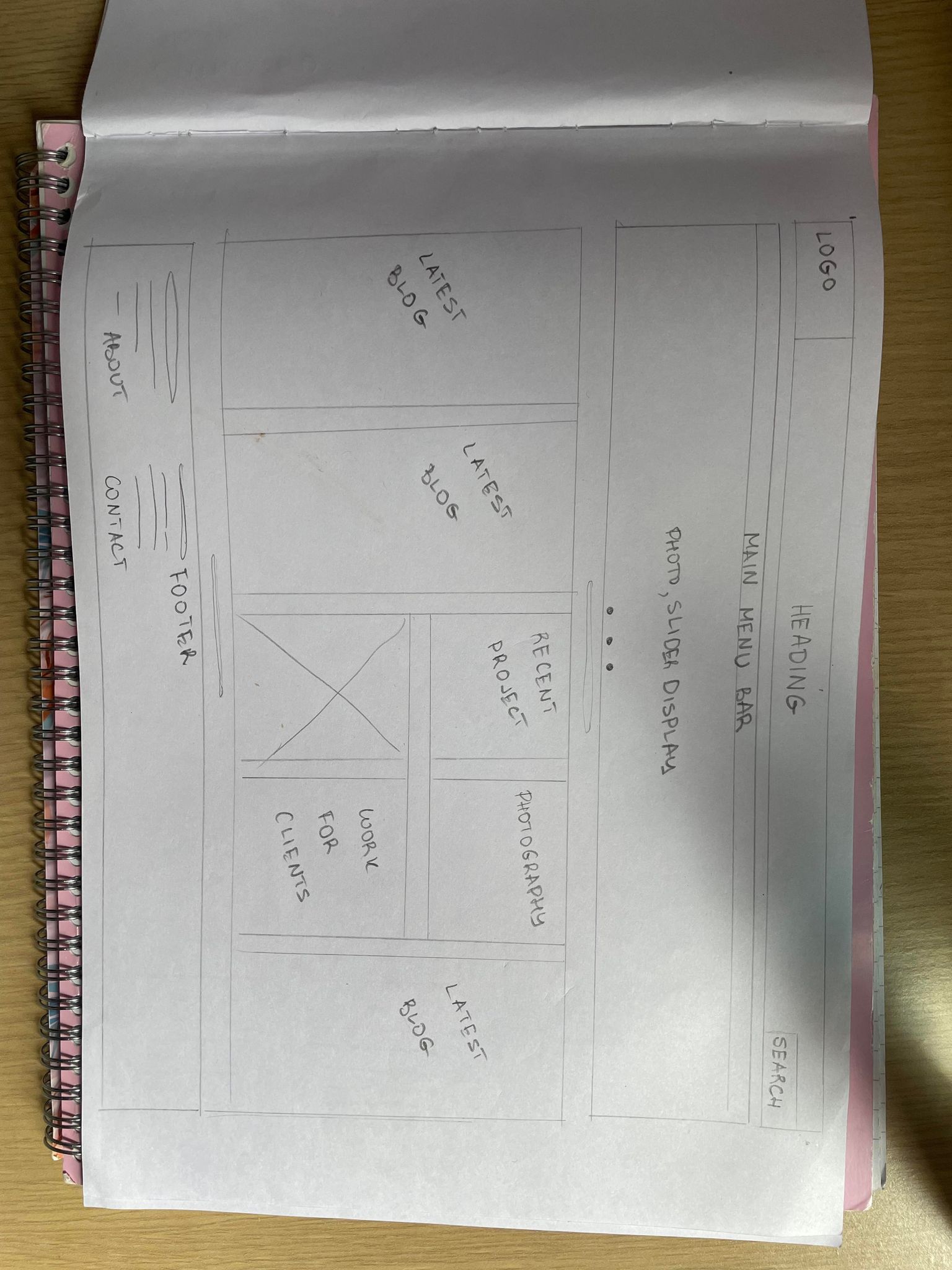
This is my first low fidelity UI prototype that is on paper. In the design we can see the architecture and the content that I will include.
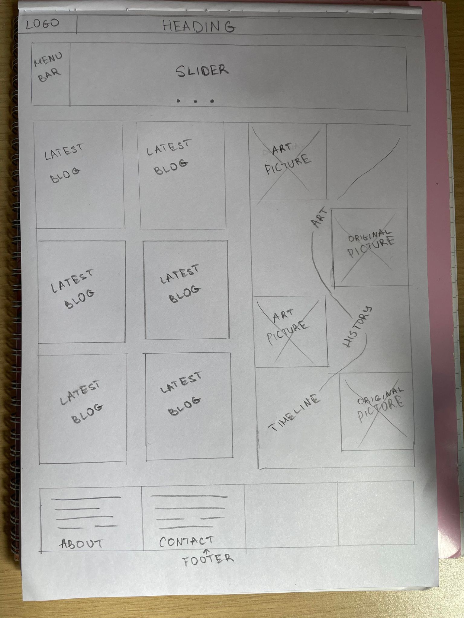
In the second low fidelity design we have a change in structure. The search button is not located in the upper right corner, it will be included in the menu bar, which will be located in the left corner. The most recent blog posts will be placed on the left side. On the right there will be a timeline of art history with photos from the different periods that will be transformed into my works. The footer remains unchanged, it will have information about me, contact form etc.
Map out your own HTA for your website to add further clarity.
Drafting our own HTA for our website can be a great way to add clarity and structure to our content. The first step is to identify the main topics or categories that our website will cover. This will help us organize our content and ensure that everything is easy to find and navigate.
Once we’ve identified our main topics, we can start creating a hierarchy of subtopics and pages. This will help us break our content into manageable chunks and ensure that everything is easy to understand. It is important that our HTA’s are simple and easy to follow so that our users can quickly find what they are looking for.
Finally, it’s important to test your HTA and make sure everything is working as it should. This will help us identify any issues or areas that need improvement and ensure that our website is easy to use and navigate. By following these simple steps, we can create a clear and effective OST for our website that will help users find what they need quickly and easily.