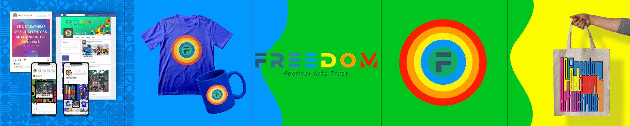
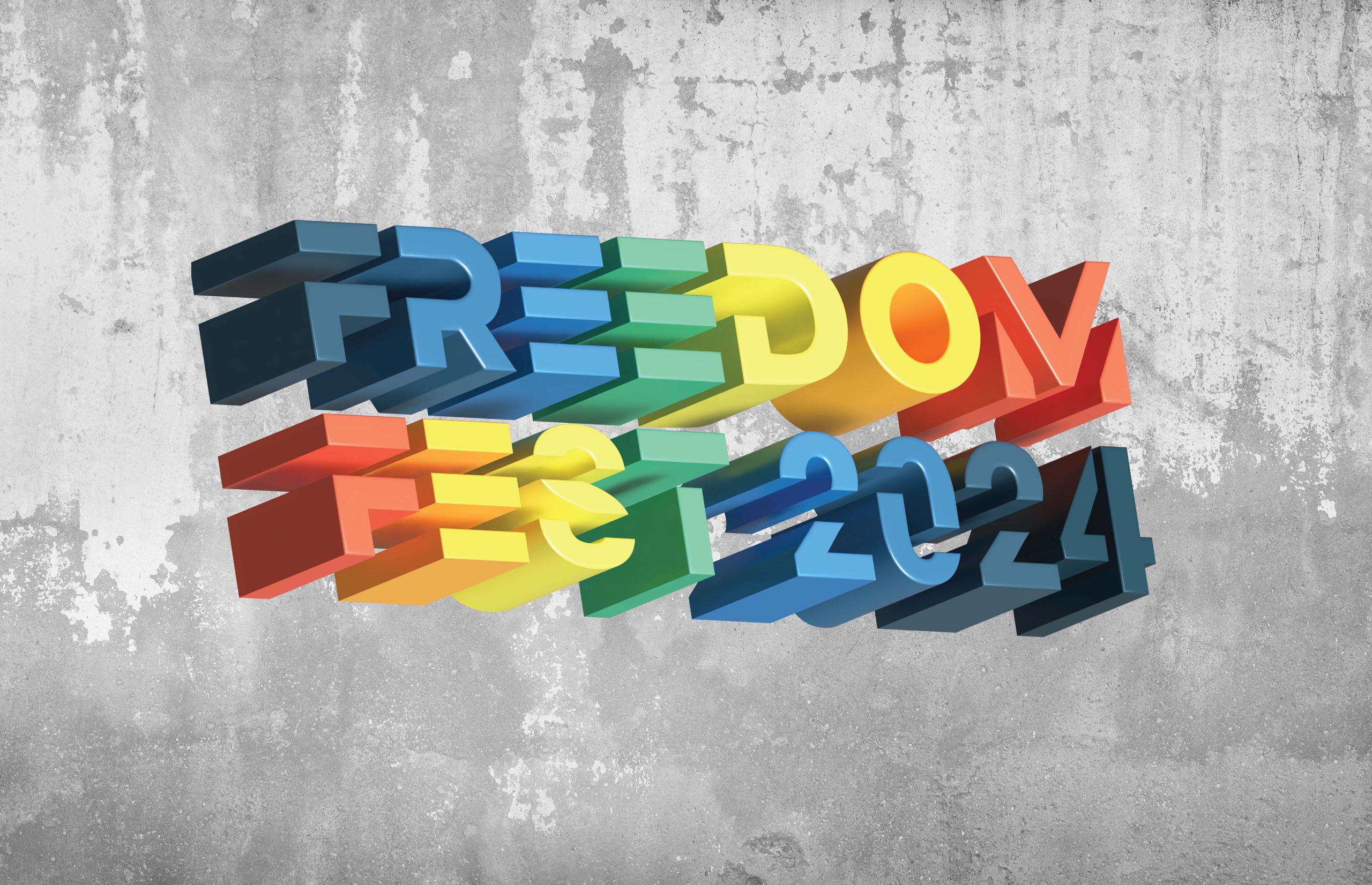
A refreshed brand identity visualisation created in Illustrator
My idea for Freedom Festival was to move it in a more modern direction so that it doesn’t have that childish look we see in its current appearance. I wanted to create a more mature brand by refraining from incorporating childish elements into the web and mobile design. Instead, I intend to use a clean interface with integrates video and motion graphic elements, and keeps the colour palette vibrant, and cohesive, and the colours complement each other perfectly. So, I think this will change the demographic groups and will include more people between 25-40 years old, as the group between 30-40 is supposed to have children and so we attract them too without the festival itself and promotions looking too childish. The original contrast between font and background was very low and ineffective and it didn’t help the overall viewer experience, so I had to change it.
To create the logo, I used a bold font, which I changed slightly to give it a more modern, artistic, cheerful, and enthusiastic look. In the same style, I also created the icon, which is solid, bright, and fun and can be used for different purposes: in web and app interface, when I have limited space, for different promotional elements until it can be integrated with different environmental and strengthen brand recognition. With this, I want to give the feeling of freedom and self-expression and move away from the sad story of slavery behind the festival.
Video for Freedom Festival created in After Effects
Freedom Festival 3D Icon created in after Effects
All the lectures and tutorials we had about cartoon graphics and animations made me interested in how it would look if I implemented them in my project. First, I played around with the festival logo that appears in the middle of the screen and gradually starts to fade until it smoothly disappears. The second attempt was to make a fun typography stretch. By stretching the text in and out, I adjusted the transition speed to be faster like a pulsation to create an exciting feeling. The next typographic animation is called a scroll effect, which makes the font scroll around the edges of the screen in a looping effect. All the type animations that follow are from the exercises we worked on in class. They fit nicely into my video with the colours from the brand and the cool transition which I used to make them.
After playing around with motion design tutorials in After Effects, I decided to create a moving 3D icon. This innovative visual branding technique adds a dynamic element to promote the brand. Utilizing different animations captures attention and engages the audience effectively. I believe it’s a clever and engaging way to enhance brand promotion.
I took all these steps with uncertainty because this software is completely new to me, but in the end, I’m very happy with the result.
In conclusion: Embedding a video and 3D icon is a great strategy to keep my target audience engaged and allows a much more immersive experience for the visitors of the website and the app. This is a great way of conveying information, emotion, and experience in a way that static content struggles to deliver. It not only supports my brand values and personality but also adds a dynamic and interactive element to the user experience. When creating the video, I made sure to use my brand’s colour palette, typography, and logo to maintain consistency and reinforce brand identity. The font-weight, alignment, and colour contrast were carefully designed to be visually appealing and grab viewers’ attention. This attention to detail is crucial in holding the viewers’ attention and eliciting a positive reaction.
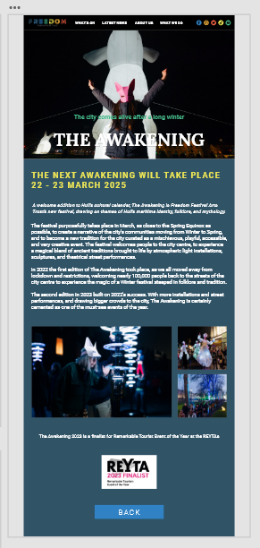
A Freedom Festival website / app design that visitors would be able to access & personalise to help them find their way around the festival
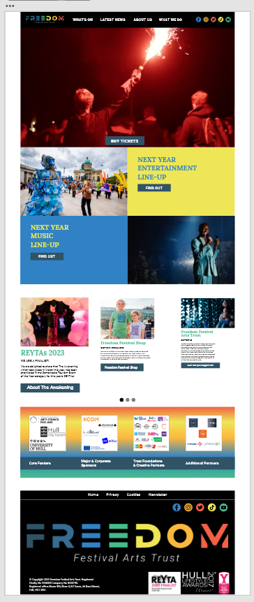
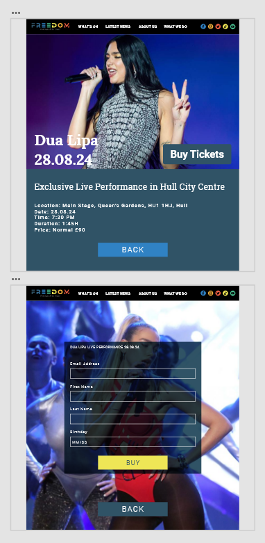
Preview of Freedom Festival Website
Buy Ticket Pages
The Awakening Page
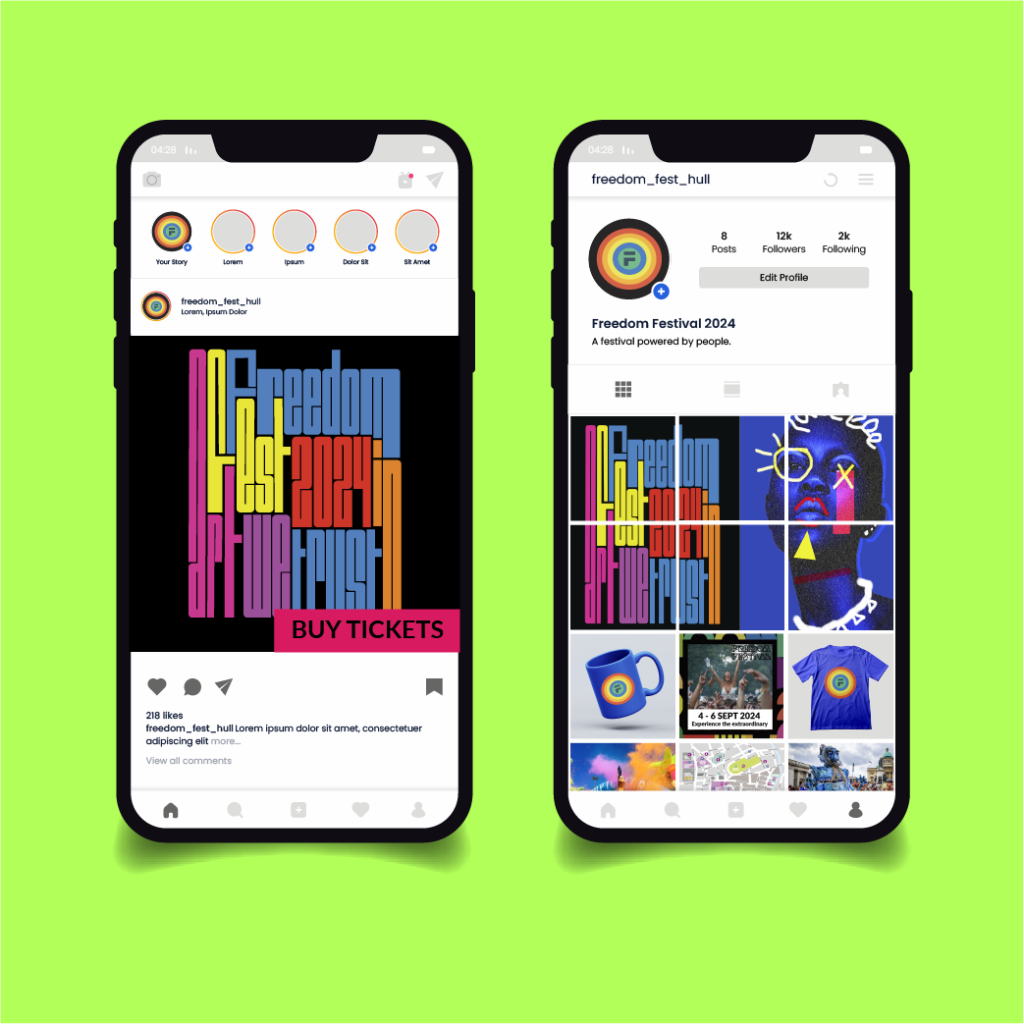
When I designed the homepage for the Freedom Festival, I wanted it to have a more modern look and be more engaging. I was inspired by different websites that seemed more expressive with their layout and interactivity. We have a clean and condensed navigation menu, with the logo in the right corner for better readability, and on the left side, I have the icons for connecting to social networks. I aligned the menu along with the rest of the items using the grid system to avoid weird gaps, so it doesn’t look cluttered and messy. To highlight what’s happening at the festival, as it’s usually easier to learn about an event visually, I included a looping video with multiple short clips and information about what to expect at the festival using creative animated typography. I also included a buy tickets button in the video that stands out in case visitors get impressed and want to buy their tickets right away.
I’ve used block navigation for music and entertainment, so it might look more streamlined. When you click on these sections, you can find information about various shows in an ordered manner with a “Learn More” button for more information about the artists. For better readability, I used white text on a dark background.
By scrolling down the page, the user can find more information about The Awakening, visit the Freedom Shop, or learn more about how they can support the festival. The visuals I used are an auto-animated scroll effect, meaning it pops in size when it reaches the centre of the screen. I hope users will find these features interactive and useful.
Last but not least, I did the design responsive so my website can fit any device from mobile to desktop. This is very important because these days most users only use their mobile phones when browsing through different websites.
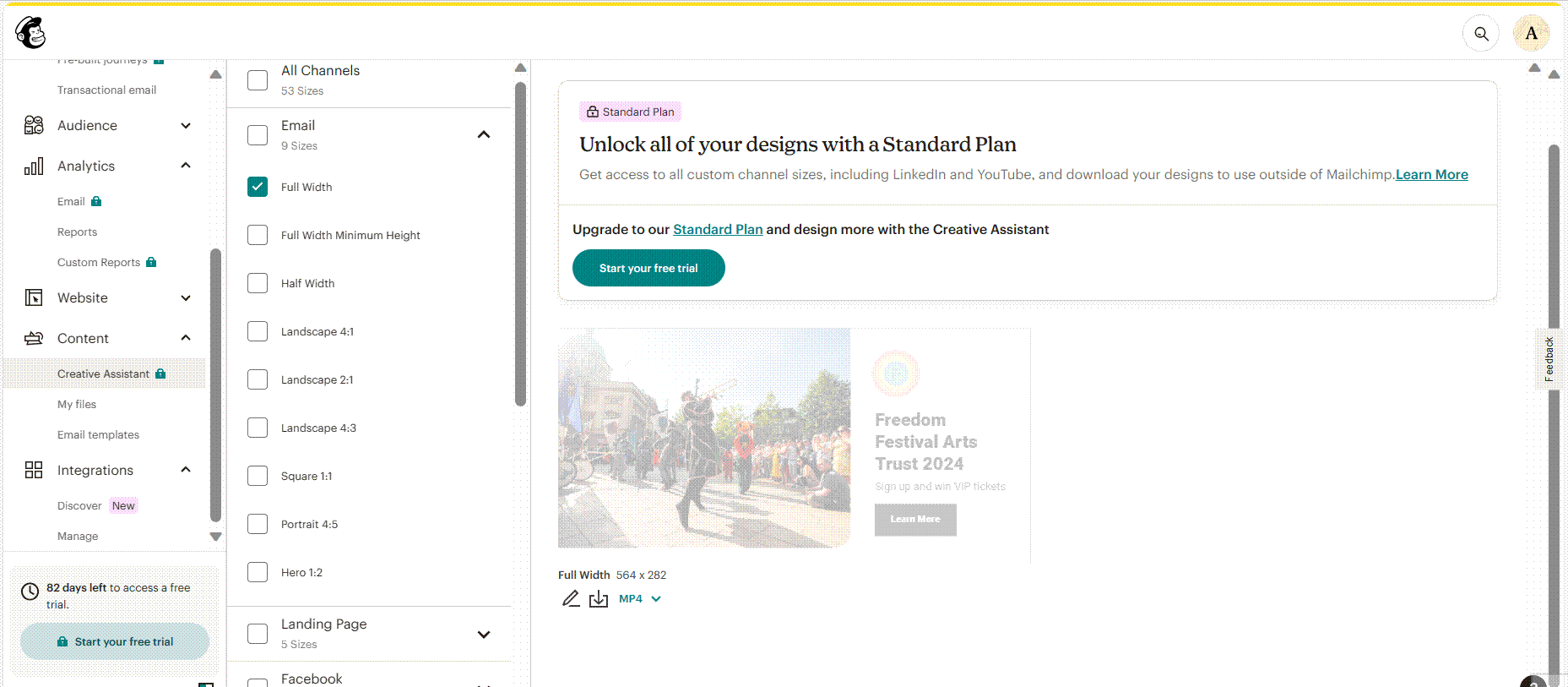
Integrated online marketing campaign to promote and celebrate the festival, incorporating Social Media & Mailchimp email marketing
Preview of how animated email campaign would look like in Mailchimp
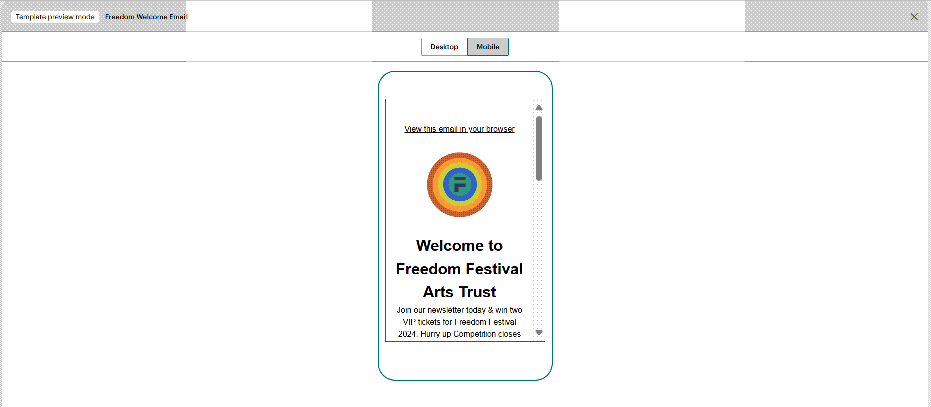
Preview of how my mobile marketing campaign will look like with Mailchimp
Email marketing is a cost-effective and highly effective way to promote products or services and share information with our target audience. It’s a powerful marketing channel that allows us to directly reach our customers through email. I chose to use Mailchimp, which is a fantastic email marketing platform that even offers a free option. One of the great features is the ability to import our brand assets and easily create templates. This makes the platform user-friendly and convenient. My goal is to keep my customers informed about our latest news and offers by integrating them into my marketing campaigns. Email marketing is not only a great way to build brand awareness, but also to establish connections and relationships with our audience. It’s an essential component of our overall marketing strategy.
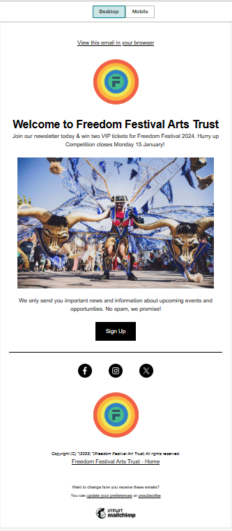
There are many different types of email marketing, but I chose The Welcome Email. This type of email welcomes my customers and encourages them to sign up for important news and upcoming events. Sometimes a customer might sign up for emails based on a particular offer, that’s why I also offer them the chance to win VIP tickets for the upcoming Freedom Festival. My design is simple, with no complicated animations and transitions this will help me make sure the message gets through. I used my brand visual language so that the recipient feels like they are scrolling through Freedom’s Website, demonstrating the importance of keeping branding consistent across all channels. I made sure my email is not too large because will takes time to download and customers may lose interest. The next thing I wanted to do was to keep my email campaign away from the junk folder or spam. That’s why I included a piece of information which could ensure customers if they decided to sign up the email marketing will only be used for important news, specific promotions, and upcoming events.
Preview of my desktop version email marketing campaign with Mailchimp
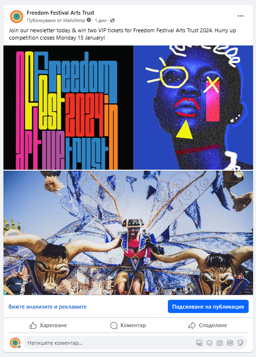
Facebook campaign preview created with Mailchimp
I want the Freedom Festival to have a strong social media presence. So, I designed examples of what the social media platforms would look like, with Instagram and Facebook posts to show how they would appear in users’ feed. For the Facebook post, I used the same design and tone of voice that I have in my Mailchimp campaign urging users to subscribe to our newsletter.
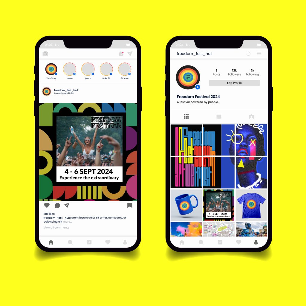
First Instagram post features a printed design with stretched typography in the brand colours that I created in Illustrator. Like all engagement posts, this one can be sponsored and will appear with a “buy a ticket” call to action, which is an interactive option that will take users to the official Freedom Festival webpage where they can find tickets for various events. The other Instagram post I created used the brand design template as a background with a photo of a festival, I also implemented friendly language to engage users through the caption and make them curious and excited about the upcoming event.
First Instagram Sponsored Post With Call To Action Button
Second Instagram Post With Information About Upcoming Event
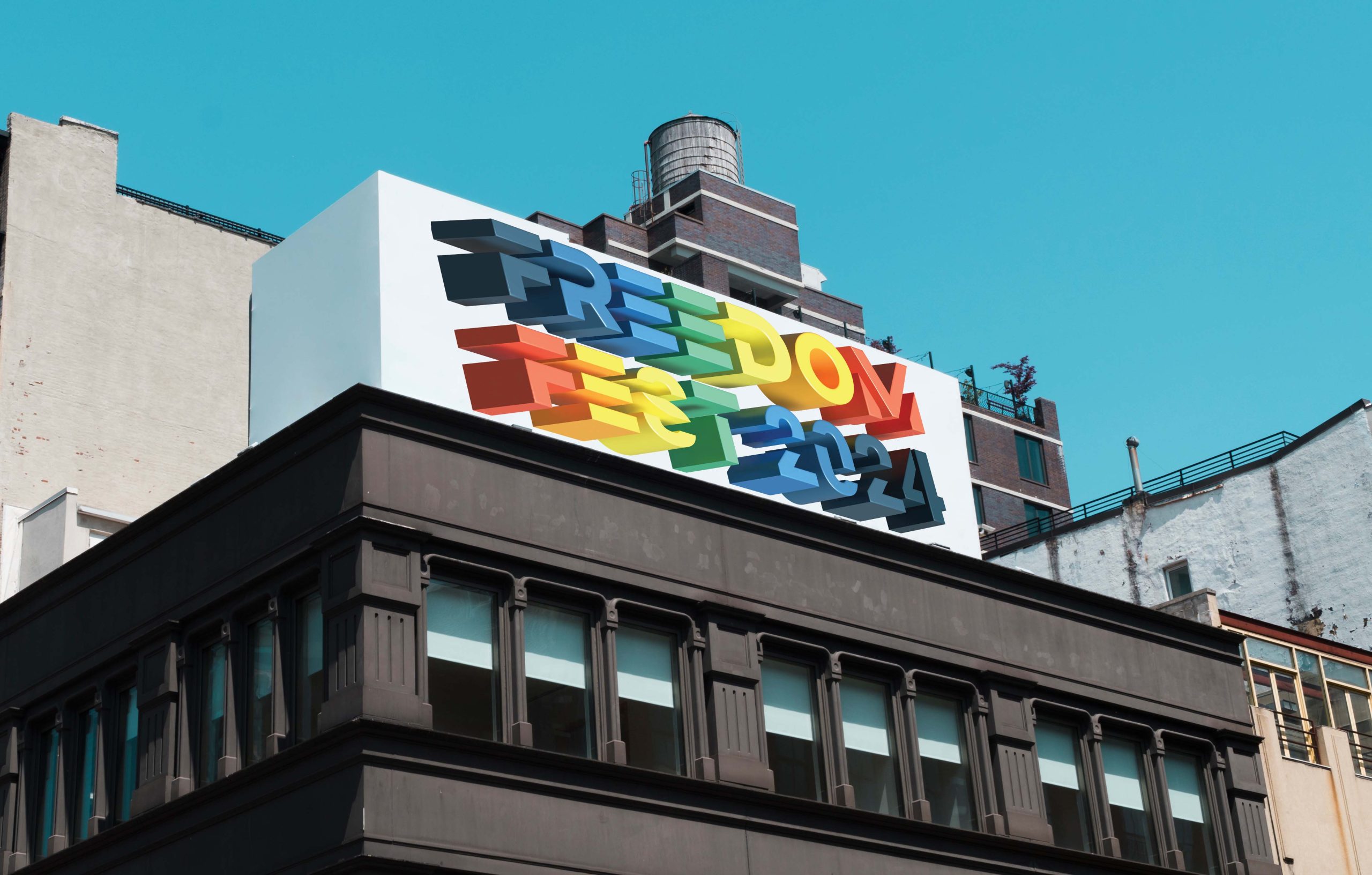
Examples of experiential & environmental brand applications
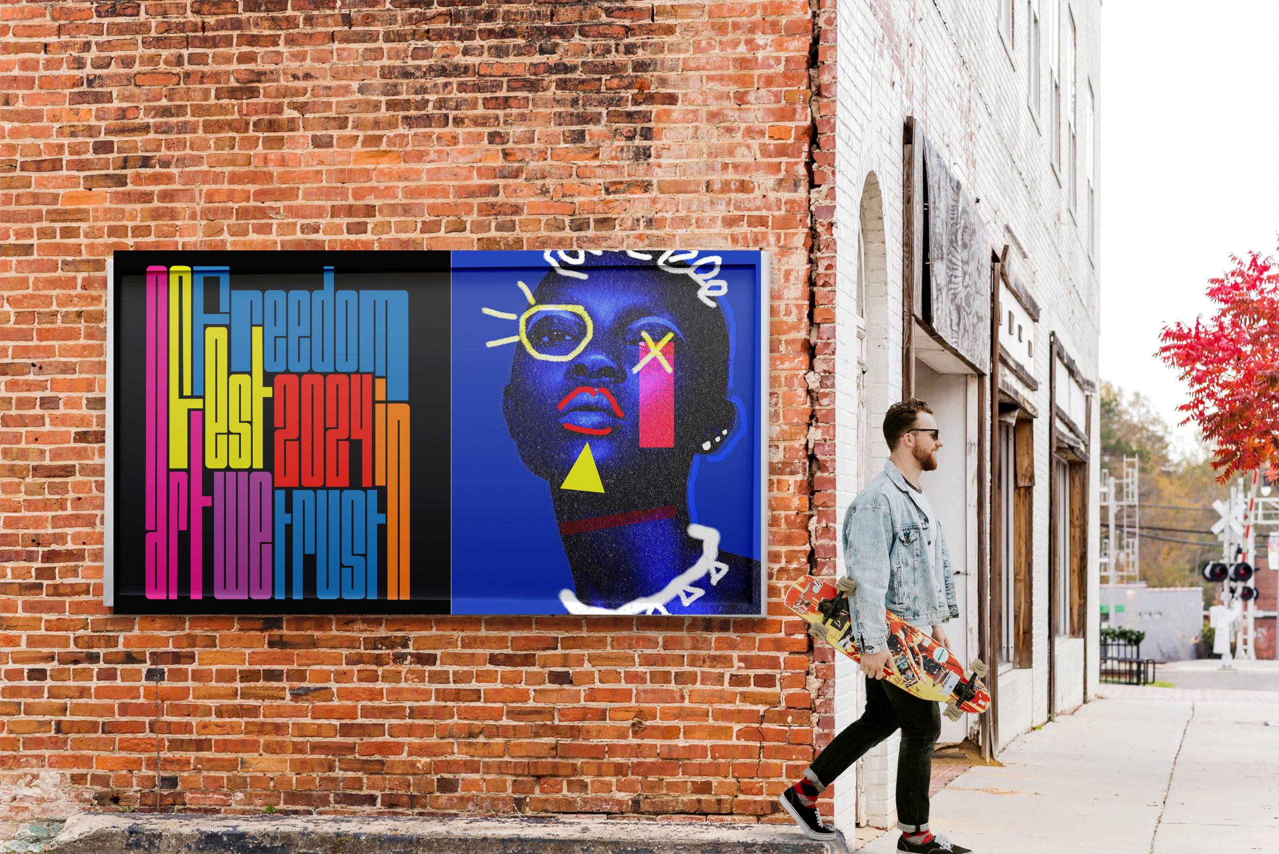
Environmental Billboard on Brick Wall
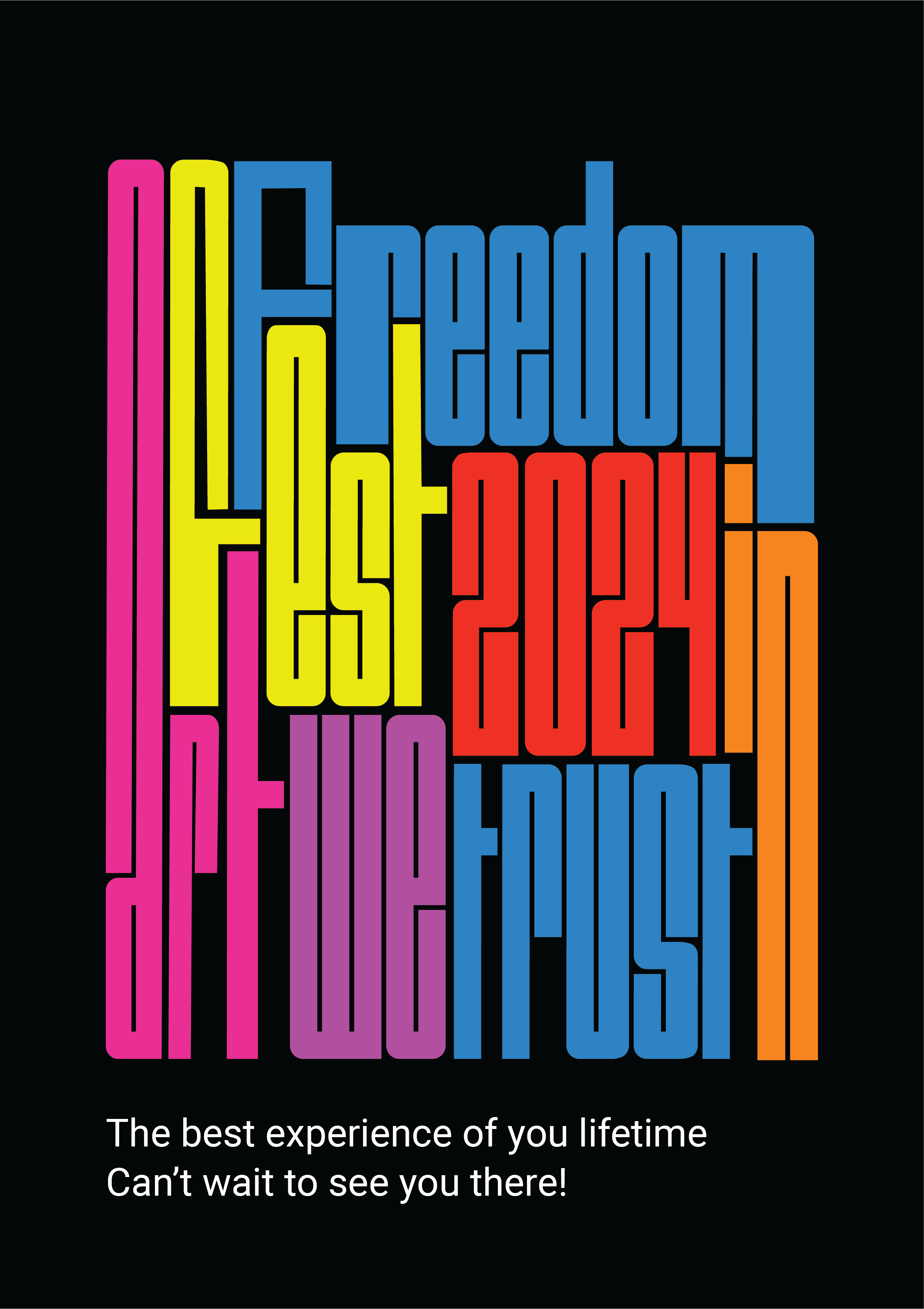
Promotional Poster for Freedom Festival 2024
Environmental branding is a great way to make our brand stand out. It’s all about bringing our brand to life in physical spaces. By incorporating brand elements into our environment, we can create a compelling brand experience that customers won’t forget. It’s not just about marketing and design, it’s about creating unique and memorable experiences that leave a lasting impression. So, if we want to create a strong relationship with both new and existing customers, we should try Eco-friendly branding.
When I designed the billboard, I strategically incorporated brand elements like colours and tone of voice. I wanted to create a visual representation that would resonate with the audience and reinforce the brand’s identity. To add an artistic touch, I played around with stretched typography and used Photoshop to enhance a photo with different elements and colours. The result was a captivating billboard that sparks curiosity and creates emotional connections with both new and existing festival-goers.
When it comes to brand identity, logos and symbols play a central role. In my eco-branding designs, I strategically incorporated these elements into physical spaces such as walls and fixtures. This enhances brand awareness and recognition, making the brand more memorable and distinctive. By using logos and symbols as signage, I can provide a seamless and cohesive navigation experience that reflects the brand’s personality and values.
Colour is a powerful tool when it comes to evoking cheerful emotions and associations. By using my brand’s colour palettes and patterns consistently when designing, I aimed to create an environment that is both cohesive and recognizable. This not only reinforces the brand but also creates a sense of familiarity for my customers.
Creating a strong connection between customers and my brand’s physical environment is crucial. When customers feel connected and engaged, they are more likely to develop positive associations and loyalty towards the Freedom brand. Memorable experiences in our physical spaces not only foster long-term relationships but also lead to word-of-mouth referrals. So, it’s important to make sure my brand’s physical environment is engaging, memorable, and true to the brand’s identity.
Examples of Environmental Brand Application in Building
Examples of Environmental Brand Application in Office
Examples of Environmental Brand Application
Examples of Environmental Brand Application
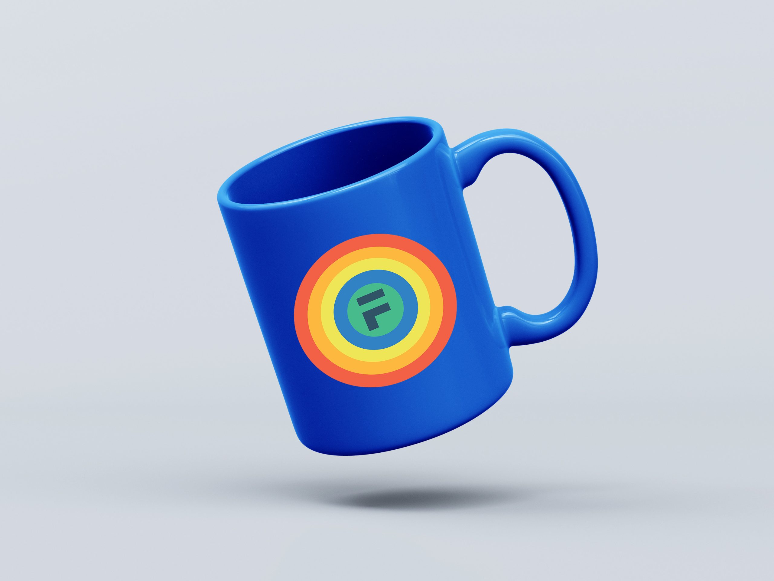
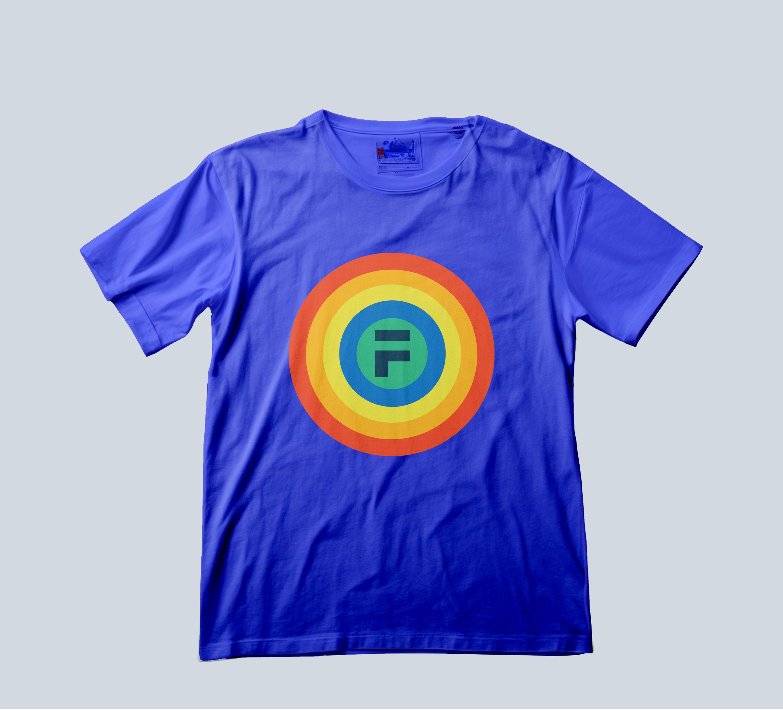
Examples of appropriate branded apparel to be worn by volunteers / ambassadors / guides
Promotional merchandise aimed at festival goers is a smart move for our brand. Not only does it offer real use for our customers, but it also aligns our brand with great memories and good times. Whether they’re drinking from their coffee mug or carrying their groceries in their tote bag, our branded festival merchandise keeps our brand at the centre. It’s a win-win for everyone involved! So it would be great if we give out these gifts at the next festival, not only to the volunteers who help and participate in the preparations but also to the visitors. Our visitors will thank us and the brand will shine.
Freedom Festival Branded Mug
Freedom Festival Branded T-Shirt
For the mug and t-shirt design, I chose a clean blue background on which I placed the festival icon. I chose the blue background because it symbolizes the positive, it is the color of the sky and the sea which can be also used to imply a connection to nature and freedom, which is the concept of the festival. Also perfectly combines with the colors of the icon and makes it to pop out.
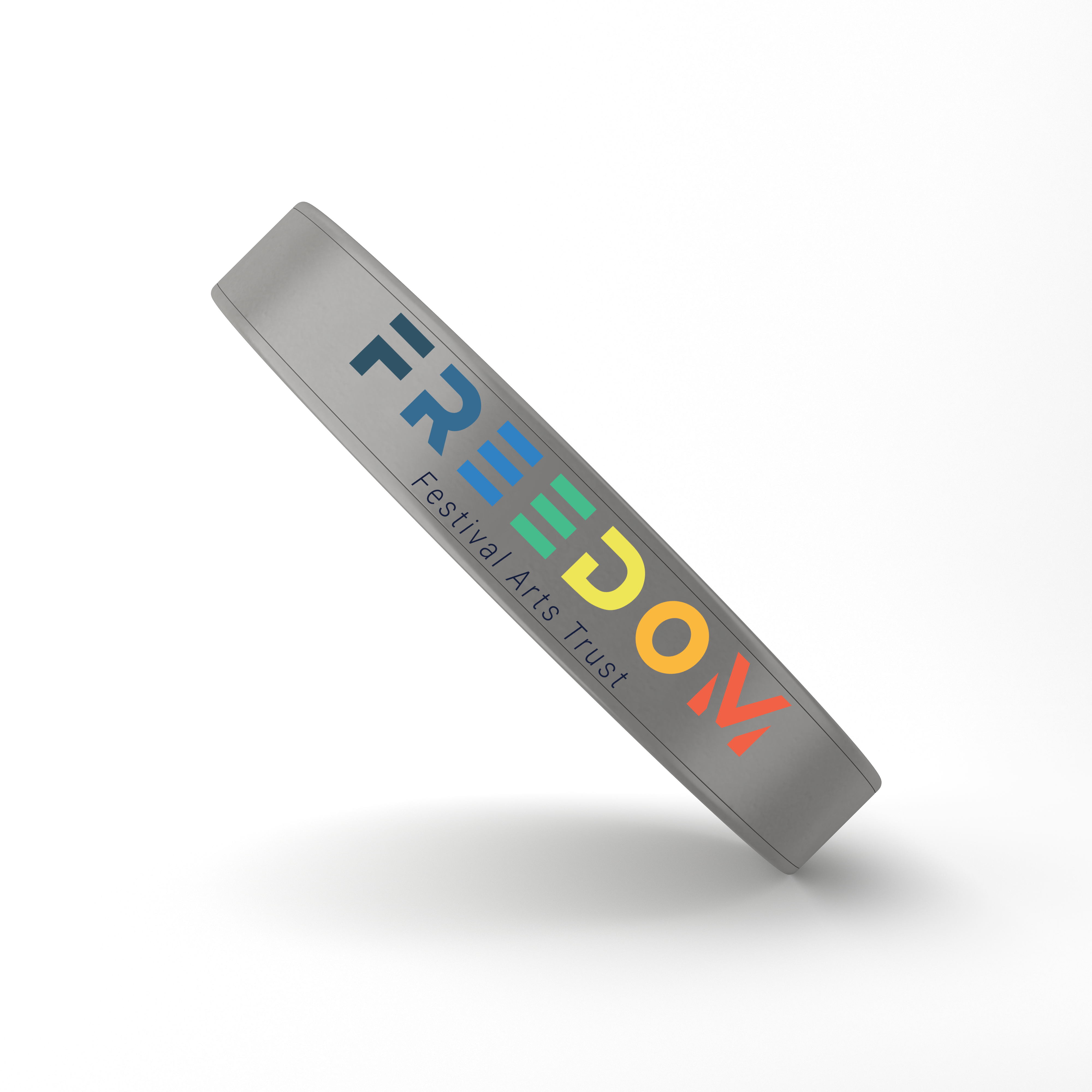
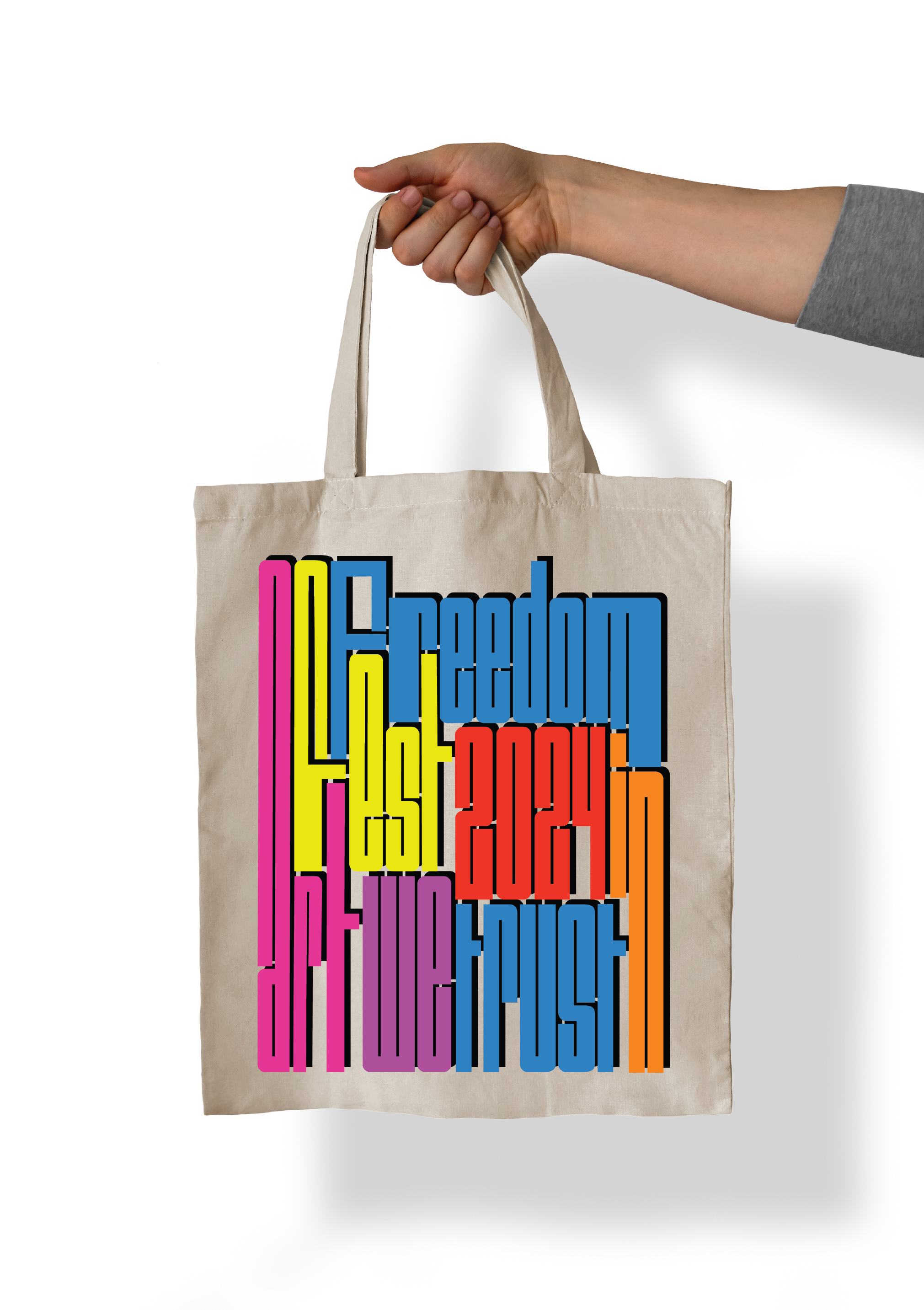
For the wristband I chose to implement the logo of the festival on a mettalic effect band to looks more ellegant and classic. For example that wristband can be given to VIP customers so they can easily access different stages and to buy drinks without queing. After the festival finish the goers can still wearing this merchandise to support the brand identity. For the tote bag I used the stretched typography design which is recognisable in general and as a part of the billboards promotion. Also using those words makes stronger connection with the festival and what can you expect to see there ( lots of creative and artistry people).
Freedom Festival Branded Metallic Wristband
Freedom Festival Branded Tote Bag
A video using OBS demonstrating my campaign including interactive XD prototypes