Conceptualization of website design, including layout, color schemes, and typography
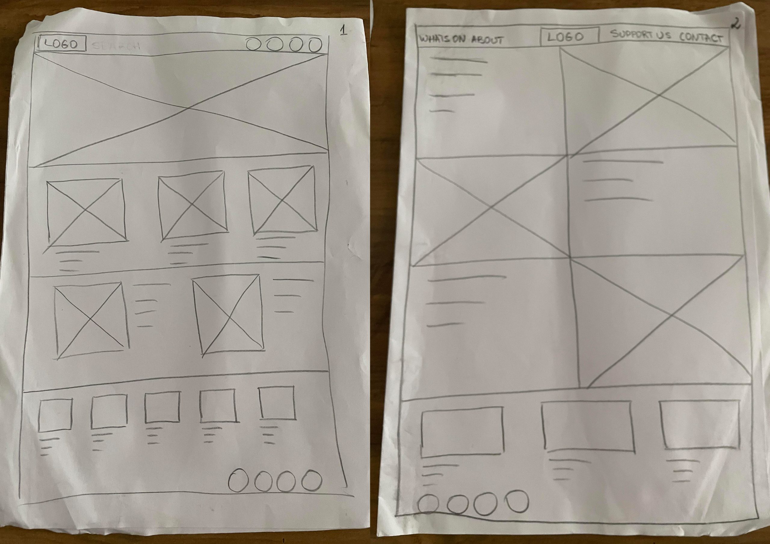
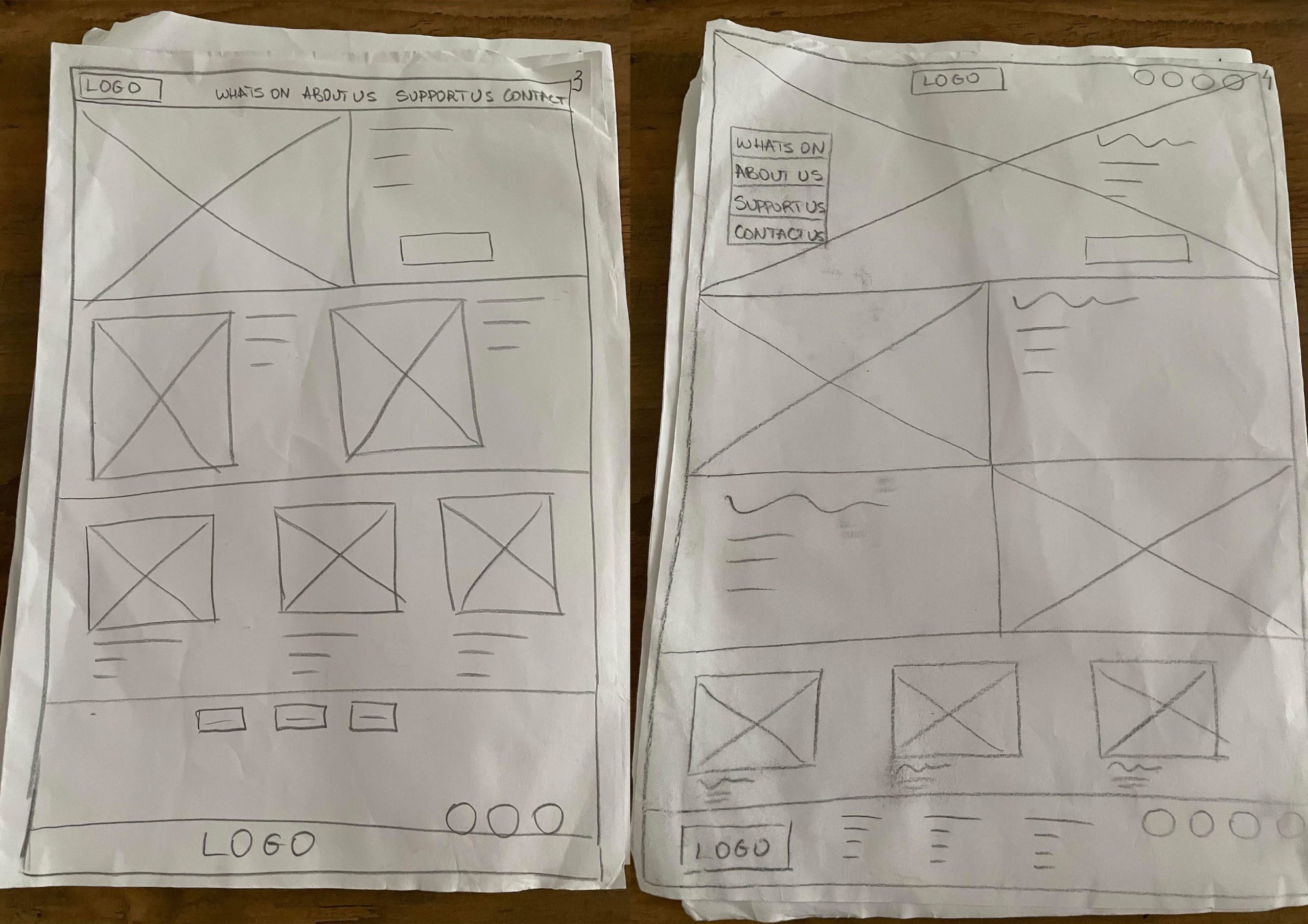
Low fidelity website wireframe on paper
Low fidelity website wireframes on paper
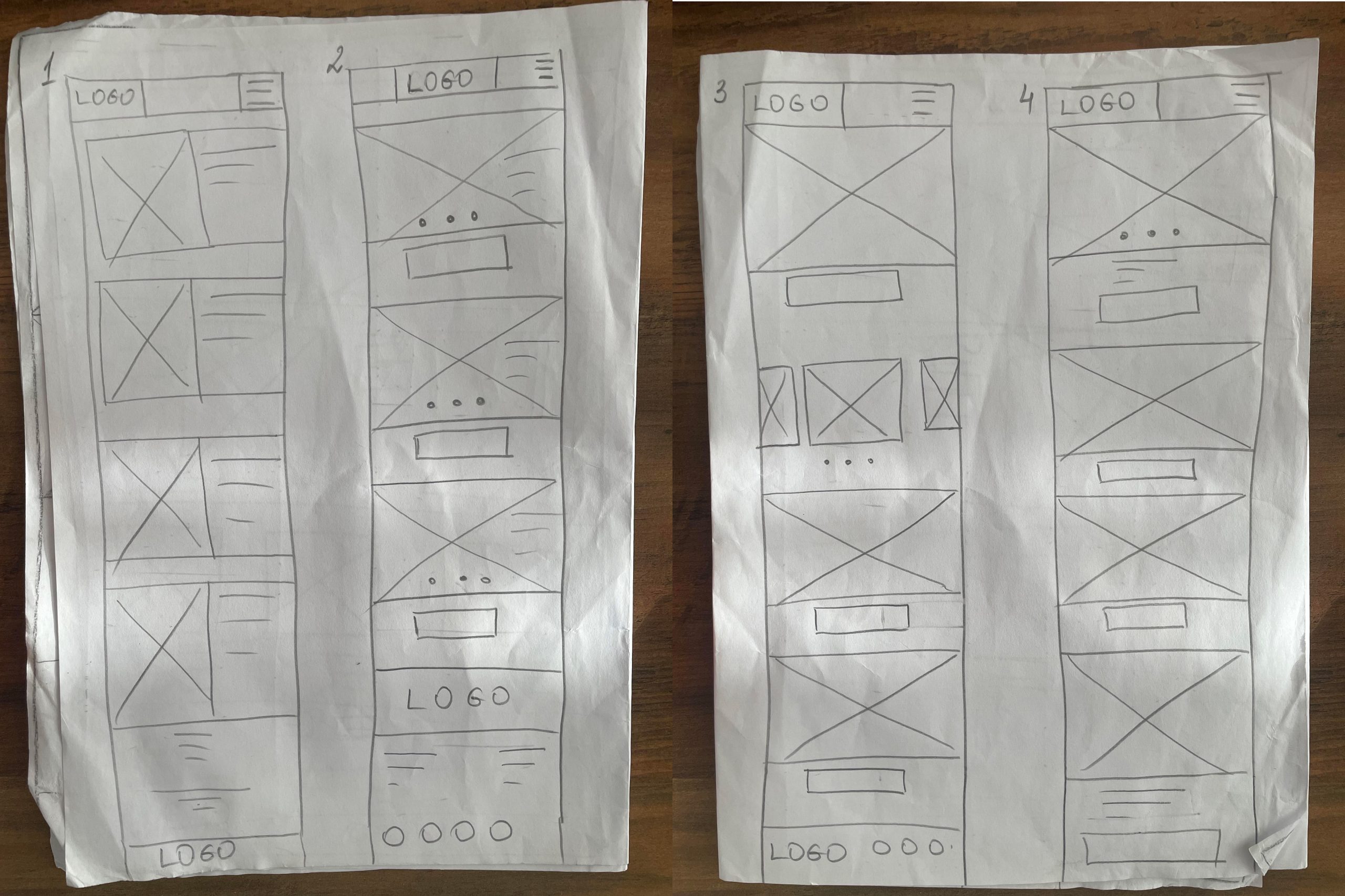
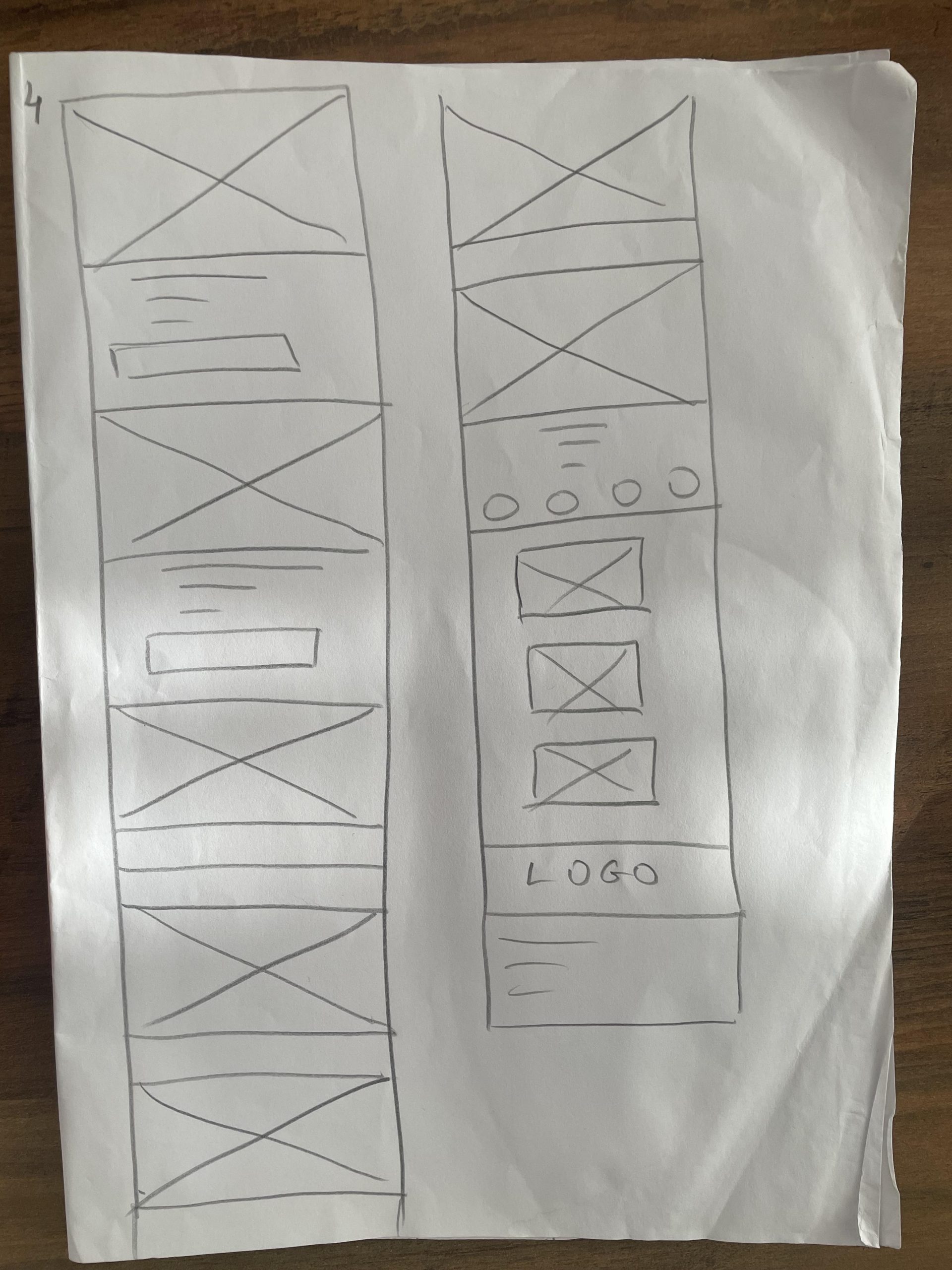
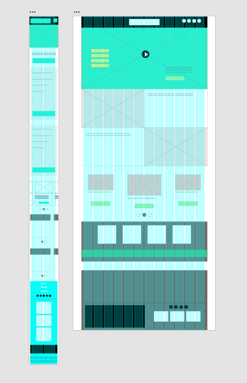
Low fidelity mobile wireframe on paper
Low fidelity mobile wireframe on paper
Freedom Festival App and Web Grid Layout
Freedom Festival Wireframe For Mobile App
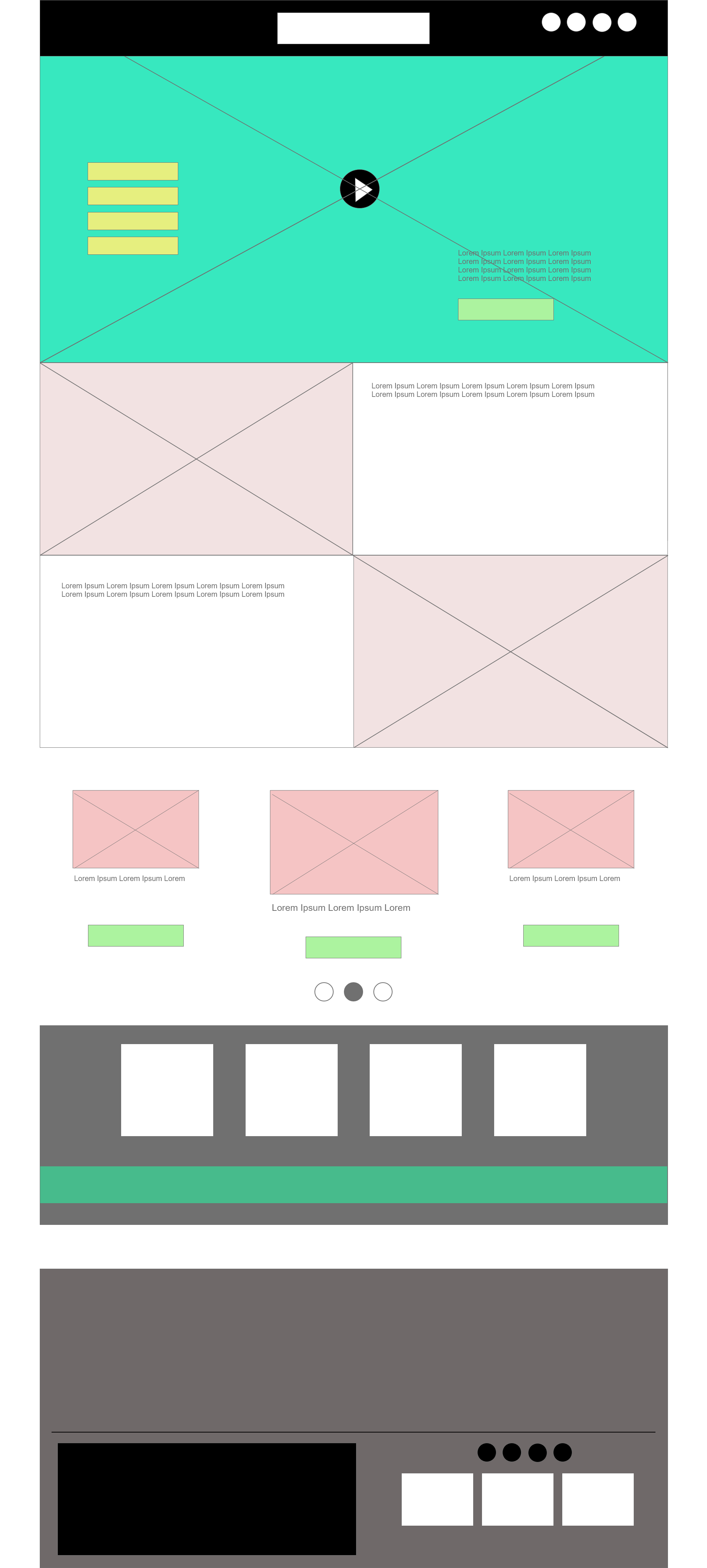
Freedom Festival Wireframe For Website
I started working with the grid system and layout for the refreshed design of Freedom Festival. The grid system is a crucial tool that provides a flexible framework for designing and organizing content in a logical and accessible manner. It allows for the incorporation of complex information hierarchies, including text, illustrations, photography, iconography, moving images, and interactive elements. I opted for the column-based grid, which is highly flexible and can accommodate other grid systems. By using this virtual map, I aim to create balance, symmetry, and uniformity throughout the design. This will make it easier for users to navigate the page or app without confusion or losing thread of information. One of the most important foundations in web design is usability. If users can’t find easily what they are looking for quickly they’ll leave a website without a second thought. Grids make it easier for users to find what they need by providing visual cues about where things are on the page.
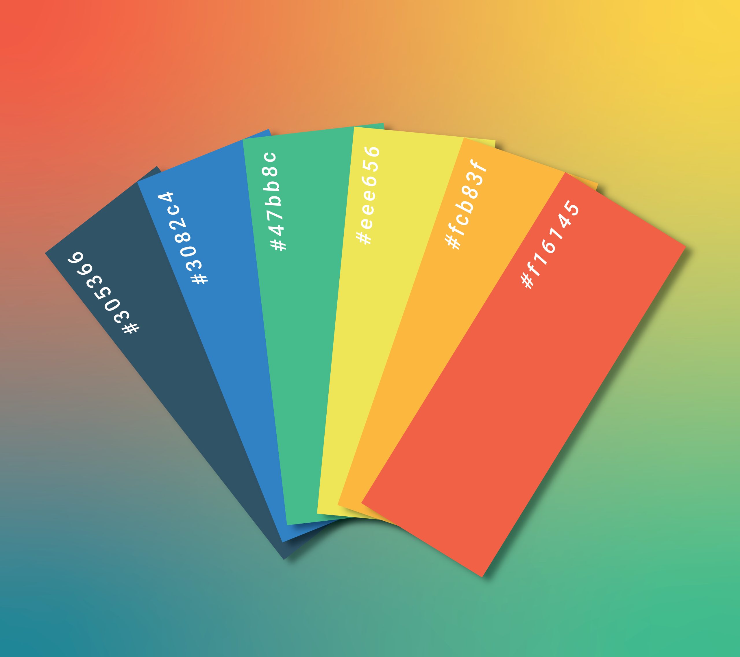
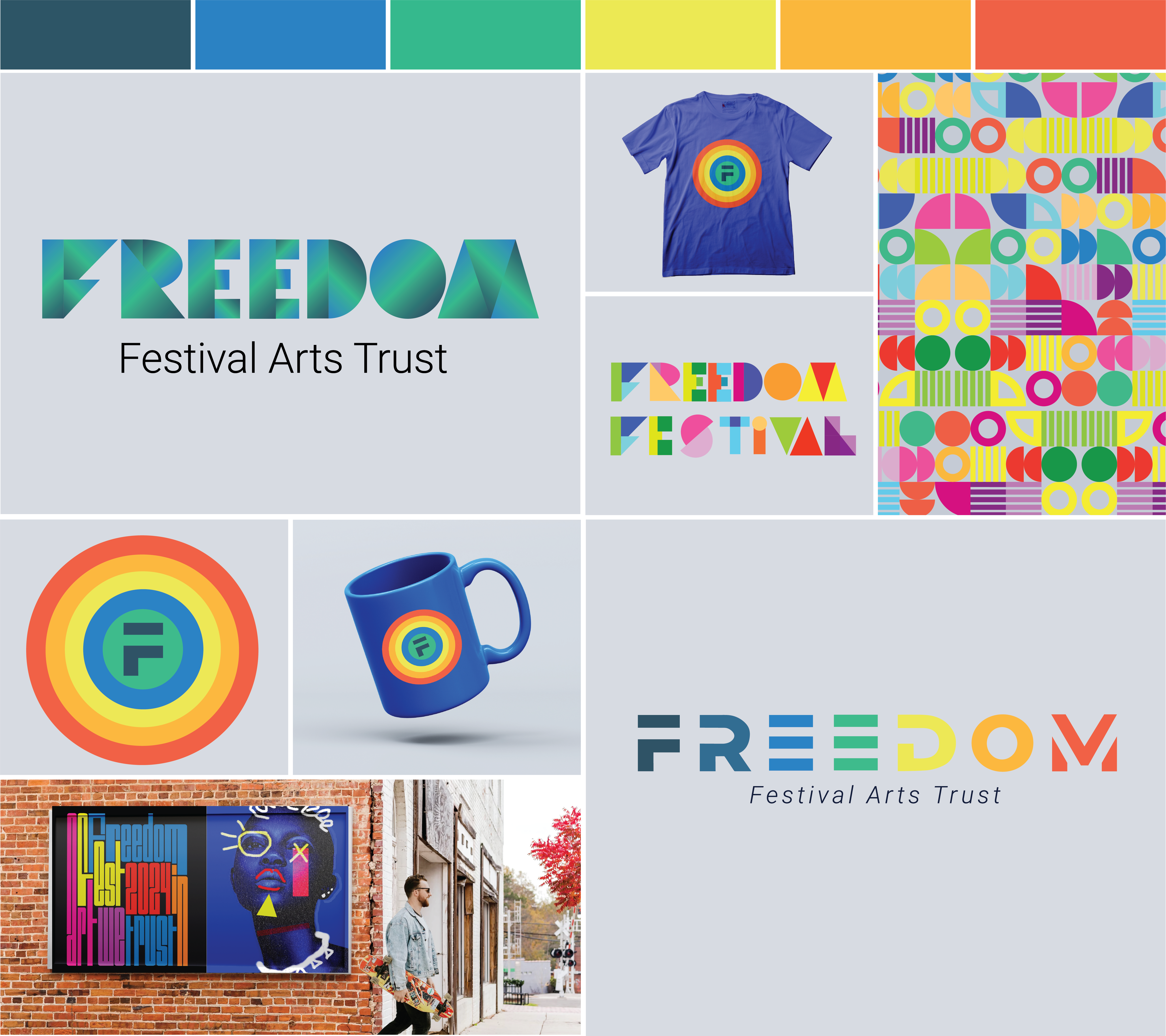
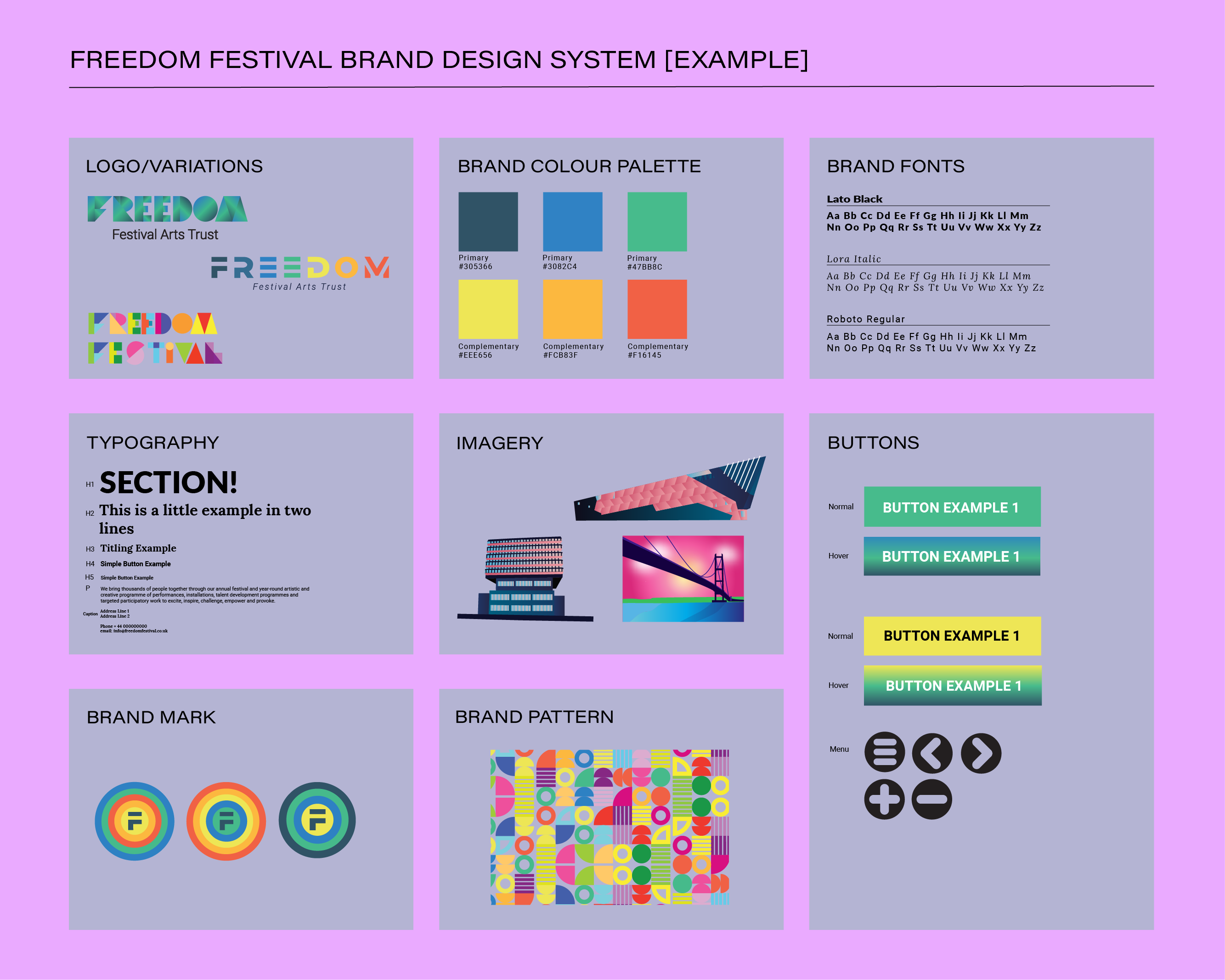
Freedom Festival Colour Palette Designed By Me
My colour palette consists of 6 colours, the blue colour will predominate, and the rest will be complementary colours. Blue websites are inviting due to the colour’s association with tranquillity, clear skies, and light emotions. Darker shades of blue convey depth and professionalism, while lighter shades represent friendship, strength, and calmness. I choose blue for its versatility, as it creates clean, modern, cool, and transparent website designs. In contrast, red is associated with speed, energy, and passion. It is commonly used to prompt action in audiences, making it suitable for ecommerce websites, restaurants, and takeaway apps. Orange is universally seen as a “fun” colour and using it in web design is a great way to show a lack of seriousness. Yellow is associated with happiness, warmth, joy and energy making it a great colour to create a cheerful positive atmosphere. Green is calming and natural, making it one of the most popular design choices, due to the effect it has on the audience. It is associate with nature, safety, and reliability.
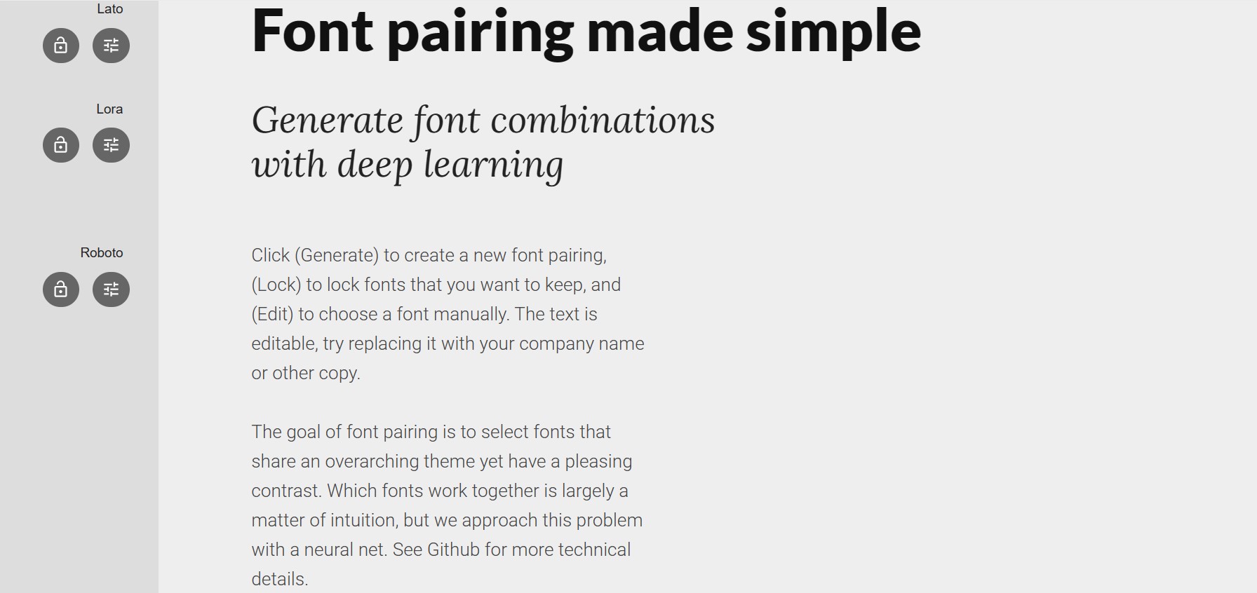
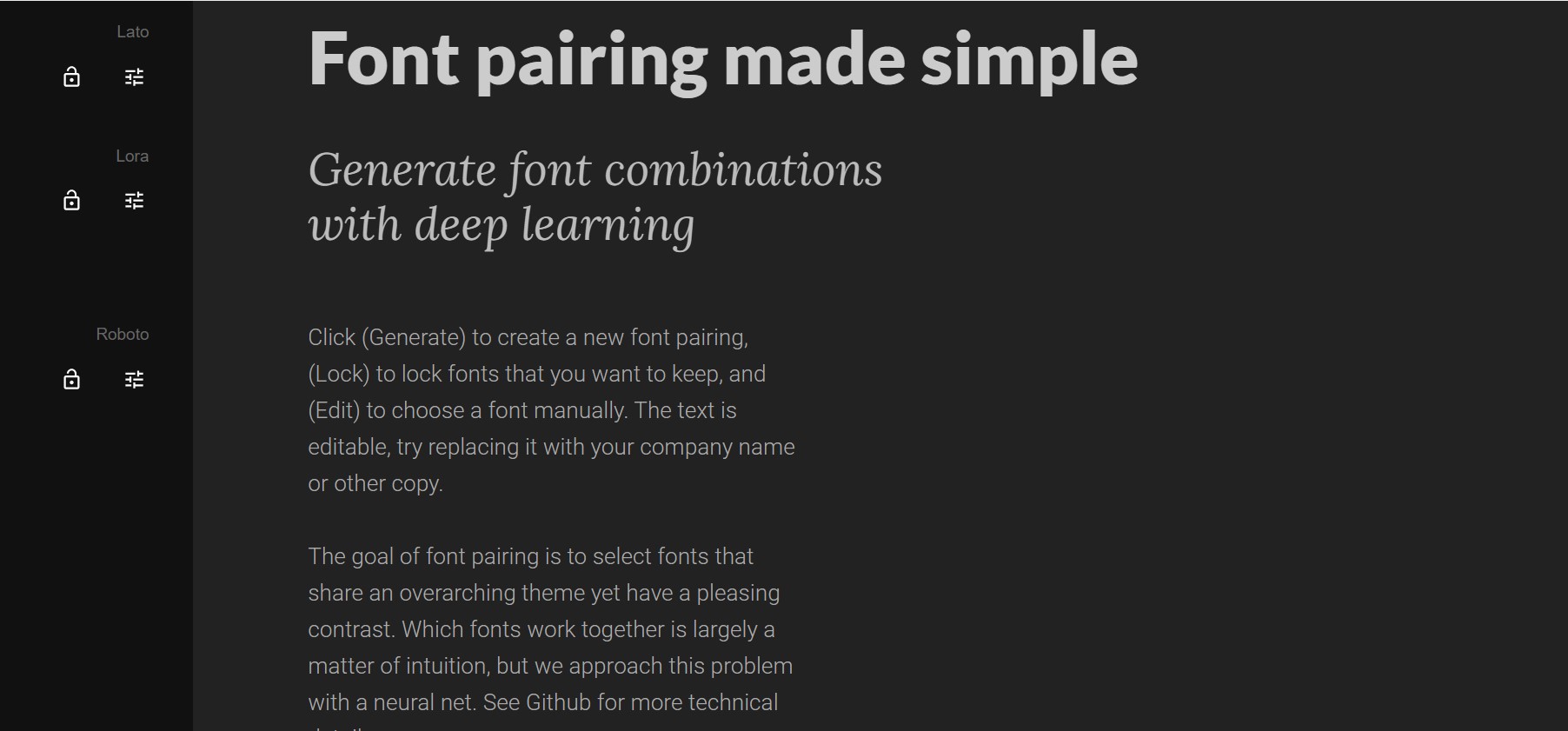
Font Pairing Choices On White Background created in Fontjoy.com
Font Pairing Choices on Dark Background created in Fontjoy.com
When designing a website, typography plays a crucial role in guiding visitors to engage with the content. By using essential principles like hierarchy, contrast, and space, effective typography can convey the value of the information on the screen. To maintain visual consistency, it is recommended to use no more than two or three different fonts. In my case, I have chosen a combination of serif and sans serif fonts, which will create a cohesive and harmonious visual experience across the website. The typeface Lato will be used for headings, Lora for subheadings and Roboto for body text.
I chose the fonts keeping in mind the “roles” (typographic styles) that would be required (body text, caption, headings, subheadings.) Basically, at least one of the fonts we chose should read easily in longer blocks of text and be legible in small sizes, and I have two Lato and Roboto are legible in both cases.
The use of these fonts reflects not only the personality of the brand individually but also in combination. For example, serif fonts are considered more elegant and traditional, and San serif fonts are generally considered modern and contemporary.
If the two are combined, the total result can be both contemporary and elegant. This combination of fonts is balanced, and the fonts complement each other. The idea is to create contrast when I pair a serif font with a sans serif font, or you can also pair fonts from the same family but different weights to provide typographic hierarchy.
Wireframes and mock-ups illustrating the website's user interface
High Fidelity Mobile App Mockup
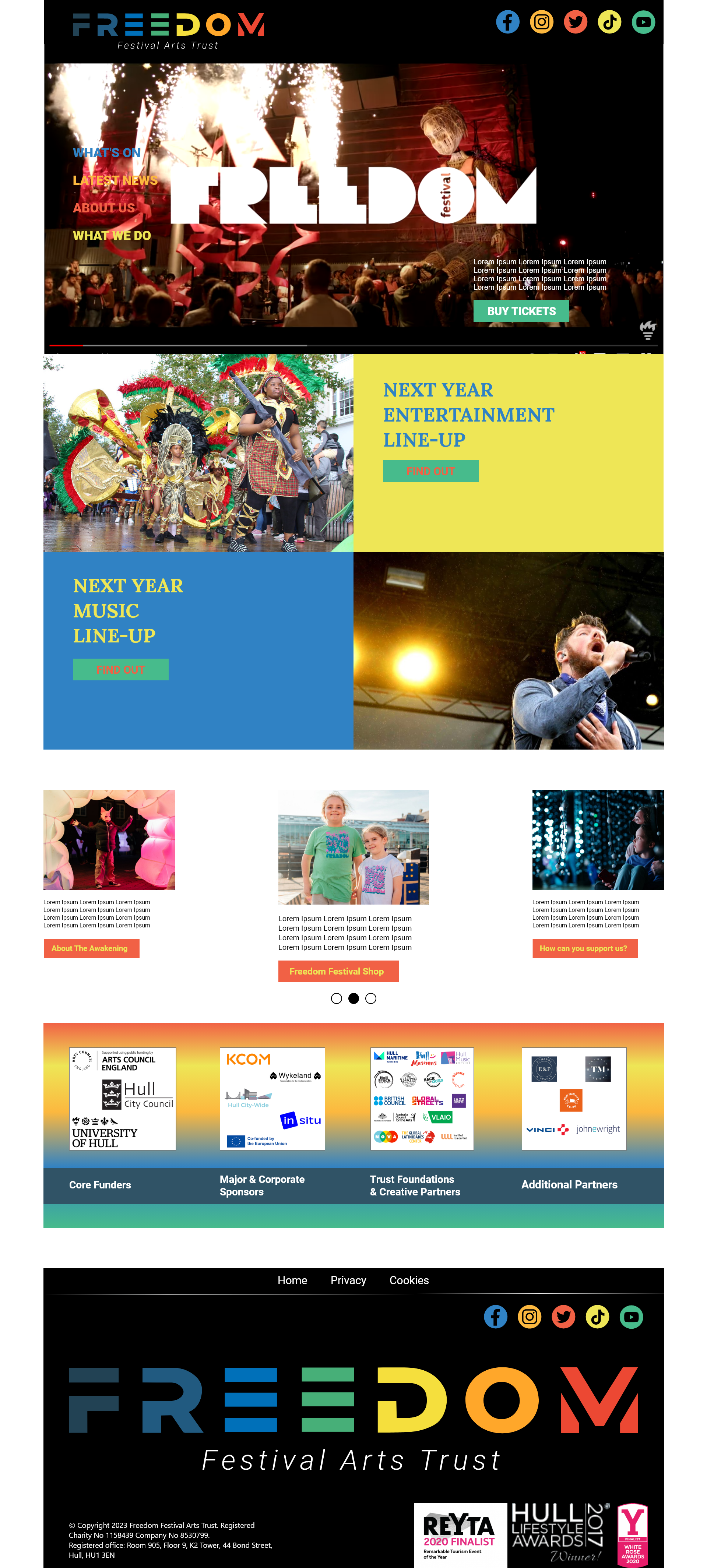
High Fidelity Website Mockup
Wireframes and mockups are essential tools on the website or app design process. It is very important to start designing for a mobile app first, because it’s the smallest screen to work on for your project. I started creating low-fidelity wireframes for both mobile and website. I outlined the basic design and functions of the user interface, focusing solely on the size, placement, and relationship of key interface elements.
The mockup was the next, more in-depth iteration of the wireframe. It includes more stylistic and visual UI details to represent a realistic model of what my final page or app will look like. Layout includes additional visual details such as colours, styles, graphics, typography, styled buttons and text, navigation graphics, and component spacing.
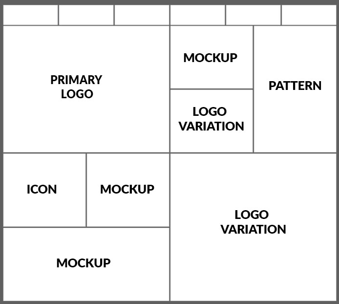
Brand Mockup Created In Illustrator
Filled Brand Mockup
I have created a brand mockup to show how the individual elements I made would look in use. This is the main logo and its variations, icon, pattern, and various mockups.
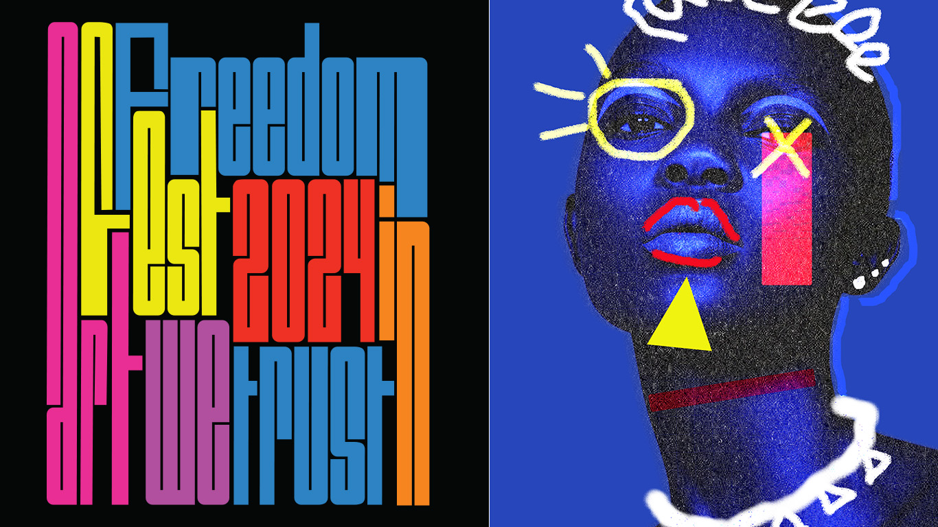
Poster with stretched typography created in Illustrator and Photoshop
Implementation of responsive design principles to ensure cross-device compatibility
Creating a website that is visually appealing and functions well on all devices is essential for reaching a wider audience. Implementing responsive design principles ensures that the website adapts to different screen sizes, providing an optimal viewing experience. This is important for user experience, as visitors are more likely to stay and explore a website that is easy to navigate and visually appealing on their device. Additionally, responsive design is crucial for better search engine visibility, as search engines prioritize mobile-friendly websites in their rankings. From a cost perspective, developing a single responsive website is more cost-effective than creating separate versions for different devices.
First, I will start my design process with the mobile version first, prioritizing the main elements for smaller screens and progressively improving the design for larger devices.
Second, I’ll be using smooth grids that I can adjust proportionally to different screen sizes, allowing the content to scale seamlessly across devices.
Next step is to optimize images for different resolutions and screen sizes by implementing techniques like CSS media query to serve the appropriate image size based on the device.
Lastly, I’m going to create a user-friendly navigation menu that will work equally well on both a laptop and a mobile device, using a hamburger menu to save screen space.
Integration of interactive elements to enhance user engagement.
Freedom Brand Design System Created In Illustrator
Interactive elements are essential for transforming a static page into something captivating and memorable. They not only add practical functionality but also enhance personalization. Additionally, interactivity adds entertainment value, making websites more engaging and intriguing. Many impressive sites prioritize interactivity, resulting in remarkable user experiences.
In today’s digital age, businesses must incorporate interactive elements to boost audience engagement. These elements, such as quizzes and games, actively involve the audience in the content. By doing so, businesses create immersive experiences that drive increased engagement and brand loyalty.
Animations can greatly enhance the initial impression of a website, immediately signaling to users that the site offers a unique experience. This can capture their interest and encourage them to explore the displayed information. In today’s competitive landscape, a simple animation can make the difference between gaining an engaged new customer or losing them to a Google search. The banking site “Wickret” served as my inspiration, as its mobile banking app’s website has received high praise for its original design. Notably, animations are prominently featured on the homepage, creating a captivating first impression that showcases the bank’s commitment to providing an extraordinary experience.
To maximize engagement, I will strategically place social sharing buttons throughout my website. These buttons are quick and easy to implement, allowing users to easily share pages and engage with the content. By incorporating social sharing buttons, I can harness the power of social media to improve brand awareness and encourage word-of-mouth recommendations.
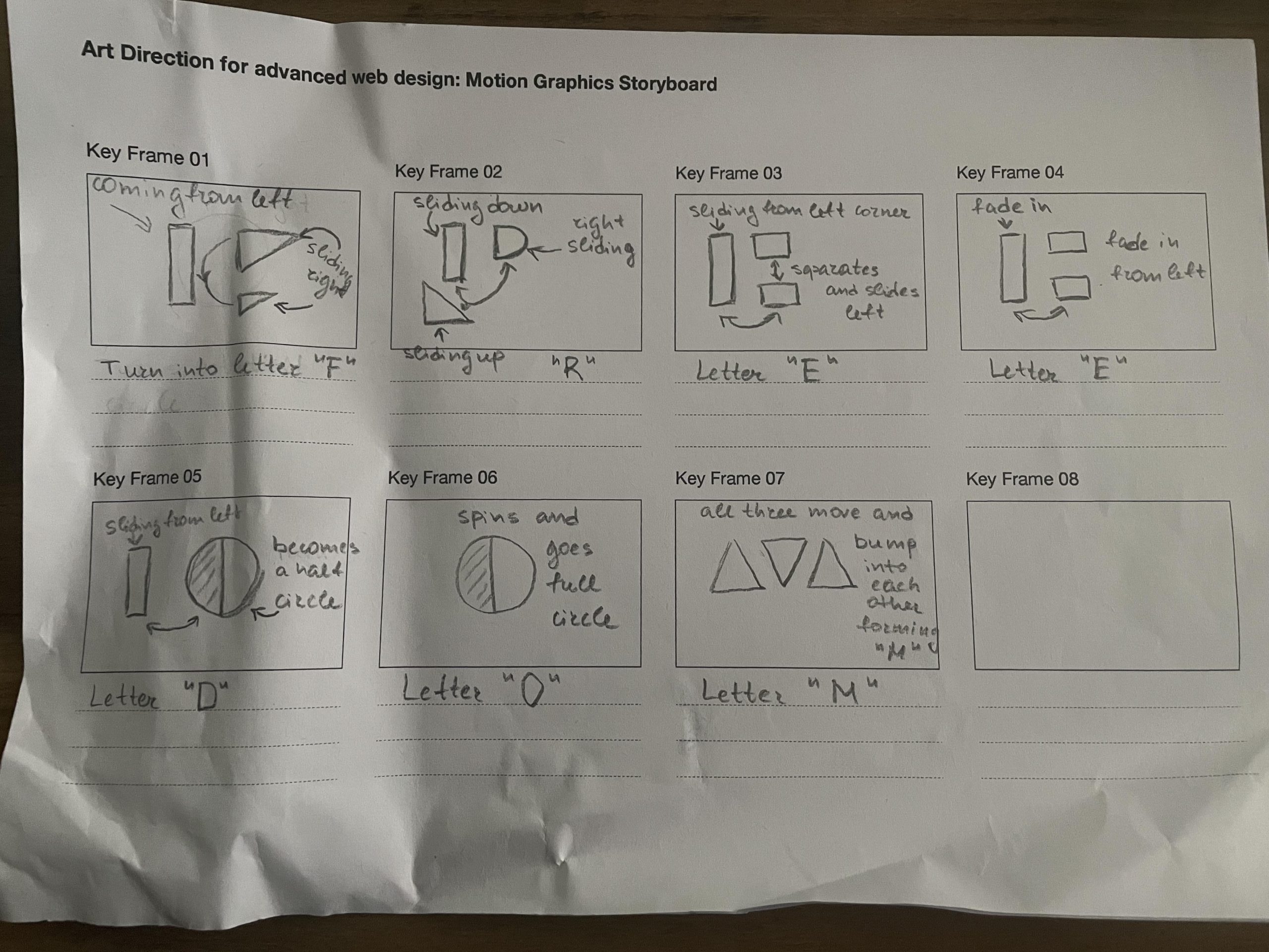
Motion Graphics Storyboard one
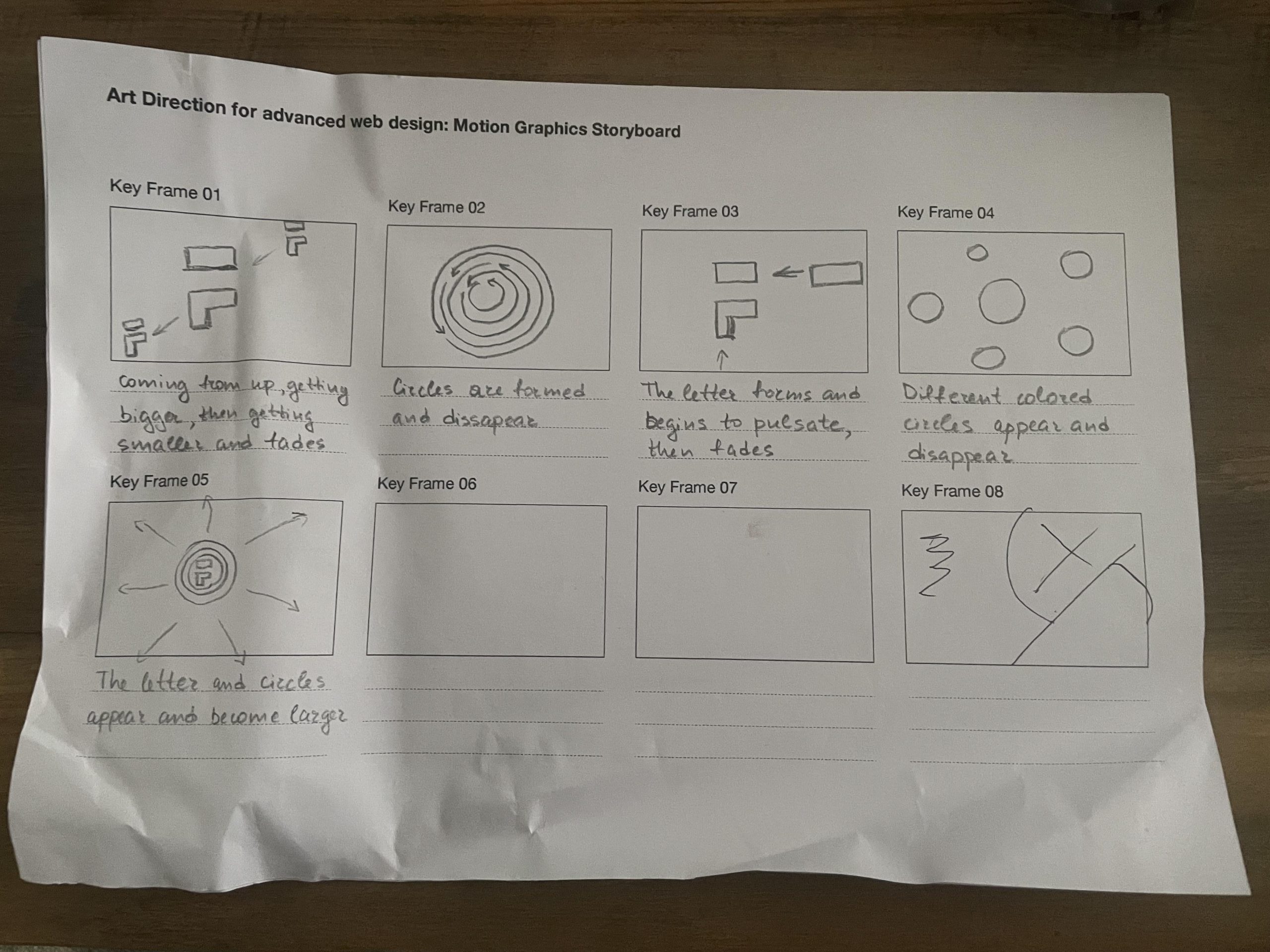
Motion Graphics Storyboard two
I made two motion graphics storyboards and would love to include one of them as interaction in the website and mobile app design. I will try to finalize them in Adobe After Effects, if I can’t manage to recreate them completely I will do something easier as this software is completely new to me.
My animated 3D Freedom Festival Icon made in Adobe After Effects
Multichannel visual identity that spans both the web and app design
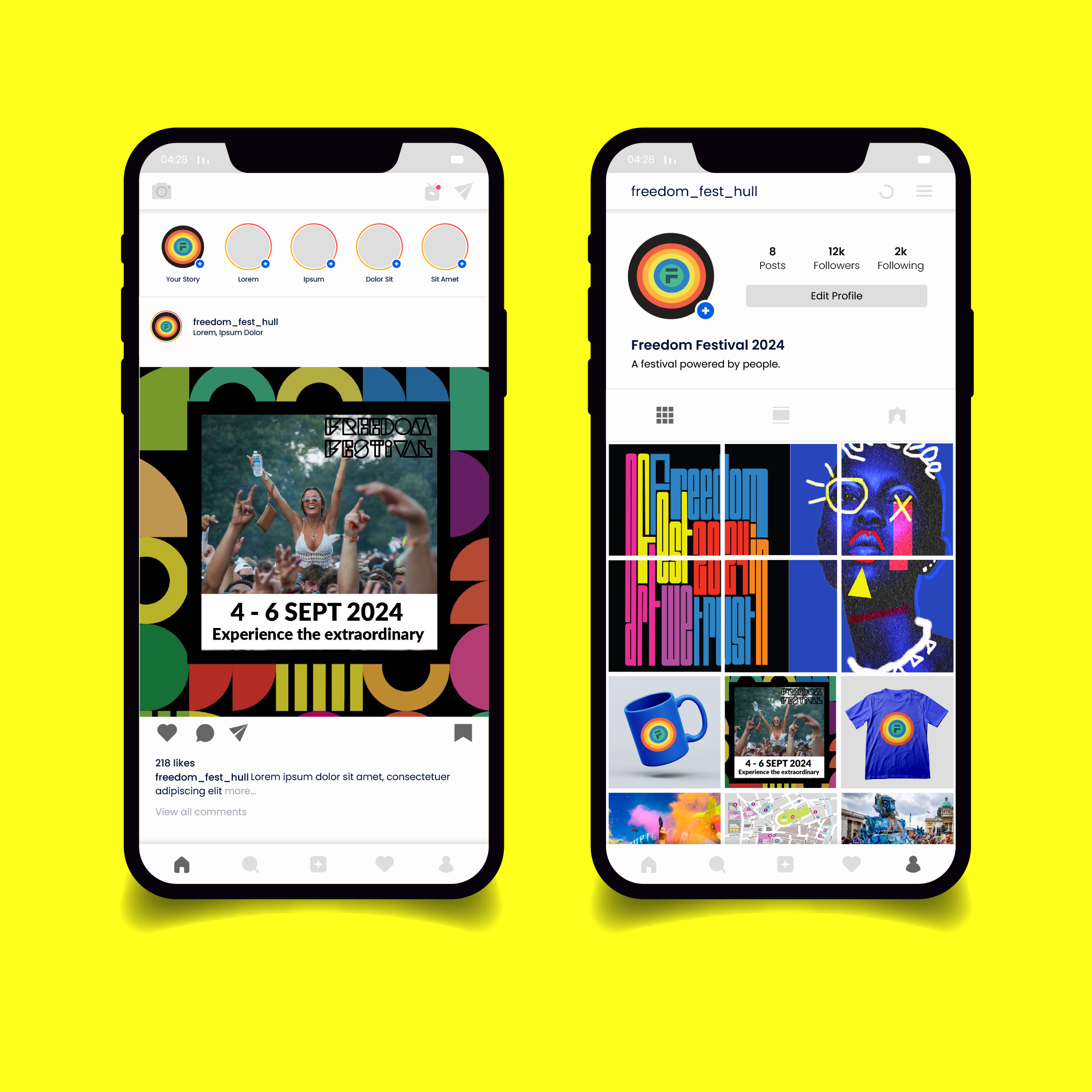
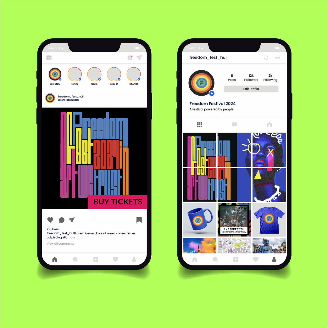
Instagram Visual Identity
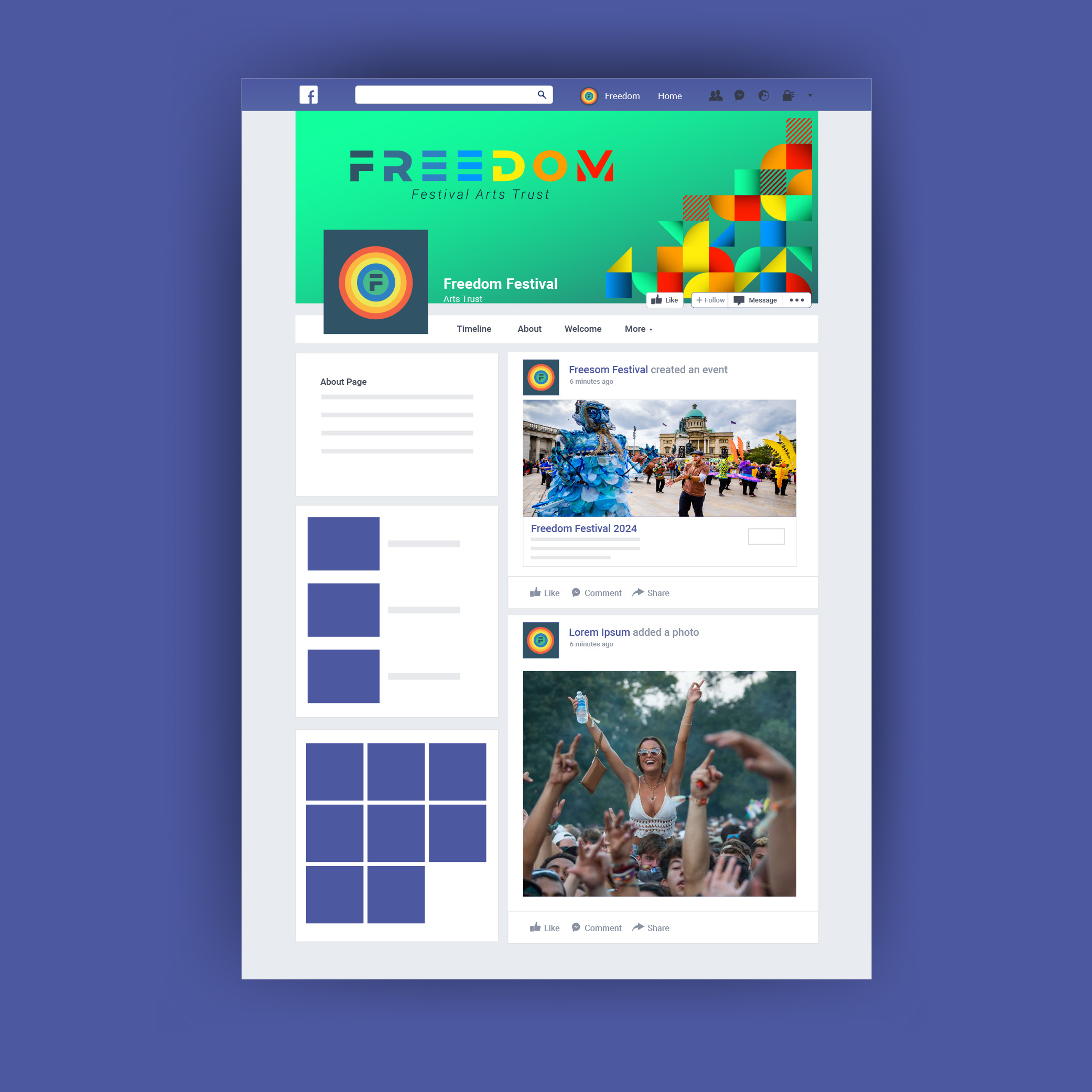
Facebook Visual Identity
Instagram Visual Identity
Building a strong brand is crucial for showcasing its mission, personality, and expertise to the community. Social media plays a vital role in establishing the brand by allowing us to regularly share ideas, photos, videos, animations, and snippets of our company’s personality. In addition to developing a visual identity, we can enhance the brand by incorporating compelling storytelling and maintaining a consistent voice and tone. This combination will make it even more memorable.
The most important part of building a brand is consistent application. Anyone creating external materials needs to know the exact right colours, fonts, and elements to use. And our brand’s social media presence should align with our overall marketing goals and target audience. To ensure that the entire company adheres to brand parameters, branding teams often create style guides, a voice and tone guide, and examples of how to implement the brand in different types of social media content.
A brand identity encompasses more than just a logo design and colours. It also includes the voice and personality of the brand. Freedom Festival’s brand identity is characterized by a distinctive creative voice that enriches society. They express themes of democracy, identity, human rights, and freedom through artistic expression. This creativity and playfulness are reflected in the language they use and the overall personality of the brand. An award-winning international organization, known for their leadership in outdoor arts. That communication reflects their confidence through a powerful narrative, strong imagery, messaging, and copy lines.
Confident and straight-talking
Playful and creative
Authentic and diverse
Dynamic and accessible
Provocative and challenging
Welcoming and friendly
Accessibility considerations for an inclusive user experience
When designing for accessibility, it is crucial to consider certain key factors. First and foremost, the information architecture should be clear and consistent. This means organizing content in a logical and hierarchical manner, making it easy for users to navigate and find the information they need. Descriptive headings, subheadings, and clear labelling for buttons and links can greatly enhance the user experience.
Another important consideration is keyboard accessibility. It is essential to ensure that all interactive elements and functionality can be accessed and operated using only a keyboard. This is particularly important for users with mobility impairments or those who rely on assistive technologies like screen readers. By making sure that all actions can be performed without a mouse, we as designers can ensure that our websites are inclusive and accessible to all users.
When optimizing colour contrast for users with visual impairments or colour blindness, it is important to use appropriate colour combinations. Additionally, providing alternative text for visual content, such as images and icons, is crucial. This includes providing alternative text (alt text) for images, transcripts for videos, and captions for audio content. By doing so, users who rely on screen readers or have limited access to visual or auditory information can understand the content. It is also important to ensure compatibility with assistive technologies such as screen readers, screen magnifiers, and voice recognition software. Testing the design with different assistive tools is necessary to ensure a seamless user experience.
In conclusion, when we are designing for accessibility, it is crucial to prioritize clear and consistent information architecture, contrast and visual perception, text alternatives, keyboard accessibility and assistive technology compatibility. These considerations can greatly enhance the user experience for all individuals and gain equal access to information, products, and services and ensure that they can access and interact with digital content effectively.