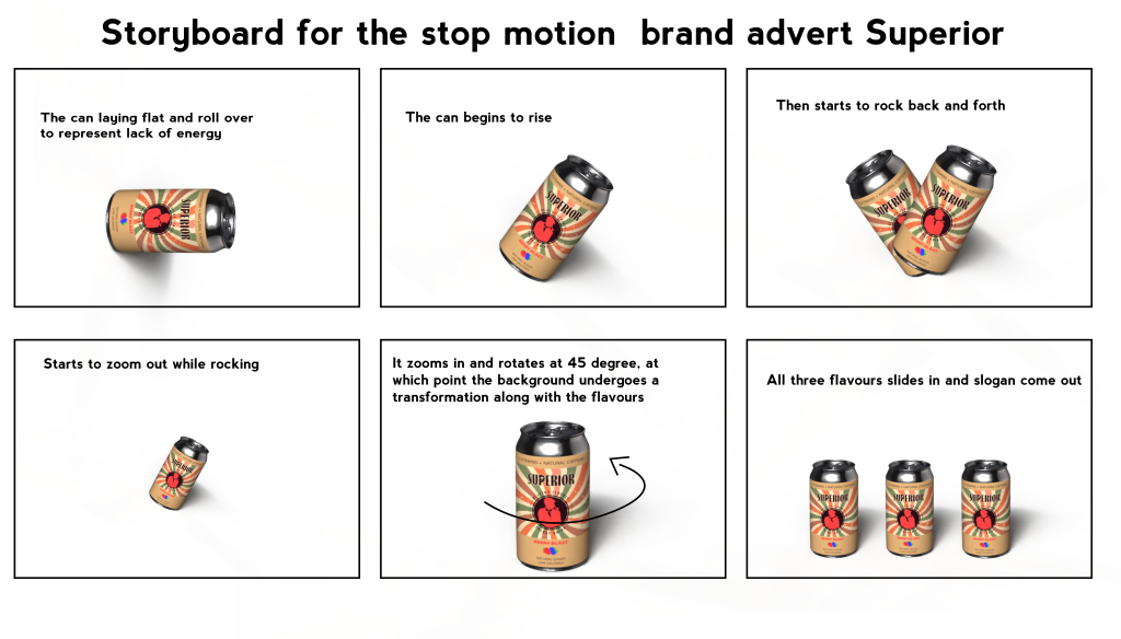
The storyboard featured a symbolic representation of the target audience, specifically individuals over the age of 65. The narrative of the animation aimed to reflect the physiological changes associated with aging, particularly the decrease in metabolism and energy levels. This concept was visually portrayed through the movement of the can, starting with a depiction of low energy levels, and progressing to a subtle but meaningful transition symbolizing resilience and vitality.
That’s why my stop motion advert will start with the can lying down to represent the lack of energy and then slowly roll over. In the next part of the animation, the can begins to rise, symbolizing the start of energy kicking in. Following this, the can rocks back and forth rapidly, giving the impression of a dynamic and powerful movement right in front of the camera. As the animation progresses, the can slowly fades while maintaining its rocking motion. Moving on to the fifth frame, the can is now zoomed in and starts rotating at a 45-degree angle. Simultaneously, the background transforms along with the flavors, adding to the visual impact of the animation. Finally, in the last frame, all three flavors slide in, culminating in the appearance of the slogan designed to convey information about the Superior brand.
Digitalised storyboard created for the stop motion advert for Superior Brand
The initial idea was discarded due to my unfamiliarity with Blender and time constraints, as I needed to redesign my brand’s logo and associated content. Although this concept was my preferred choice, my attempt to execute it in Blender was impeded by the complexity of the software, making it very challenging to progress within a week.
Idea two
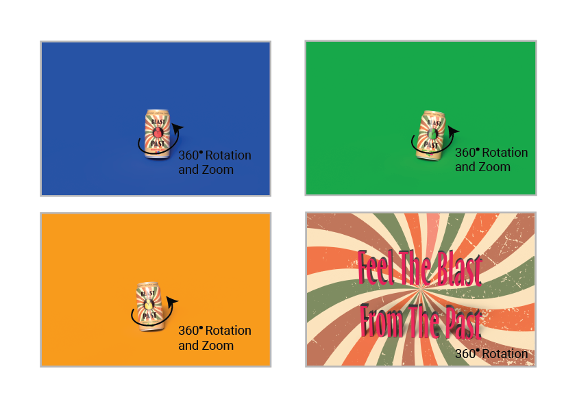
The second idea is also the final one that I decided to use. It’s a simple animation, but the requirements are met. The idea is interesting because in addition to the can rotating it also orbits 360 degrees. The idea of the zoom at the end of each flavor is to make the animation transition more smoothly between each rotation and between moving to the next scene. After the last flavor, there is a small blackout transition, and then the brand’s slogan appears, dynamically spinning and bouncing sideways. At the end of the video, there should have been a credit to the soundtrack I used, but I didn’t put it because it would exceed the requested time for the animation. Instead, I put the credit in the description, as a thumbnail of the video, and in the title of the animation.
Final Animation Storyboard with a transition of colours
Existing Commercial Animations
I recently watched many 3D product animations that left a lasting impression on me. The vibrant color schemes and innovative packaging designs utilized in these animations truly make the products pop on screen. The incorporation of bubbles and various fruits not only adds visual appeal but effectively conveys the refreshing nature of the beverages being showcased.
While comparing two of the animations, it’s evident that both focus on zooming in on the products. However, the second animation distinguishes itself by incorporating more dynamic elements and a wider array of effects. The swift yet seamless transitions between scenes enhance the overall viewing experience.
In conclusion, these 3D animations serve as a great source of inspiration for aspiring designers and marketers. The attention-grabbing visuals and clever use of motion effects demonstrate the potential to create engaging product showcases.