Requirements Gathering and Analysis
- Define your audience
Defining my audience is a crucial step in any form of communication. Understanding who I am speaking to help me tailor my message to their needs and interests. My audience can be defined by a variety of factors.
When defining the audience, it is important to consider their demographics. This includes factors such as age, gender, income, and education level. For example, if I am creating a marketing campaign for a luxury product, I may want to target individuals with a higher income level.
In addition to demographics, it is important to consider psychographics. This includes factors such as values, beliefs, and interests. Understanding my audience’s psychographics can help me create messaging that resonates with them on a deeper level.
Overall, defining the audience is a critical step in effective communication. By understanding who we are speaking to, we can tailor a message to their needs and interests, ultimately leading to more successful outcomes.
- The product’s stakeholders. What will your stakeholders consider success? What assumptions do they have around your product?
The stakeholders for my arts website will have various considerations for success. Firstly, they will look at the number of visitors to the website and the amount of engagement they have with the content. This could be measured through comments, shares, and likes on social media. Additionally, stakeholders will consider the revenue generated through advertising and partnerships with other arts organizations. Finally, they will look at the overall reputation of the website within the arts community, including positive reviews and awards.
The stakeholders have certain assumptions about my website. They assume that the website will provide a platform for artists to showcase their work and connect with potential buyers. They also assume that the website will provide valuable information and resources for those interested in the arts, such as upcoming events and exhibitions. Finally, stakeholders assume that the website will be user-friendly and visually appealing, with easy navigation and high-quality content.
In order to meet the expectations of my stakeholders, I will need to focus on creating engaging and informative content, building partnerships with other arts organizations, and investing in high-quality design and user experience. By doing so, I can ensure the success of my arts website and establish a strong reputation within the arts community.
- The product’s users. What are your users’ needs? What will your users consider success? What are their core needs in this space?
As I develop my arts graphic website, it is important to consider the needs of the users. Users are primarily artists, designers who require a platform to showcase their work and connect with potential clients, gallery owners who want to make profit. Or they might be lecturers or higher education students who are looking for inspiration and information, or even regular people who have interest in arts.
Success for the users will be measured by the level of engagement they receive on their work, the number of inquiries they receive from potential clients, and the ease of use of the platform. They will also consider success to be the ability to easily share their work across various social media platforms and the ability to track their analytics.
The core needs of users in this space are a user-friendly interface, customizable design templates and the ability to easily connect with potential clients. Additionally, they require a secure platform to protect their intellectual property and a reliable support system to assist with any technical issues. By meeting these needs, I can ensure the success of my product and the satisfaction of the users.
- Accessibility concerns
One major concern is the use of images without alternative text descriptions, which can make it difficult or impossible for users with visual impairments to understand the content. Additionally, websites with complex layouts or colour schemes may pose challenges for users with cognitive or neurological disabilities.
To address these concerns, me as a designer should prioritize accessibility in my website development process. This includes ensuring that all images have alternative text descriptions, using clear and consistent navigation, and avoiding flashing or rapidly changing content that can trigger reactions in users with photosensitive conditions. By making accessibility a priority, I can create website that is not only visually stunning, but also inclusive and accessible to all users.
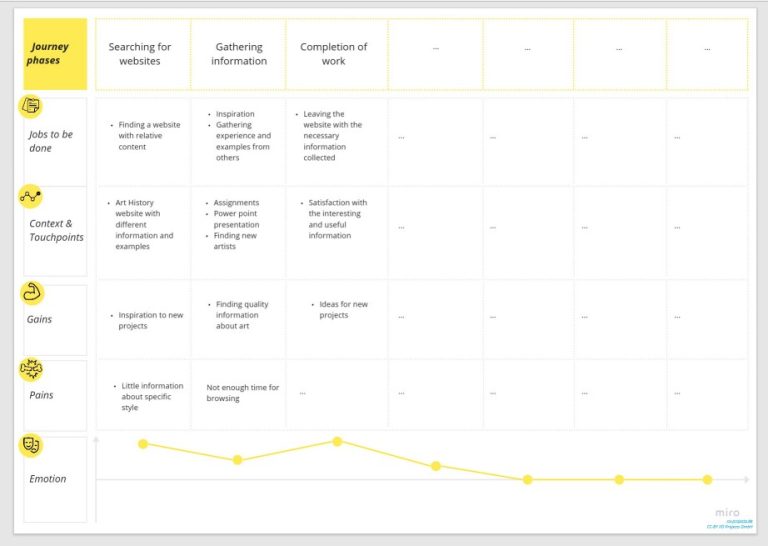
- User journey maps (Miro etc)
User journey maps are an important tool for graphic design artists. These maps help designers understand user experience and needs, allowing them to create designs that are intuitive and user-friendly. By mapping the user journey, designers can identify pain points and areas where design can be improved.
- Similar websites a- review them and summarise your takeaway points from this process (Hierarchical Task Analysis)
Hierarchical Task Analysis (HTA) is a popular method used in UX design to break down complex tasks into smaller, more manageable sub-tasks. The process involves identifying the main goal of the task and then breaking it down into smaller steps, each of which can be analysed and optimized for efficiency and effectiveness. This approach helps designers to understand the user’s perspective and identify areas where the user may encounter difficulties or confusion.
The first step in HTA is to identify the main goal of the task. This could be anything from completing a purchase on an e-commerce website to booking a flight. Once the main goal has been identified, the task is broken down into smaller sub-tasks. For example, booking a flight could involve selecting a departure and arrival airport, choosing a date and time, selecting a seat, and entering personal information.
Each sub-task is then analysed to identify any potential issues or areas where the user may encounter difficulties. This could include confusing navigation, unclear instructions, or a lack of feedback. By identifying these issues, designers can make changes to the interface or user experience to improve the overall usability of the product.
In conclusion, Hierarchical Task Analysis is a powerful tool for UX designers to break down complex tasks into smaller, more manageable steps. By analysing each of these steps, designers can identify potential issues and make changes to improve the overall user experience. This approach helps to ensure that products are intuitive, efficient, and effective, ultimately leading to higher user satisfaction and engagement.
Minimalist Websites
https://www.scottsnyderphoto.com/
Scott Snyder is a photographer based in California who has a website that caught my attention. His website has a minimalistic design and features his projects arranged sequentially from left to right. I appreciate the slight animation in some of his photos and the animated footer. The website is simple, organized and has a fresh, minimalist style.
I recently came across “We Ain’t Plastic”, a company founded by Roland, a creative technologist and user experience engineer. The website’s minimalistic design caught my attention, particularly the large dark grey gem that serves as the centrepiece. Roland’s introduction and services are presented in a short and straightforward manner, which is effective in conveying his message. Overall, the design is well-balanced and powerful.
- Define what success will look like for your designs.
Success for my graphic design work will be defined by several key factors. Firstly, it will be measured by the level of engagement that my designs generate. This means that the number of likes, shares, and comments on social media, as well as the amount of traffic to my website will be important indicators of success.
Secondly, I will measure success by the impact that my designs have on the target audience. This means that I will pay close attention to the feedback that I receive from clients and customers and use this feedback to improve my designs. I will also track the success of my designs by monitoring sales figures.
Finally, success for my graphic design work will be defined by the level of recognition that I receive within the industry. This means that I will aim to win awards, be featured in industry publications, and be invited at conferences and events. By achieving these goals, I will be able to establish myself as a thought leader in the field of graphic design and build a reputation for excellence.
- Define any assumptions for your website.
When I am creating a graphic design website, it is important to define certain assumptions. Firstly, I assumed that the website will be visually appealing and user-friendly. This means that the website should have a clean layout, easy navigation, and high-quality graphics.
Secondly, assumed that the website will showcase the designer’s portfolio. This means that the website should have a section dedicated to displaying my design work, with clear descriptions and high-quality images.
Lastly, assumed that the website will have a contact page. This means that my website should have a clear and easy-to-use contact form, as well as information on how to reach me through other channels such as email or social media.
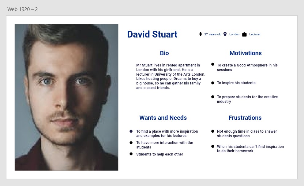
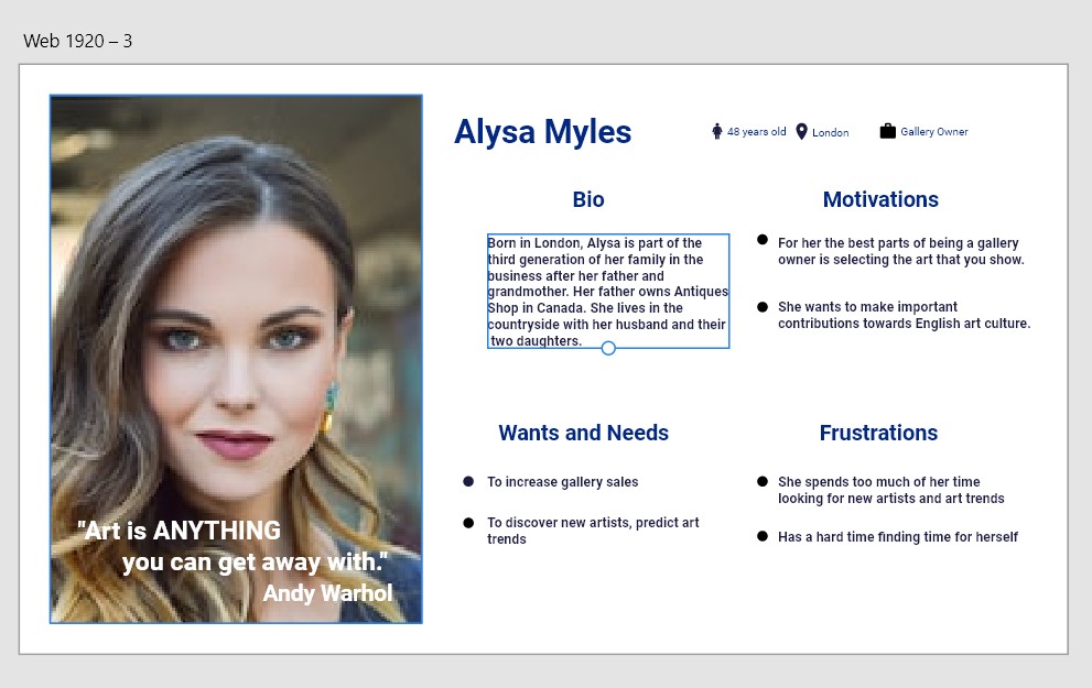
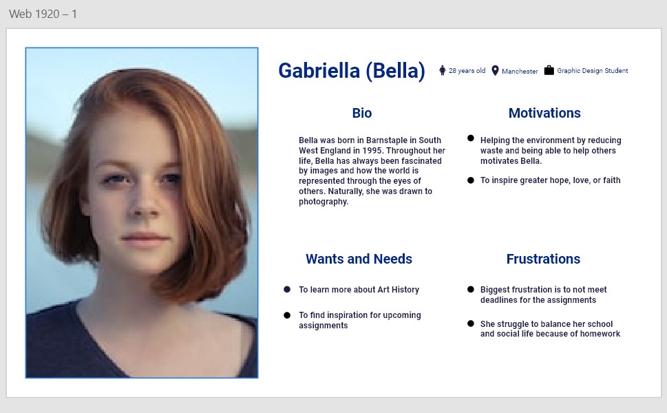
As a graphic designer, it is important to understand the needs and preferences of our stakeholders. By creating personas and scenarios, we can bring life to your stakeholders and better understand their motivations and goals.
- Construct Personas/Scenarios to help bring life to your stakeholders.
Persona 1: Sarah, the Marketing Manager
Sarah is a busy marketing manager who values clean and modern design. She is always looking for ways to make her company stand out and is willing to invest in high-quality design work. As a stakeholder, Sarah is focused on results and wants to see a clear return on investment.
Scenario 1: Sarah needs a new brochure for an upcoming trade show. She wants a design that is eye-catching, easy to read, and effectively communicates the benefits of her company’s products. She provides detailed feedback and is willing to collaborate to ensure the final product meets her expectations.
Persona 2: John, the CEO
John is a successful CEO who values creativity and innovation. He is willing to take risks and invest in unique design solutions that set his company apart from the competition. As a stakeholder, John is focused on the big picture and wants to see designs that align with his company’s overall goals and values.
Scenario 2: John wants to launch a new product line and needs a design that reflects the company’s commitment to sustainability. He is open to new ideas and wants a design that is both visually appealing and environmentally friendly. He provides clear direction and is willing to invest in high-quality design work.
Persona 3: Emily, the Designer
Emily is a talented designer who is passionate about creating beautiful and functional designs. She is always looking for ways to improve her skills and stay up to date with the latest design trends. As a stakeholder, Emily is focused on creating designs that are both visually appealing and effective.
Scenario 3: Emily is tasked with designing a new website for a client. She takes the time to understand the client’s needs and preferences and creates a design that is both user-friendly and visually stunning. She collaborates with the client throughout the design process to ensure the final product meets their expectations.
Another digitalised user personas without scenario
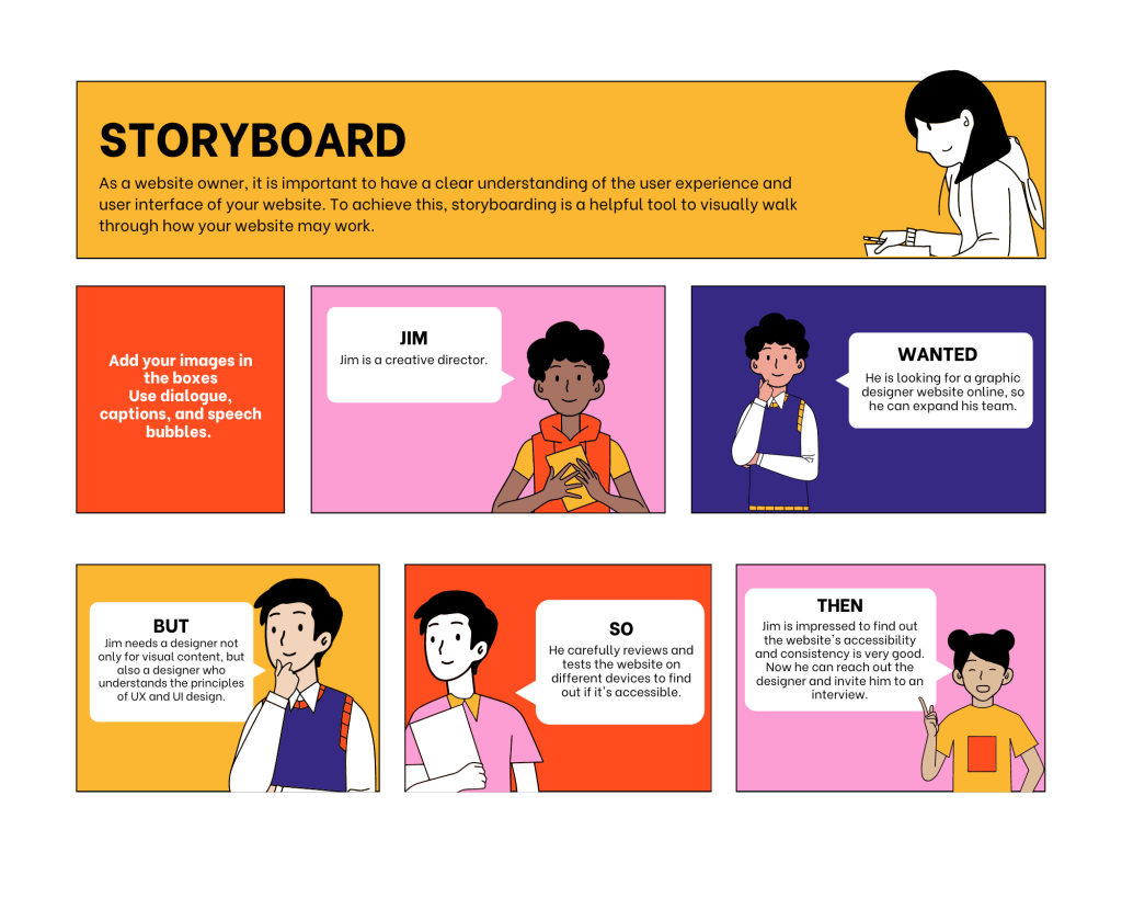
- Storyboard your UX/UI for your website? Visual walk through of how it may work.
The first step in storyboarding your UX/UI is to identify the key features and functions of your website. This includes the layout, navigation, search functionality, and any interactive elements such as forms or buttons.
Once these key features have been identified, it is important to map out the user flow. This involves outlining the steps a user will take to complete a specific task on your website.
Finally, it is important to test and refine your storyboard to ensure a seamless user experience. This may involve conducting user testing or making adjustments based on feedback from beta users.
By storyboarding your UX/UI, you can ensure that your website is user-friendly and easy to navigate, ultimately leading to increased engagement and conversions.
