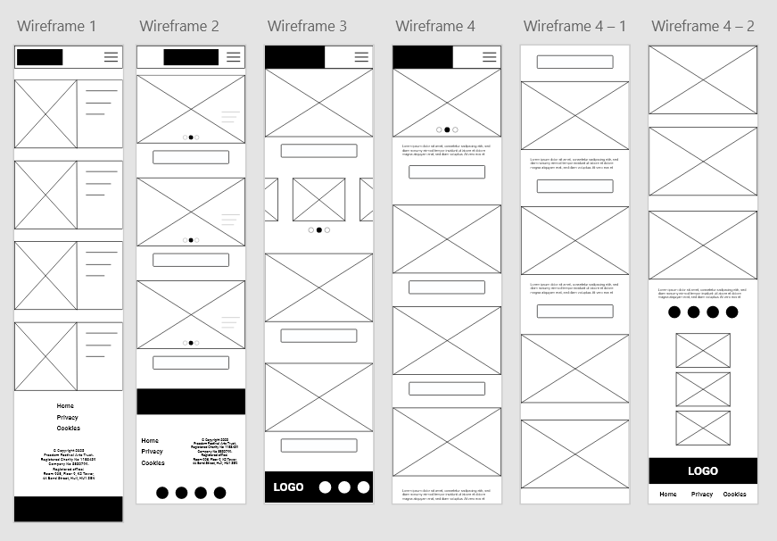
Adobe XD Detailed Web Wireframes
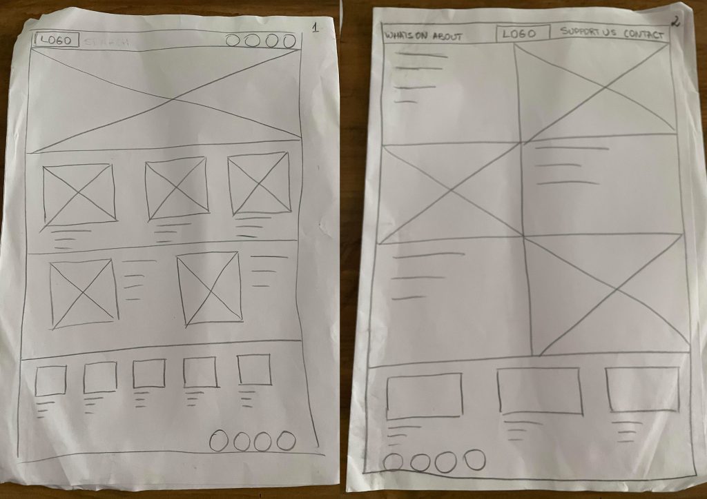
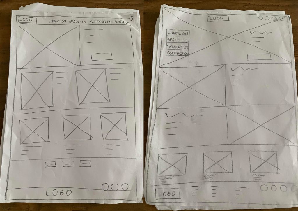
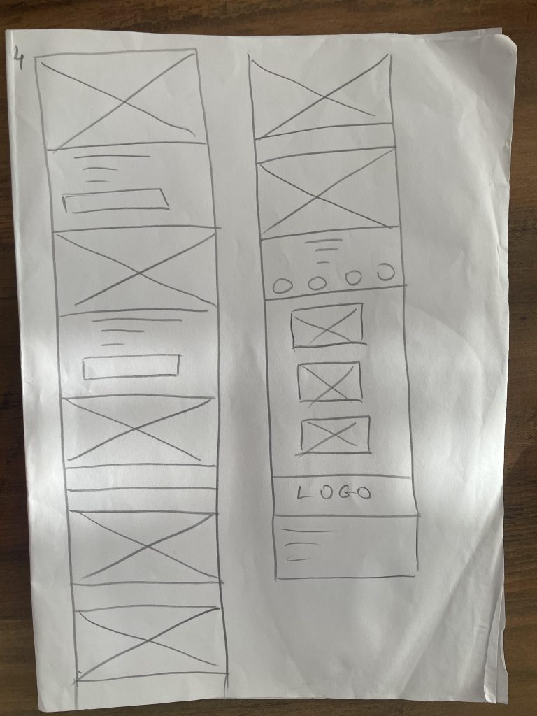
Low fidelity desktop wireframes on paper
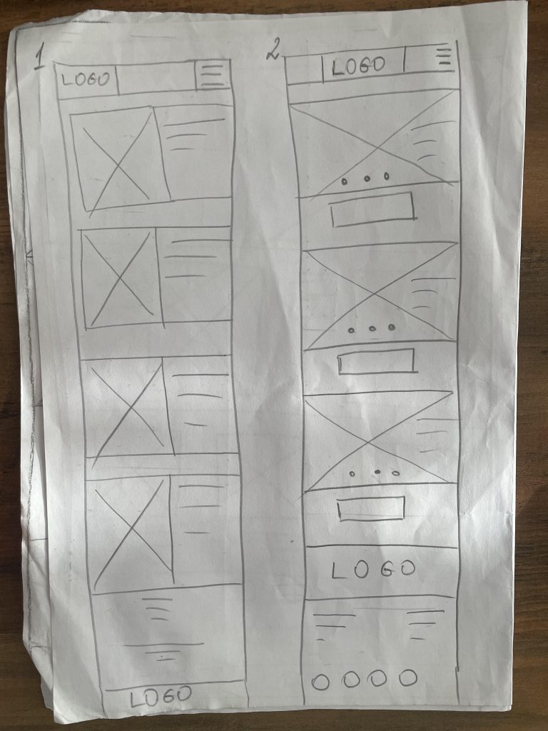
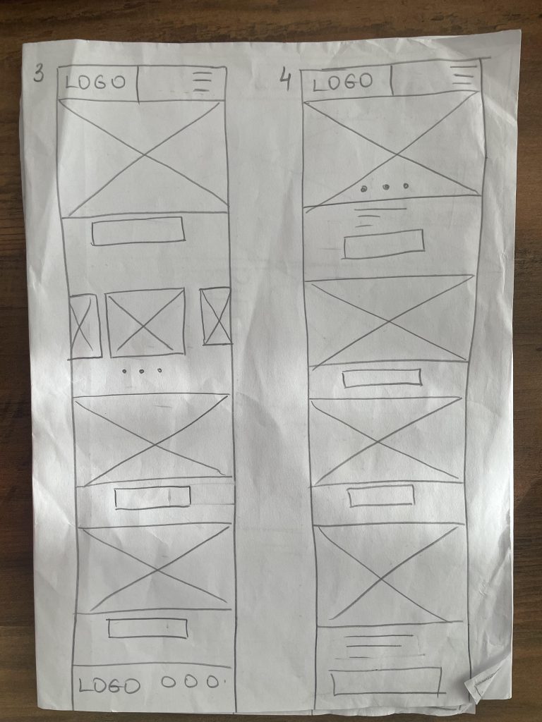
Low fidelity mobile wireframes on paper
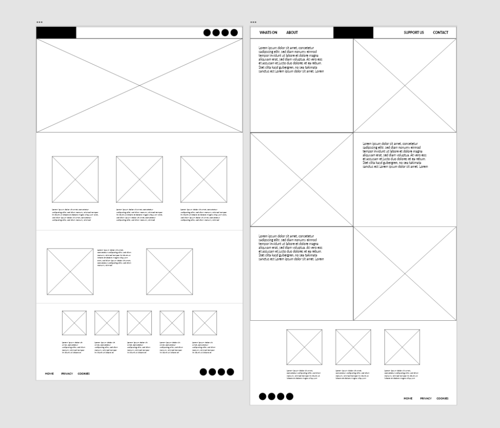
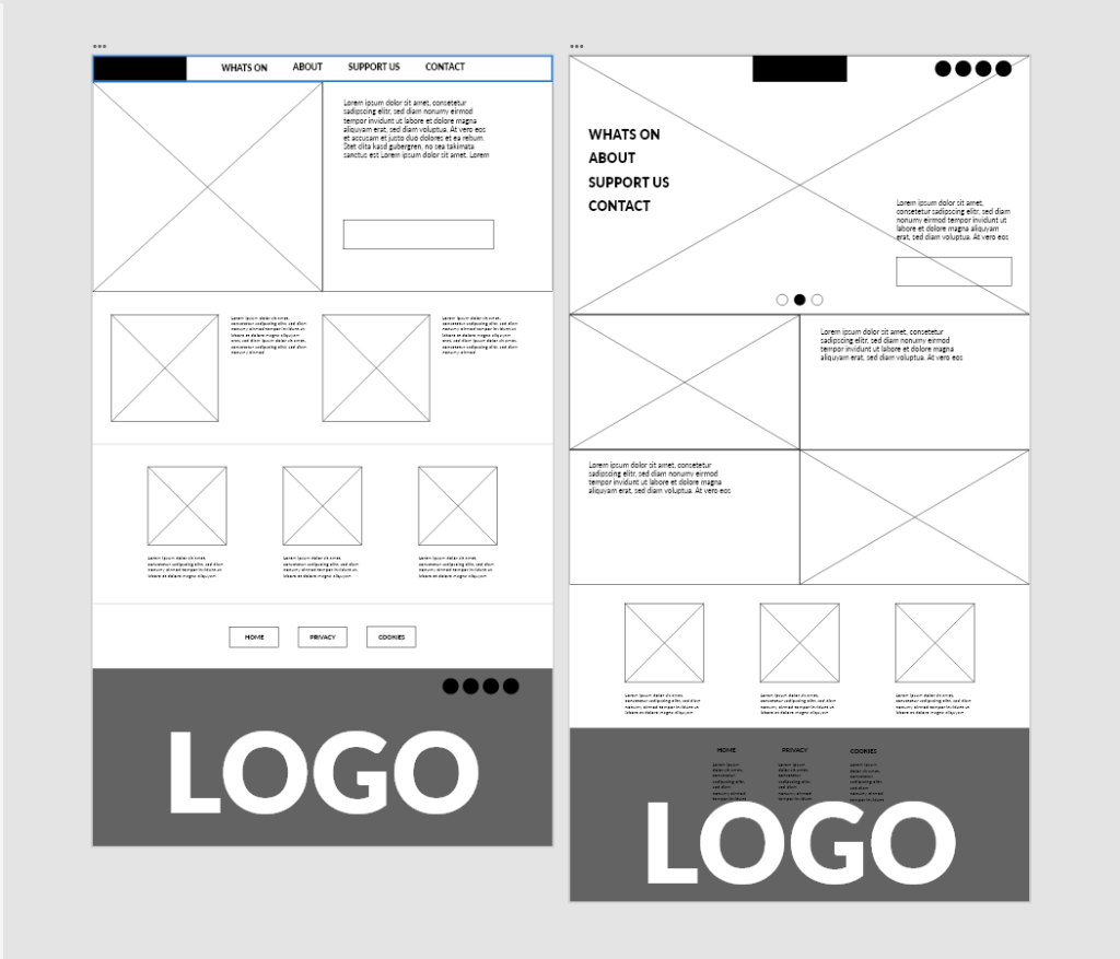
Low Fidelity Digital Web Wireframes
Wireframes, prototypes, and mock-ups are crucial elements in the early stages of product development. They provide UX (and UI) designers with the opportunity to test and gather user feedback throughout the design process. User testing is crucial for designers to assess the suitability of their product for the target audience, understand how users navigate and benefit from the product, determine its purpose, and evaluate if it meets expectations. By conducting user testing at every design iteration, starting from low-fidelity wireframes to high-fidelity prototypes, designers can create a robust and comprehensive product that delivers value to users. This forms the basis of effective user experience design.
The fidelity of wireframes, prototypes, and mock-ups is commonly understood as the main distinction between them. However, they are fundamentally different in terms of design and function in the UX design process. To explain their roles, we can use the analogy of the human body. Wireframes are like the skeleton, providing the barebones structure of the product. Prototypes act as the brain, determining how users move and interact. Mock-ups are like the skin, hair, and facial features, representing the brand and instantly identifying the product.
A wireframe is a web page layout that prioritizes page elements based on user requirements. It is a low-fidelity representation of the initial product concept, including essential elements for a webpage or app. Wireframes outline page structure, layout, information architecture, and overall direction. Traditionally created using black, white, and grey, wireframes can be drawn by hand or digitally. They are most useful in the early stages of product design, transforming abstract ideas into tangible concepts. The main purpose of a wireframe is problem-solving, rather than focusing on the product’s look and feel.
A prototype is a sample or simulation of a finished product used for testing and feedback. Low-fidelity prototypes are drawn on paper and lack user interaction. High-fidelity prototypes are computer-based and allow for interaction via mouse and keyboard. Prototypes are working models of apps or webpages created after wireframing to test the user journey, identify issues with interaction flow, and consider different actions or tasks to achieve specific outcomes.High-fidelity prototypes are fully functional and coded websites or apps that contain color, text, and other content. They are commonly used in the later stages of the design process to refine the product’s usability. Both low and high-fidelity prototypes are important for allowing users to see how the product might be used on a daily basis and for refining its usability.
On the other hand, mock-ups are static, high-fidelity simulations of the finished product that convey the visual appearance of the product design, including typography, iconography, colour, and overall style. Mock-ups are essential visual representations of the final webpage or application design. They play a crucial role in establishing how users will perceive the brand through its visual identity. While prototypes primarily focus on interaction design, mockups provide stakeholders with a more realistic perspective. They help identify and address potential issues that may not have been apparent during the wireframing and prototyping stages, such as color clashes or typography problems. In summary, mockups are a highly effective tool for exploring and refining the brand’s visual identity before committing to permanent design decisions through coding.
Reference list:
