Conceptual Design and Brand Identity

Brand Overview

Careful design ensures that the brand identity evokes a sense of exploration, adventure, and connection with nature. Through deliberately choosing colours, typography, and design principles, Wander Wheels aims to convey its values and appeal to its target audience effectively. Below is a breakdown of the key branding components and their rationale.

Colour Palette

The brand’s colour palette combines tones that evoke nature, balance, and calm, leveraging colour theory to establish an emotional connection with users. The primary colours: Shadow Green and Meadow Green, signify growth, vitality, and connection to the natural world. As a darker, more grounded hue, Shadow Green provides stability and trust, while Meadow Green’s lighter, fresh tone promotes a welcoming and vibrant atmosphere.

Secondary colours: Moss Green, Mantis Green, and Pebble Grey reinforce this sense of harmony and add depth and versatility to the design. Moss Green and Mantis Green, close in tone to the primary colours, are associated with renewal and optimism. At the same time, Pebble Grey offers a neutral balance that complements the greens without overwhelming the primary tones. These colours are strategically applied to create an inviting, familiar, and nature-inspired aesthetic that resonates with Wander Wheels’ audience.

Figure 1: Recap of brand colour palette with the colour names, HEX, RGB and CMYK code.

Typography

Typography is essential in establishing the brand tone, as fonts, like colours, play a significant role in conveying a brand’s values. The initial choice of Metropolis Semi Bold as the primary font was deliberate, as its bold and modern character effectively communicates clarity and confidence, making it suitable for a strong brand identity. According to Michigan State University’s branding guidelines, Metropolis is a versatile sans-serif typeface that embodies a modern and approachable aesthetic (MSU Brand, n.d.). Additionally, research highlights that bold fonts like Metropolis Semi Bold convey strength and confidence, enhancing the brand’s message and appeal (Samrai, 2023.). However, to test font pairings, Fontjoy.com was used, and given that Metropolis was unavailable, Montserrat was selected as the primary font due to its versatility and familiarity.

  • Primary Font: Montserrat
  • Montserrat, chosen for its modern and approachable character, conveys a professional yet friendly tone. Bold weights of Montserrat are reserved for headings, providing visual emphasis and hierarchy essential for brand identity and readability.
  • Secondary Font: Lora
  • The medium weight of Lora is used for subheadings, offering a refined contrast to Montserrat’s geometric lines. This combination creates a balanced differentiation while enhancing readability and guiding users through various content sections.
  • Body Text Font: Hind Madurai
  • Hind Madurai is in regular weight and is designated for all body text. Its simple and clean lines ensure readability and help maintain a cohesive visual presentation across the brand’s content. Montserrat, Lora, and Hind Madurai pairing ensures a harmonious flow from headings to body text, balancing clarity with a visual appeal that supports the brand’s message.

The images below demonstrate examples of font pairing in both dark and light modes, showcasing how Montserrat, Lora, and Hind Madurai are visually balanced to enhance readability and maintain a cohesive brand tone. The primary goal of font pairing is to select fonts that not only share an overarching theme but exhibit a pleasing contrast, ensuring that each font complements the other while enhancing legibility.

In these examples, Montserrat is used for headings, establishing prominence and hierarchy, while Lora serves as the subheading font, subtly contrasting its more classic serif style. Hind Madurai is applied to the body text, offering clean lines and maintaining readability across varying colour schemes. Displaying these pairings in both dark and light modes provides insight into the flexibility of this typographic combination, as it remains effective and visually balanced regardless of background tones.

Figure 2: Font Pairing in Light Mode.
Figure 3: Font Pairing in Dark Mode.
Figure 4: Recap highlights the selected fonts showcasing variations in uppercase, lowercase and numeric characters.

A key consideration in developing the brand’s visual elements was Jakob’s Law, a principle named after usability expert Jakob Nielsen, which underscores the importance of familiarity in design. Jakob’s Law suggests that users are naturally drawn to designs that resonate with their past experiences, promoting comfort and ease of use. By embracing familiar design elements, Wander Wheels aims to create an intuitive experience that feels seamless and accessible, aligning with user expectations and enhancing overall engagement.

Through this combination of carefully chosen colours, structured typography, and adherence to proven design principles, Wander Wheels establishes a strong and cohesive brand identity. This identity communicates the brand’s values of adventure and connection and creates a visually engaging, user-friendly experience that reinforces brand recognition and appeals directly to the target audience.

Brand Name: Wander Wheels

The name “Wander Wheels” captures the spirit of travel and the allure of the open road. “Wander” conveys a sense of freedom and adventure, aligning with the brand’s mission to support camper van buyers in their pursuit of exploration. “Wheels” grounds the brand in the mobile, accessible aspect of van life, appealing to outdoor enthusiasts and adventure seekers.

Figure 5: An image of conceptual logo development process for Wander Wheels brand.

Conceptual logo and refinement process:

The logo refinement process began with a comprehensive exploration of inspiration sources, which played a pivotal role in shaping the design direction. By examining a range of existing logos, design icons, and visual references, valuable insights have been gained that fuelled creativity and guided idea development. Engaging with diverse styles, shapes, and colour palettes helped discern what aesthetically resonated while aligning with the brand’s core identity.

Beyond generating ideas, this inspiration-gathering phase clarified the design’s purpose and direction. It steered toward concepts and visual elements that best encapsulate the brand’s essence, ensuring that each design choice held intentional and meaningful value. This approach enabled envisioning how the logo could function effectively across various mediums and applications, affirming its adaptability and scalability while reinforcing confidence in the final design choice.

Figure 6: A mood board image I created on Pinterest, filled with logo inspiration.
Figure 6.1: A mood board image I created on Pinterest, filled with logo inspiration.

After thoroughly exploring various logo inspirations and evaluating the initial design, it became evident that the functional logo lacked the depth and timeless quality required to represent the brand entirely. Though clean and straightforward, the minimalistic approach risked appearing overly simplistic and failed to evoke a sense of modernity or enduring appeal. This realization prompted a reassessment of the logo’s elements, focusing on elevating its visual impact while preserving its fundamental look.

Figure 7: An image of an initial logo draft prepared for further refinement.

The logo refinement process focused on enhancing the brand’s visual identity, ensuring it aligned with the core brand colours and conveyed a sense of dimensionality and distinction. Initially, it examined how colour integration could be optimized to give the logo a subtle 3D appearance, allowing it to project depth and stand out effectively across different applications.
I have explored similar styles and incorporated gradient shading, refined line work, and nuanced layering to enhance the logo’s modernity and timelessness without changing its core design. These modifications were intended to introduce a slight 3D effect and visual depth, adding sophistication to an otherwise minimal design. The strategic use of colour contrasts within the brand’s palette has also been considered, focusing on shades that could enhance the logo’s legibility and aesthetic appeal across different mediums. This approach allowed the logo to retain its minimalist essence while presenting a refined and versatile visual identity that resonates with contemporary design principles.

Figure 8: A collection of final logos for Wander Wheels, illustrating different versions for specific applications.
Figure 8.1: A collection of final logos for Wander Wheels, illustrating different versions for specific applications.
Figure 8.2: A collection of final logos for Wander Wheels, illustrating different versions for specific applications.
Figure 8.3: A collection of final logos for Wander Wheels, illustrating different versions for specific applications.

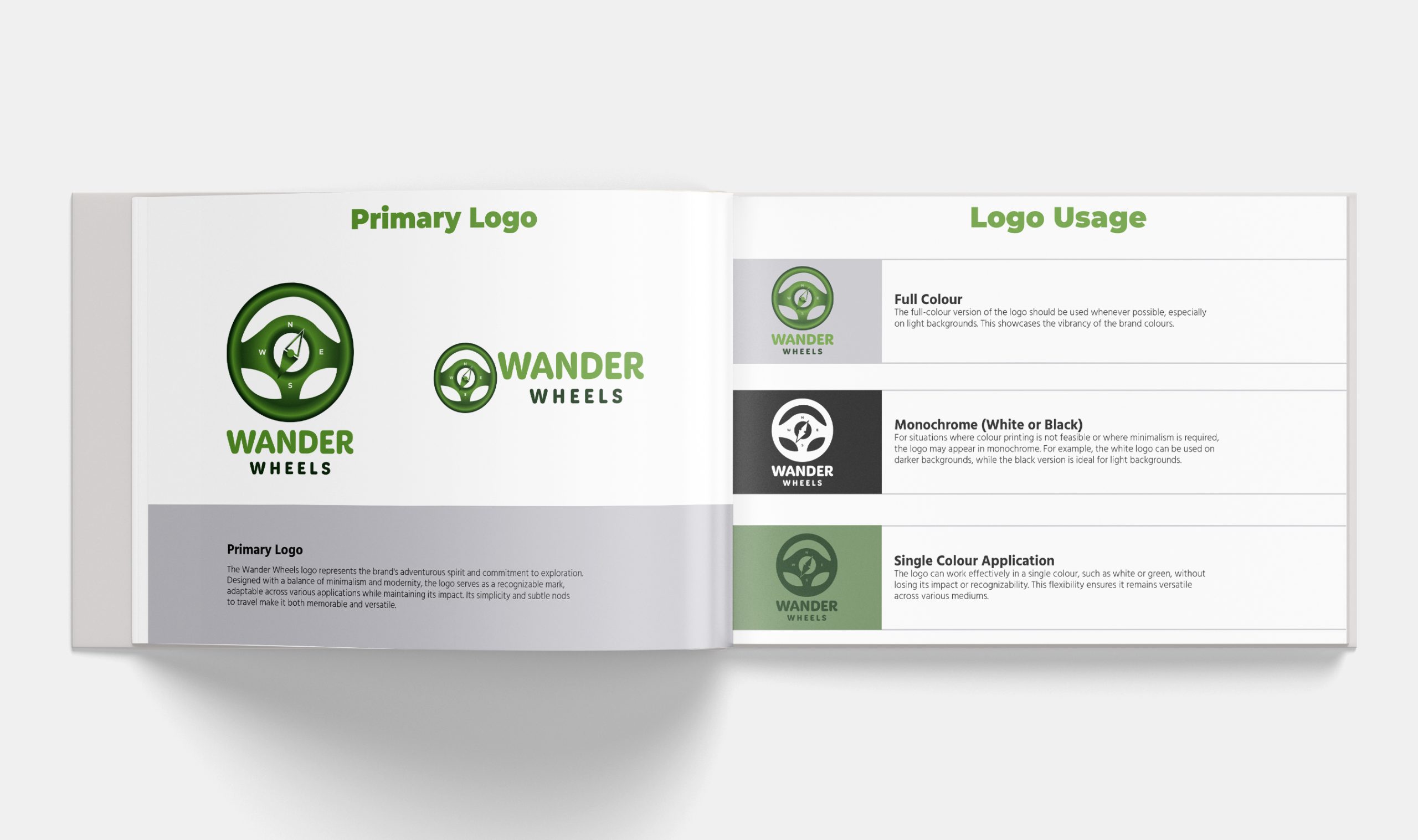
In conclusion, the finalized logo focuses on versatility, enabling it to perform well even in a single colour, such as white or green. By thoughtfully integrating the brand’s initials with subtle, symbolic imagery, the logo achieves visual appeal and conceptual depth, effectively embodying the brand’s identity. This approach ensures the logo’s flexibility across various media, maintaining its recognizability and impact in diverse applications. Ultimately, this design balances simplicity and meaning, making it memorable and timeless.

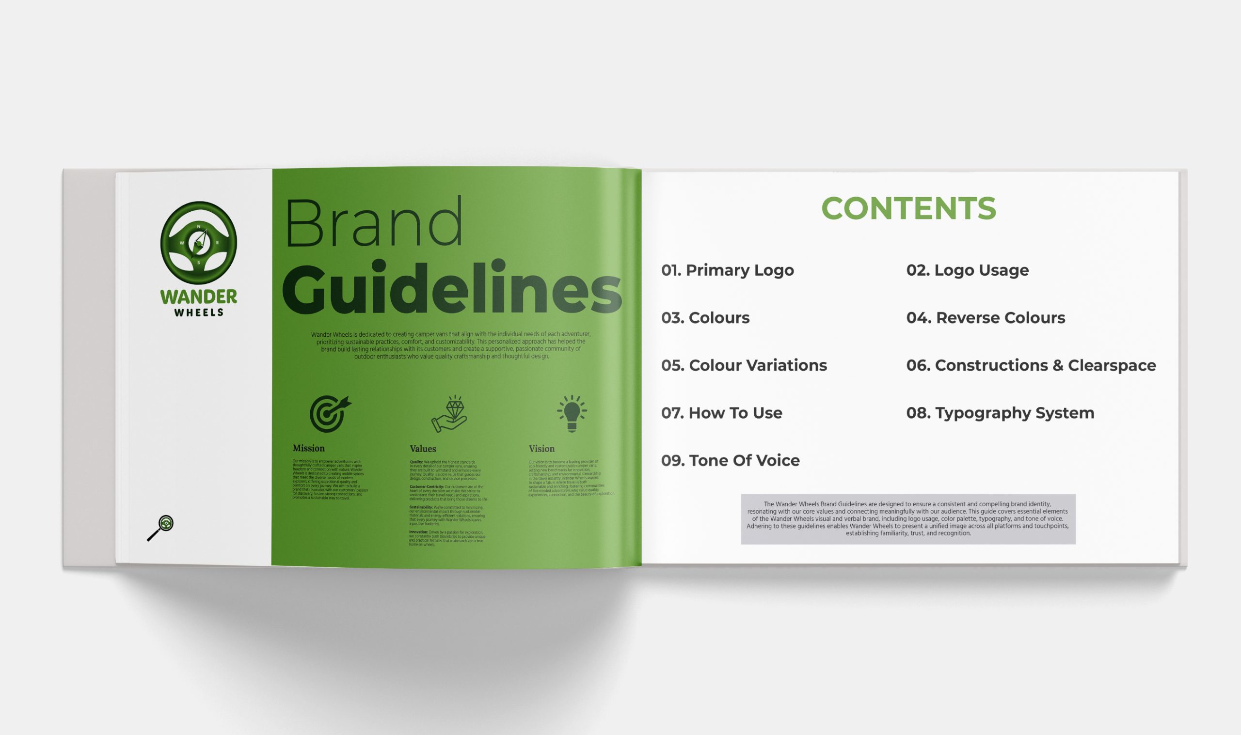
Brand Quick Guidelines

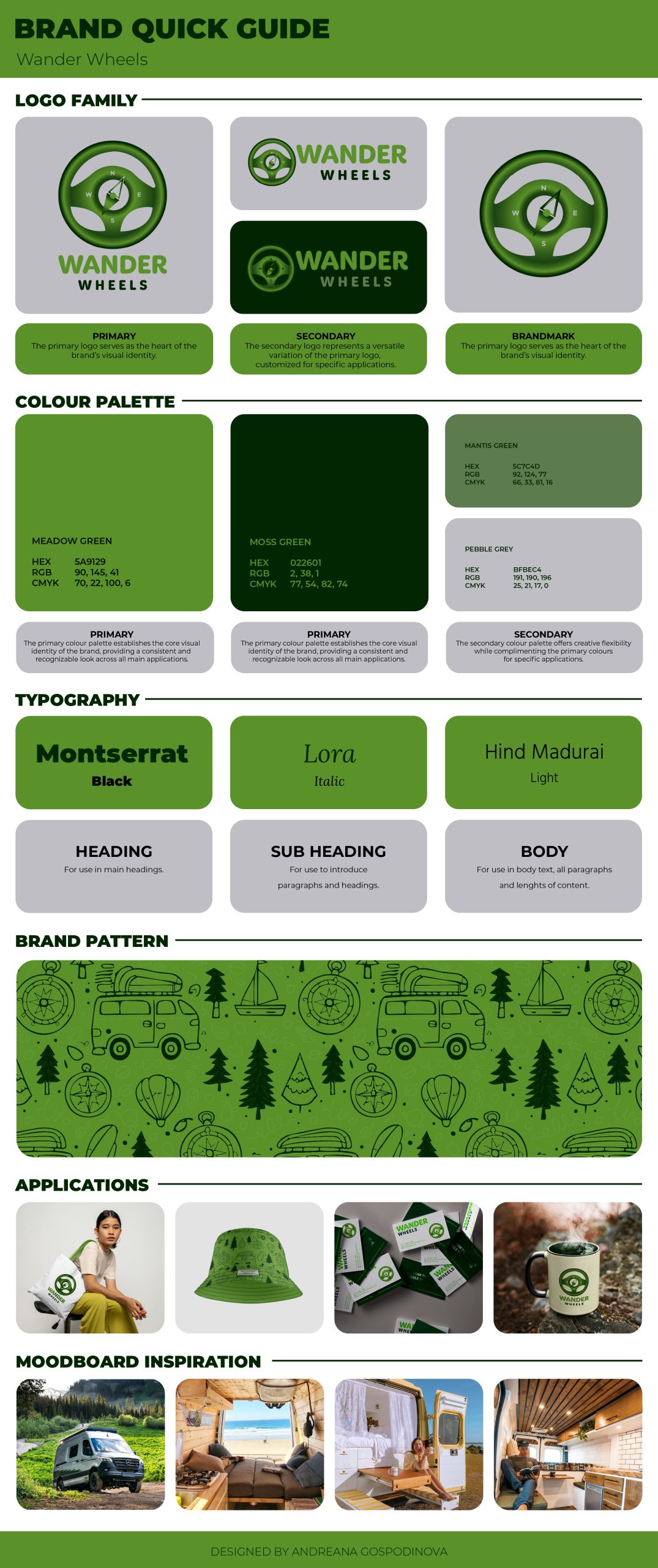
The brand quick guidelines, a comprehensive resource for consistent branding, include several foundational components: logo family, colour palette, typography, brand patterns and assets, applications, and mood board inspiration. These guidelines ensure that each brand element aligns with the visual identity and resonates cohesively across multiple platforms. This structured approach fosters uniformity and enhances brand recognition and trust among target audiences.

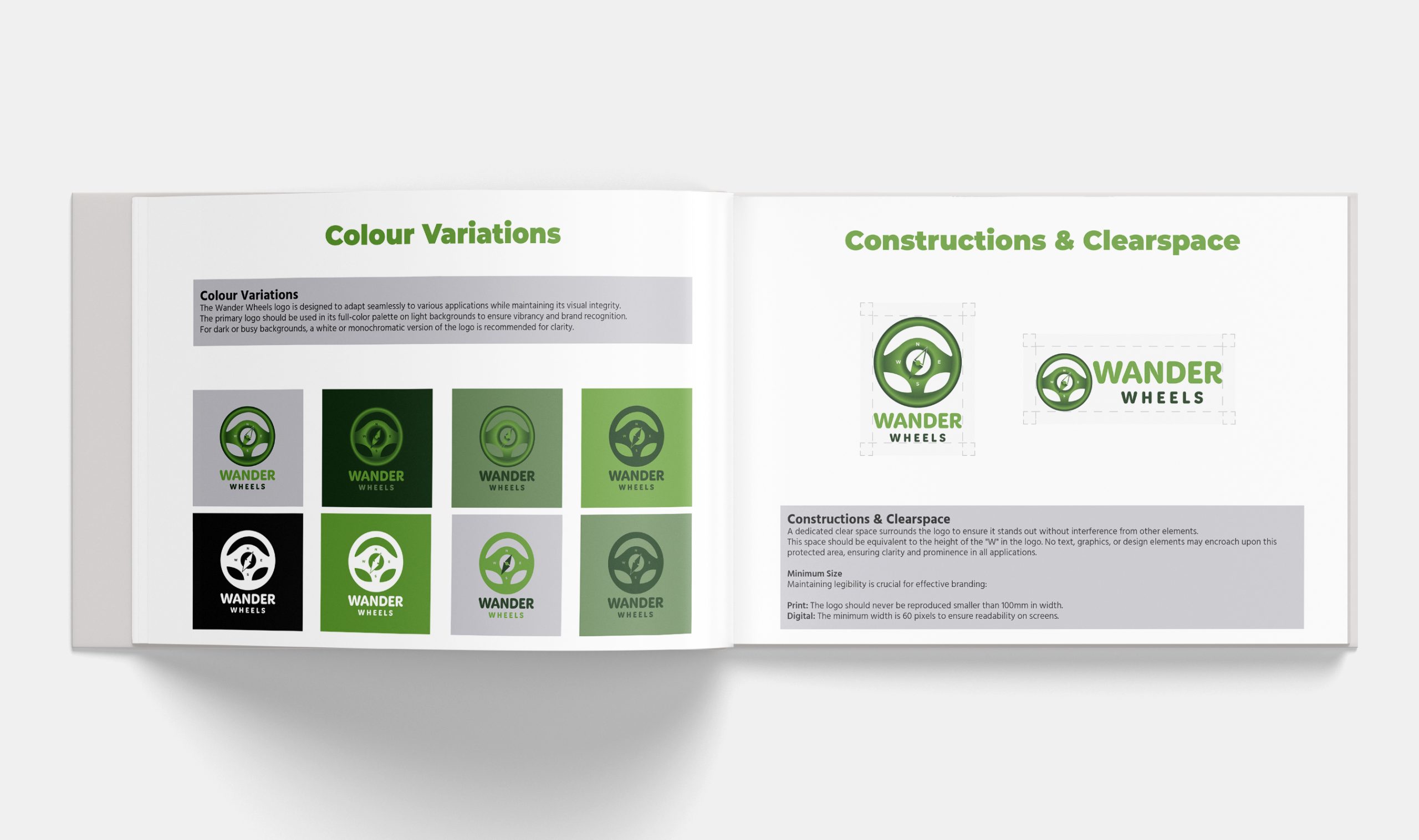
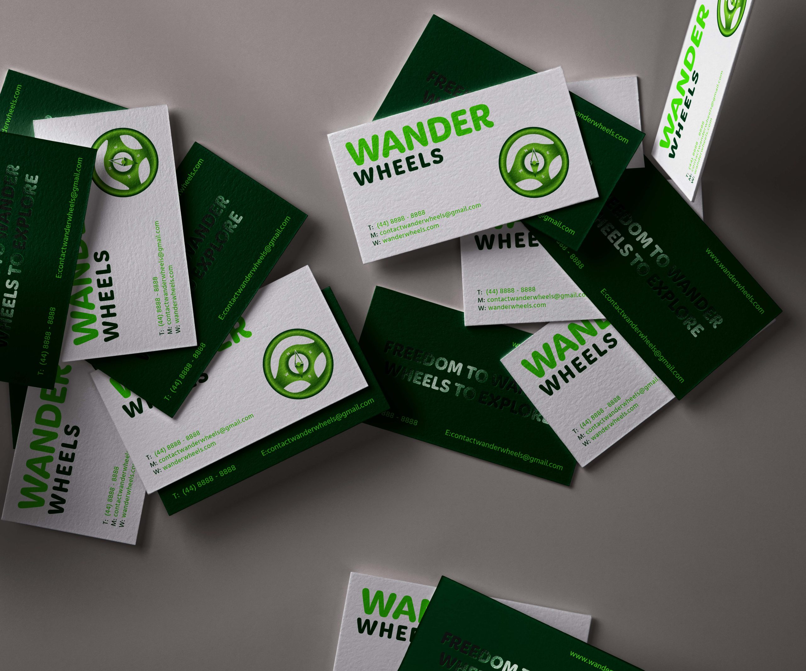
Logo Family: The logo family defines a collection of logo variations tailored to different contexts, such as digital and print applications or horizontal and stacked layouts. By offering a versatile range of options, the logo family ensures that the brand’s identity can be conveyed effectively across diverse media while maintaining visual integrity. Each logo variation is designed with specific application requirements, supporting the brand’s need for adaptability and consistency.

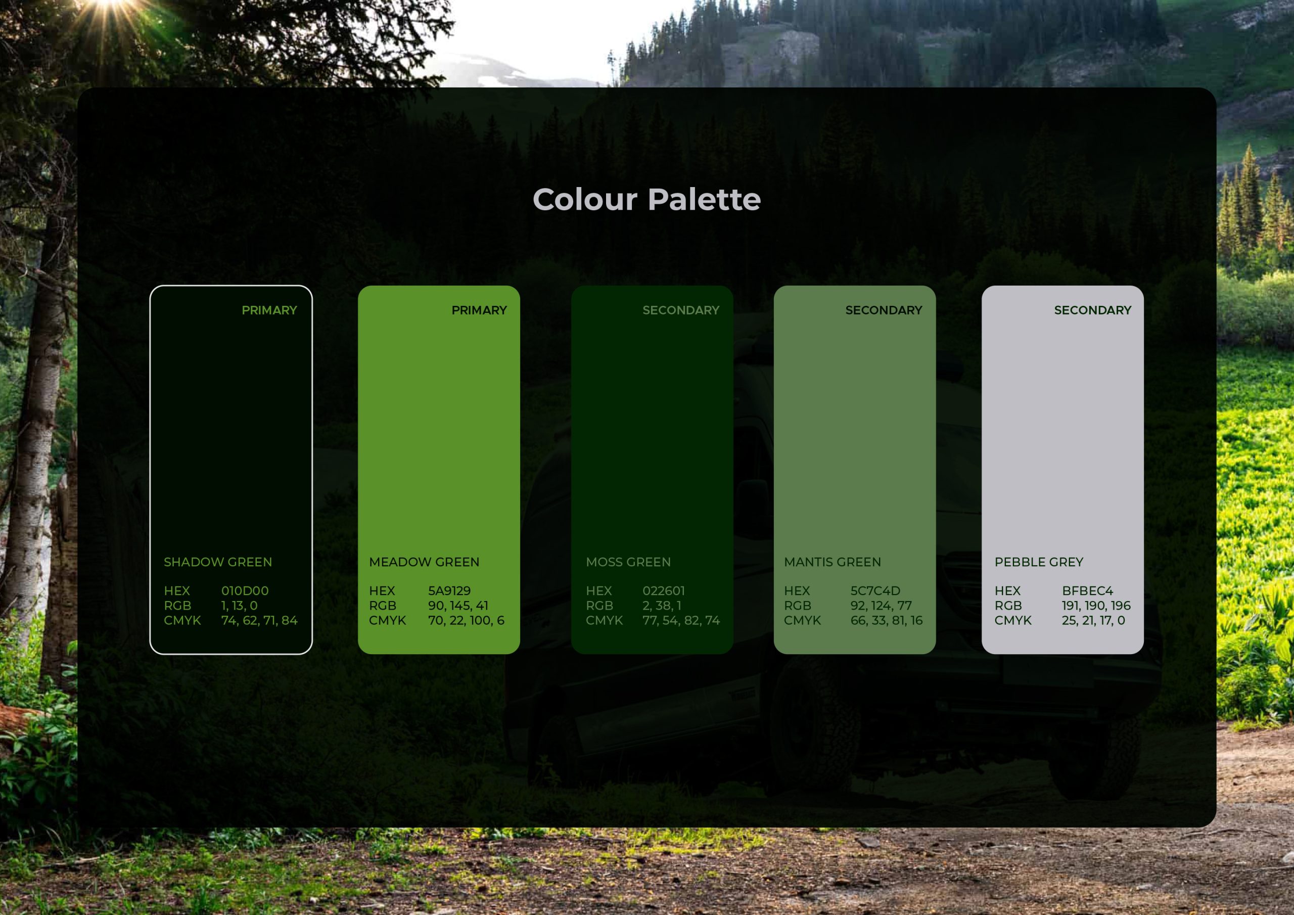
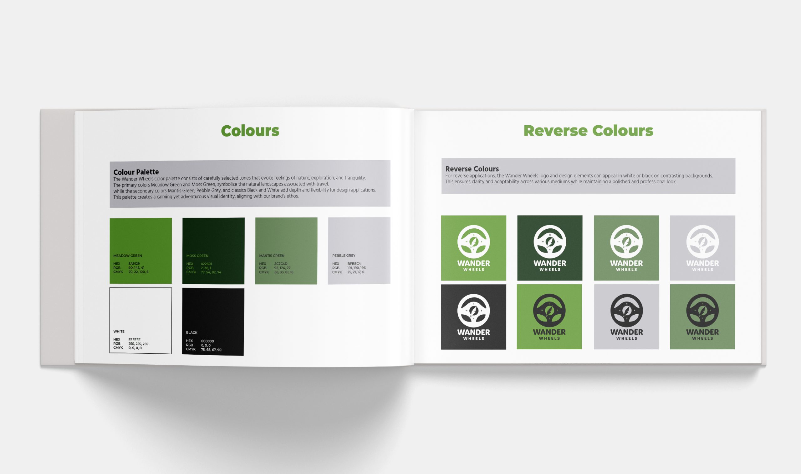
Colour Palette: The colour palette embodies the brand’s aesthetic, using a selection of hues that convey the intended emotional tone. The primary colours, particularly shades of green, such as Meadow Green and Moss Green, are carefully chosen for their capacity to evoke feelings of growth, tranquillity, and environmental awareness, consistent with the brand’s values. Initially, Shadow Green was included as a primary colour, but its visual similarity to black led to its exclusion from the primary palette. Despite this exclusion, Shadow Green remains part of the brand’s visual repertoire, utilized in select instances where a nearly black tone is needed to provide contrast or visual emphasis without overpowering other brand colours.

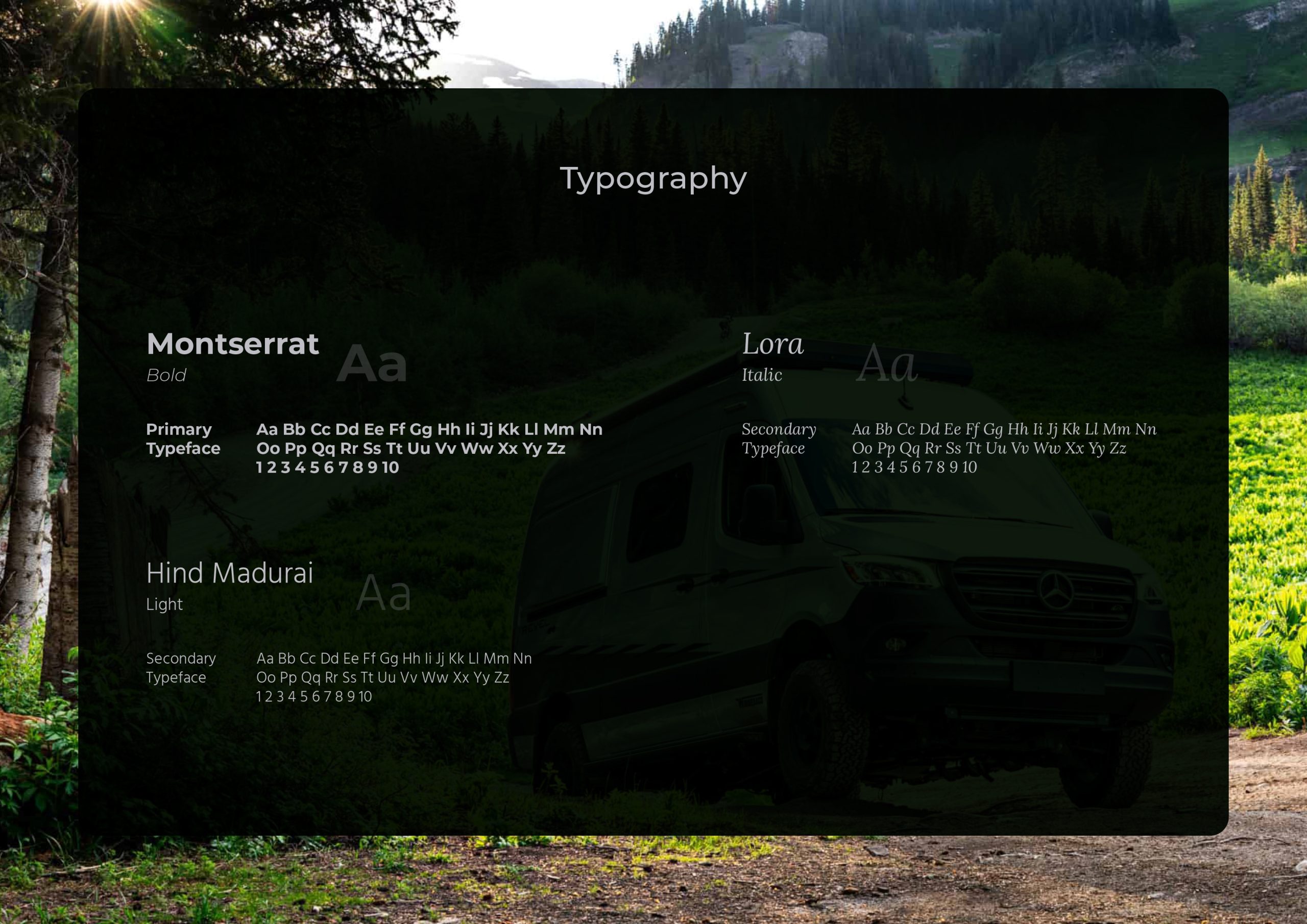
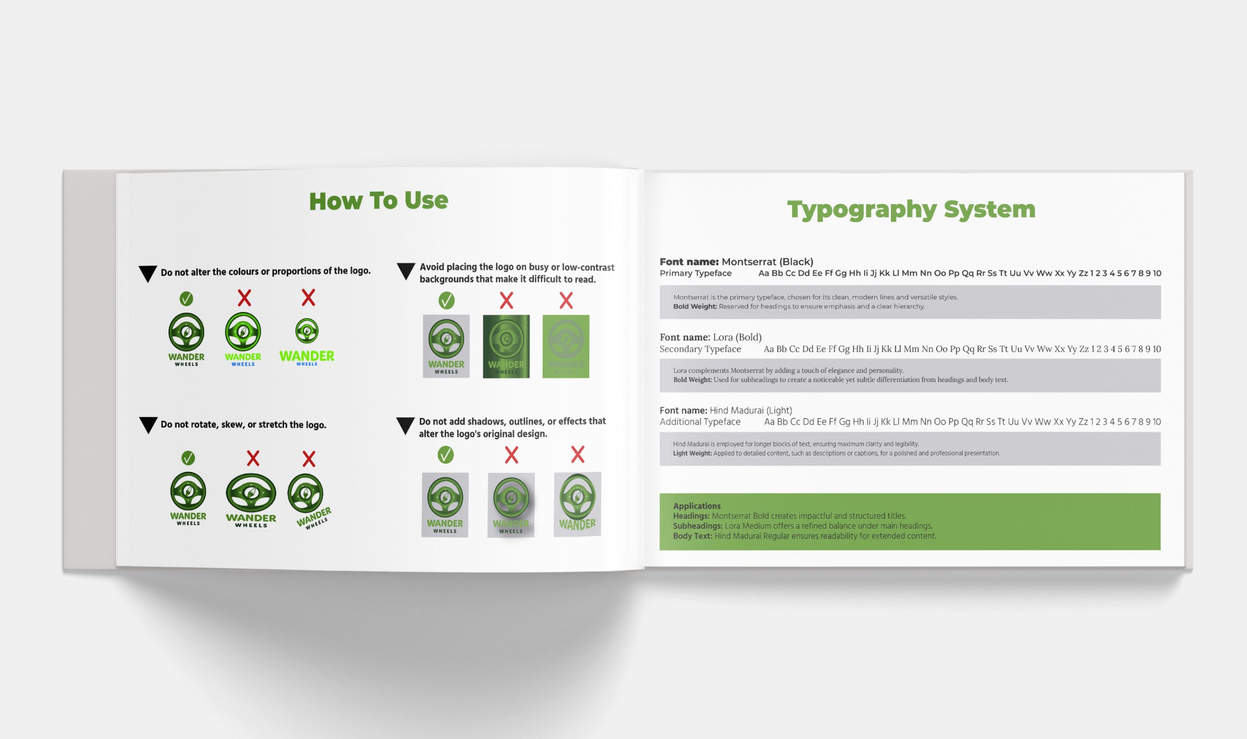
Typography: Typography serves as a visual voice for the brand, conveying its personality through font choices, weights, and styles. The brand guidelines define a primary and secondary font, each chosen for its readability and compatibility with the brand’s tone. For example, a bold primary font may be reserved for headings to establish hierarchy, while a medium or regular weight secondary font provides a harmonious look for body text. The selected fonts align with the brand’s values, aiming to present an approachable yet professional image.

Brand Patterns: Brand patterns extend the brand’s identity beyond logos and typography, enriching its visual language. Patterns inspired by natural forms or geometric shapes can reinforce the brand’s themes, providing cohesion across digital and print materials. These assets include icons, graphics, and backgrounds that add visual depth while adhering to the brand’s colour palette and design principles.

Applications: Clear guidance on brand applications ensures that brand elements are used consistently across various mediums, such as stationery, social media, packaging, and digital interfaces. Each application follows the guidelines for logo usage, colour placement, typography, and pattern integration, creating a seamless experience that strengthens brand recognition.

Mood Board Inspiration: The mood board serves as a visual repository, gathering images and design elements that reflect the brand’s desired aesthetic. This inspiration board acts as a touchstone for the brand’s visual style, providing a cohesive framework that informs the development of all other brand components. The board includes visual references for colour schemes, typography styles, textures, and illustrative elements, offering a unified direction for the brand’s visual identity.

These brand guidelines establish a coherent visual strategy, ensuring each component supports a unified identity. By meticulously defining the roles of each brand element, the guidelines enable the brand to be consistently represented, promoting a strong and recognizable presence that resonates with its intended audience.

Figure 9: This image showcases the concise version of the Wander Wheels brand quick guide. It serves as an at a glance reference for core branding elements, including the logo, primary color palette, and typography, providing a streamlined overview for quick application.

Brand Guidelines

Brand guidelines share similarities with quick style guides but go further by offering in-depth instructions on applying each element of the brand identity and outlining improper usage. These guidelines take inspiration from the practices of well-known brands like Airbnb, ensuring they are clear and user-friendly. Each section is thoughtfully structured to include detailed dos and don’ts, supported by visual examples to clarify the correct application of the brand’s assets.

Brand Applications

With the branding now established, it is crucial to illustrate how it will be implemented across various stationery and promotional materials. This approach ensures a unified and professional representation of the brand. Below is an outline of how key items such as business cards, mugs, hats, and bags will feature the brand identity:

Business Cards:

The business cards will emphasize the company logo as the central visual feature, enhancing brand recall. One side will prominently display the logo, while the reverse will contain essential contact details such as the address, phone number, email, and website. Consistent with the brand’s typography guidelines, the selected fonts will create a cohesive visual identity across all materials.

Mugs, Hats, and Bags:

Each item will incorporate the logo and brand colours to ensure clarity and visibility. The designs will reflect the brand’s aesthetic by balancing simplicity and elegance, creating versatile merchandise that resonates with customers while reinforcing the brand’s image.

By maintaining consistent branding across these items, the company establishes a cohesive and recognizable identity in all interactions. This uniformity not only strengthens brand recognition and trust among stakeholders but also upholds a professional and unified image across all points of engagement.

Time Management Reflection

The branding process for Wander Wheels required more time than initially anticipated, primarily due to the inclusion of additional elements, such as detailed brand guidelines and an extensive style guide, which had not been fully accounted for in the initial project timeline. While these additions enhanced the overall quality and coherence of the brand, they extended the duration of the design process.

This experience highlighted the importance of building flexible project timelines to accommodate unforeseen tasks or adjustments. It also underscored the value of thorough planning and prioritization to ensure that all aspects of the project align with the desired outcomes, even if it means revisiting the schedule to achieve a higher standard of work.

Figure 12: This image showcases my Trello Board and all of the tasks I have completed for this particular post, which keeps me on track with the time management of my major project.

Time Management Reflection

The branding process for Wander Wheels required more time than initially anticipated, primarily due to the inclusion of additional elements, such as detailed brand guidelines and an extensive style guide, which had not been fully accounted for in the initial project timeline. While these additions enhanced the overall quality and coherence of the brand, they extended the duration of the design process.

This experience highlighted the importance of building flexible project timelines to accommodate unforeseen tasks or adjustments. It also underscored the value of thorough planning and prioritization to ensure that all aspects of the project align with the desired outcomes, even if it means revisiting the schedule to achieve a higher standard of work.

Reference List:

Guidelines research & inspiration:

Airbnb (n.d.). Airbnb Style guide. Brand Assets. [Blog]. Available at: Airbnb Style Guide – Branding Guid [Accessed 11 Nov. 2024].

Airbnb (n.d.). Trademark Guidelines. Airbnb’s Trademarks. [Blog]. Available at: Trademark Guidelines – Airbnb Help Centre [Accessed 11 Nov. 2024].

Ajab Samrai (2023). Exploring the Art of Typography in Marketing: Choosing the Right Fonts for Maximum Impact. [online] Medium. Available at: https://ajabsamrai.medium.com/exploring-the-art-of-typography-in-marketing-choosing-the-right-fonts-for-maximum-impact-740f3367e13f [Accessed 10 Dec. 2024].

Bicaku, E. (2024). 28 Brand Guidelines Examples to Inspire Your Brand Guide. [Blog]. Available at: 28 Brand Guidelines Examples to Inspire Your Brand Guide | Looka [Accessed 15 Nov. 2024].

Hardy, T. (2020). How to Create Brand Guidelines: A Step-by-Step Guide. [Blog]. Available at: How to Create Brand Guidelines: A Step-by-Step Guide [Accessed 1 Nov. 2024].

Manusama, S. (2024). 30 Best Brand Guideline Examples to Inspire You. Available at: 30 Best Brand Guideline Examples to Inspire You | VistaPrint US [Accessed 15 Nov. 2024].

Msu.edu. (2024). Typography | MSU Brand Studio | Michigan State University. [online] Available at: https://brand.msu.edu/visual/typography [Accessed 10 Dec. 2024].

Images:

Andersen, H. (2021). Dolce Sole Camper – Queensland. [Image]. Available at: 10 Most Unique Places to Stay in Australia — Haylsa [Accessed 15 Nov. 2024].

Holcombe, P. (2024). Winnebago flexes its RV industry experience in its Revel 4×4. Available at: Why the Toyota Tacoma Trailhunter Should Be Your Next Overlanding Rig [Accessed 10 Oct. 2024].

Two Dogs And A Van (2020). 20 Campervan Interior Inspirations For Your Next Conversion. [Image] Available at: 20 Campervan Interior Inspirations For Your Next Conversion [Accessed 17 Nov. 2024]. 

Vanny, M. (2018). Converted 2016 144 High Roof Mercedes Sprinter Interior. [Image]. Available at: Manny’s Vanny™ (@mannysvanny) • Instagram photos and videos [Accessed 2 Oct. 2024].

Mock-ups:

Design, M. (n.d.). Free landscape book mockup. Available at: Free landscape book mockup – Mockups Design [Accessed 14 Nov. 2024].

Mockups, G. (n.d.). Free Bucket Hat Mockup PSD Set. Available at: Free Bucket Hat Mockup PSD Set – Good Mockups [Accessed 13 Nov. 2024].

Mockups, G. (n.d.). Free Female Carrying Shoulder Canvas Tote Bag Mockup PSD. Available at: Free Female Carrying Shoulder Canvas Tote Bag Mockup PSD – Good Mockups [Accessed 13 Nov. 2024].

Mockups, G. (n.d.). Free Overlapped Foil Business Cards Mockup PSD. Available at: Free Overlapped Foil Business Cards Mockup PSD – Good Mockups [Accessed 13 Nov. 2024].

Mockups, G. (n.d.). Free Vintage Coffee Mug Mockup PSD. Available at: Free Vintage Coffee Mug Mockup PSD – Good Mockups [Accessed 13 Nov. 2024].

‌Typography:

Cyreal (n.d.). Lora Font. [online] Google Fonts. Available at: Lora – Google Fonts [Accessed 14 Oct. 2024].

Foundry, I.T. (n.d.). Hind Madurai Font. [online] Google Fonts. Available at: Hind Madurai – Google Fonts [Accessed 14 Oct. 2024].

Ulanovsky, J., Matas, S., Peral, J.P. del and Bailly, J.L. (n.d.). Montserrat Font. [online] Google Fonts. Available at: Montserrat – Google Fonts [Accessed 14 Nov. 2024].