Early Designs and Sketches: Visualizing the Future Camper Van Experience
Initial Design Concepts
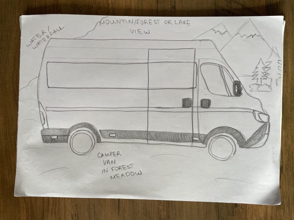
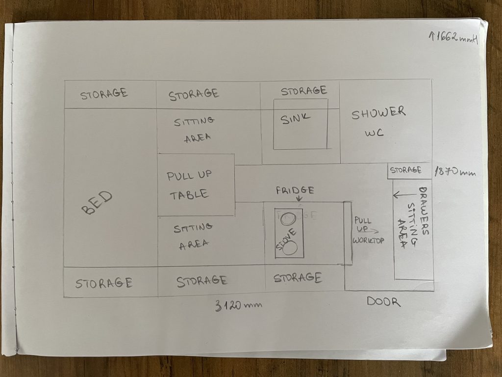
The initial design phase of my immersive camper van project has involved crafting early visual elements that establish a cohesive look and feel for the user experience. These initial concepts include thumbnail sketches, low-fidelity wireframes, a preliminary 3D model sketch, potential interior layouts, a conceptual logo, as well as the colour palette and typography for brand identity. The purpose of these early designs is to provide a visual foundation and framework to guide the entire project’s development, ensuring consistency and clarity in the design process. To enhance efficiency, I have kept the visual details minimalistic to allow for flexible adjustments in later stages. My primary focus has been on designing the exterior customization options of the van and refining the interior layout based on feedback, rather than constructing a full environment or a comprehensive 360-degree tour, which could present challenges in managing time effectively.
Visual Inspiration
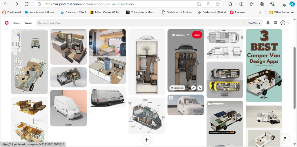
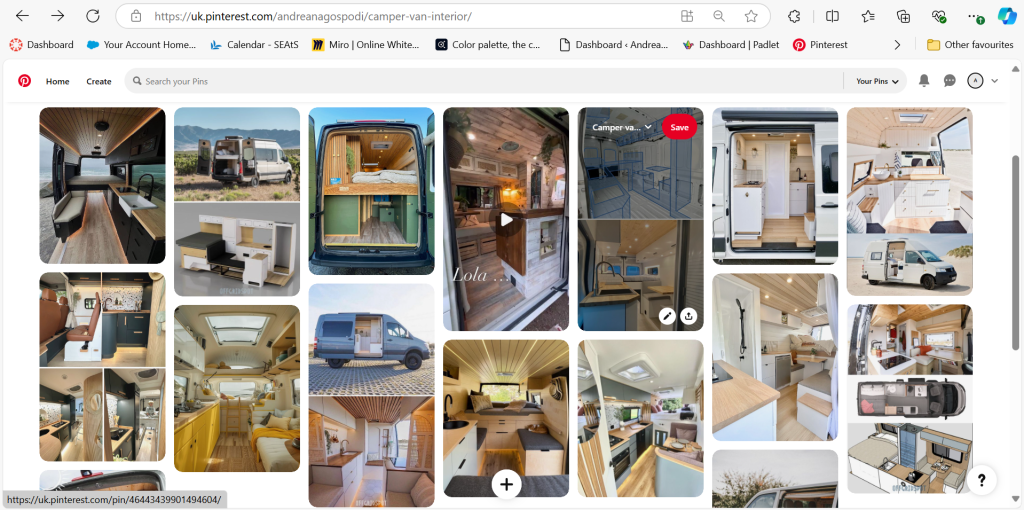
To refine the design approach, I have gathered a wealth of visual inspiration from various Pinterest boards, which serve as a source of ideas for the 3D models and camper van interiors. These boards feature an array of design layouts and functional features, spanning from sleek, minimalist interiors to cosy, multifunctional living spaces. The curated images offer a diverse perspective on camper van aesthetics, which I aim to incorporate into my own designs. You can view these Pinterest boards here:
Leveraging this visual inspiration has enabled me to craft a design that aligns with real-world trends, ultimately enriching the immersive experience for future users of the app. By integrating these curated visuals into my design process, I can create a virtual camper van experience that is both modern and appealing, enhancing user engagement and satisfaction.
Visual Examples
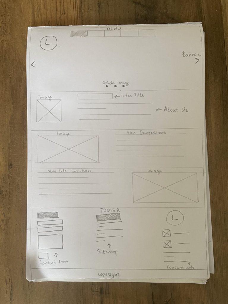
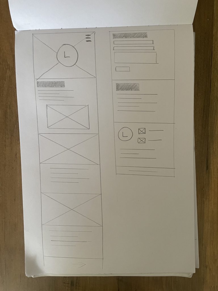
Presented below are a series of screenshots illustrating the early-stage designs, including preliminary 3D models, the camper van’s interior and low-fidelity wireframes of the app interface.
The low-fidelity wireframes for the project’s website/app provide a foundational layout and structure. Key elements such as the menu, banner, images, text sections, and footer are arranged in a simple format to prioritize the spatial organization and user flow rather than focusing on intricate design details at this stage. These wireframes serve as an essential tool to guide the development process, offering a visual reference that aids both myself and potential developers in understanding how each component integrates within the overall design.
Furthermore, these wireframes are instrumental in collecting early feedback, facilitating adjustments before moving toward higher-fidelity versions. Their simplicity allows for quick modifications, ensuring efficient progress without over-investment in unnecessary details.
Overall, these wireframes provide a structured starting point that keeps the focus on optimizing the user experience, ensuring that the design aligns with the project’s objectives from the outset.
Colour Psychology in Web Design
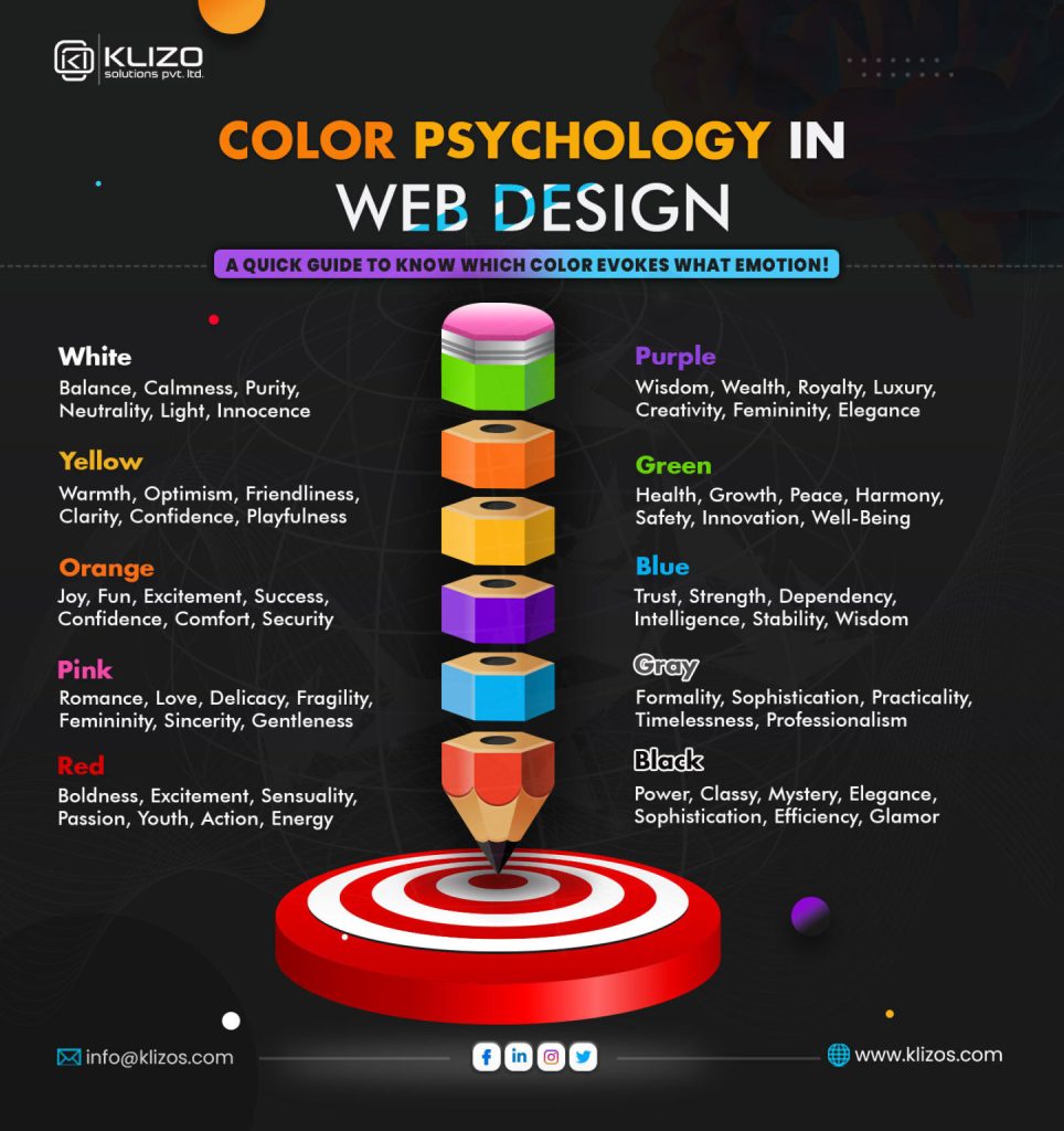
In web design, colour psychology plays a pivotal role in influencing user perception, engagement, and behaviour. Each colour choice can evoke specific emotions and attitudes, significantly impacting how users interact with a website and its brand. Colour psychology in design involves understanding the psychological responses that different colours trigger and applying this knowledge to create a more engaging and persuasive user experience.
For instance, selecting the right colours can not only enhance aesthetic appeal but also improve conversion rates and strengthen customer loyalty. Research indicates that certain colours are more effective in evoking desired emotional responses within specific industries. For example, blue, often associated with trust and professionalism, is commonly used in financial services, while green—symbolic of health and growth—frequently appears in environmental or wellness-focused websites.
Men and women may display differing colour preferences, as do various demographic groups, making targeted colour choices crucial for audience-specific engagement. Selecting a colour palette that aligns with the brand’s message and appeals to the target audience strengthens the overall brand experience, supporting both engagement and long-term loyalty. Thus, understanding the principles of colour psychology enables designers to make informed, strategic choices, crafting visually cohesive websites that resonate with users on an emotional level and effectively convey the intended message.
Example from the Industry
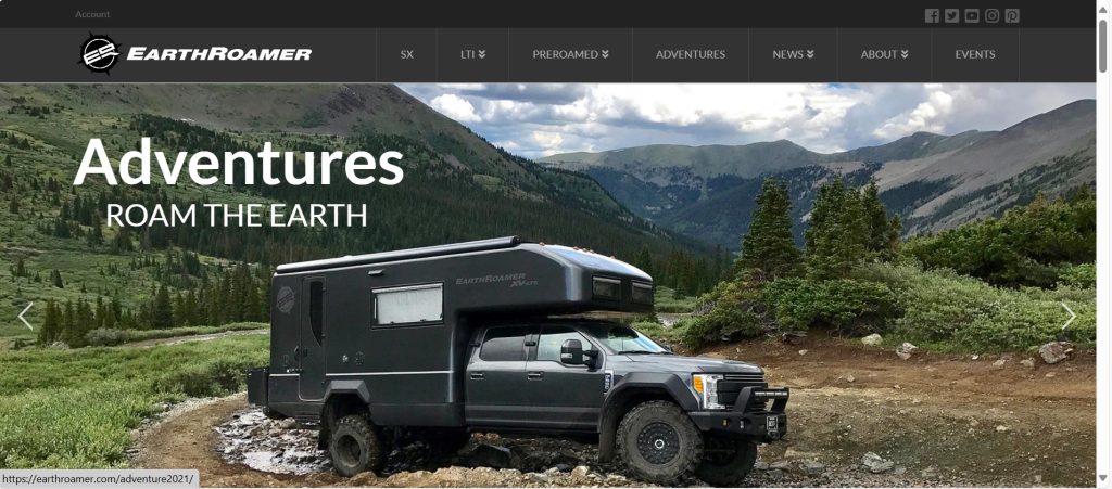
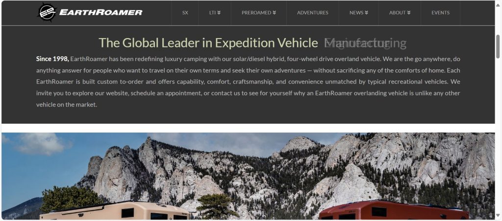
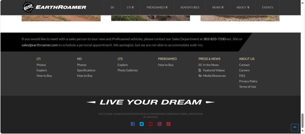
A compelling illustration of effective colour palette usage is found on the EarthRoamer website, a prominent brand specializing in off-road luxury vehicles. EarthRoamer employs a sophisticated combination of dark grey tones and white, accented with very light green and brown. This design strategy effectively captures the ruggedness and adventurous spirit of their products while maintaining a visually clean and immersive interface. By prioritizing large imagery and minimizing text, EarthRoamer creates an engaging and easy-to-navigate platform—principles that will similarly inform the design of my immersive camper van project.
Beyond EarthRoamer, numerous brands targeting nomadic adventure travellers utilize carefully crafted colour palettes to enhance user experience and foster a connection to the outdoors. Noteworthy examples include:
Airstream
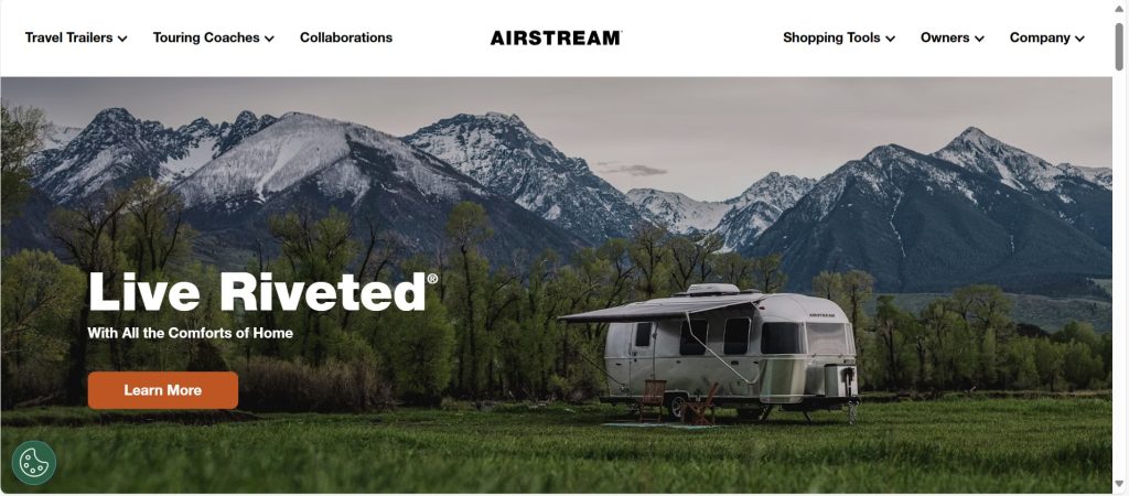
Airstream, a well-established name in the camper van and RV industry, employs a calming, nature-inspired colour palette that harmonizes with their iconic silver trailers. The primary colours consist of:
- Silver and Gray: These neutral tones resonate with the brand’s classic aluminium exterior, evoking a sense of timelessness and durability.
- Forest Green and Sky Blue: These earthy tones create an inviting atmosphere that underscores the brand’s association with nature and adventure.
- Sunset Orange Accents: Airstream judiciously incorporates bright accent colours to direct users toward key actions, such as exploring travel trailers or touring coaches. The vibrant pop of orange infuses a sense of urgency and excitement.
Vanlife Customs
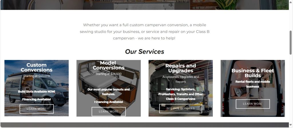
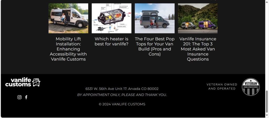
Vanlife Customs, a camper van conversion company, features a natural colour palette on their website:
- Primary Colours: Black and white establish a strong, clean foundation.
- Secondary Colours: Grey and silver enhance the modern, sophisticated aesthetic.
GoCamp
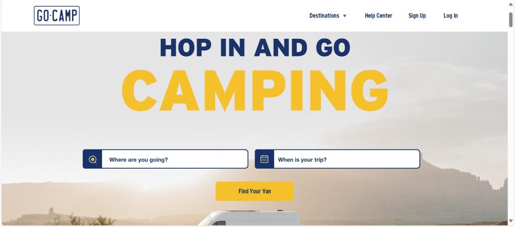
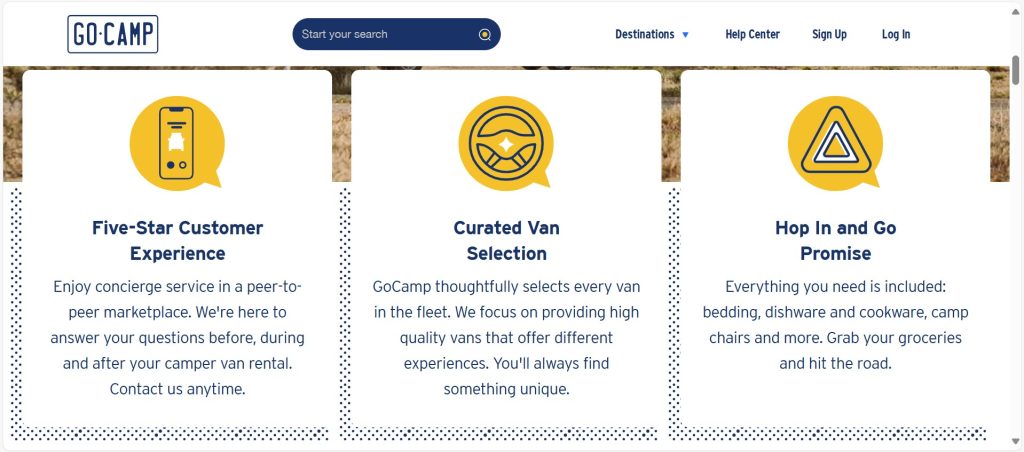
GoCamp, a peer-to-peer camper van rental platform, utilizes a playful yet earthy colour palette to engage users:
- Primary Colours: Blue and grey create a calming and trustworthy environment.
- Secondary Colours: Yellow and teal are employed to add a lively touch, making the interface inviting and dynamic.
These examples underscore the critical role that colour plays in conveying brand identity and enhancing user experience within the outdoor and adventure travel industries. By thoughtfully selecting and applying colour palettes, these brands successfully evoke emotional connections with their audiences while facilitating intuitive navigation and interaction.
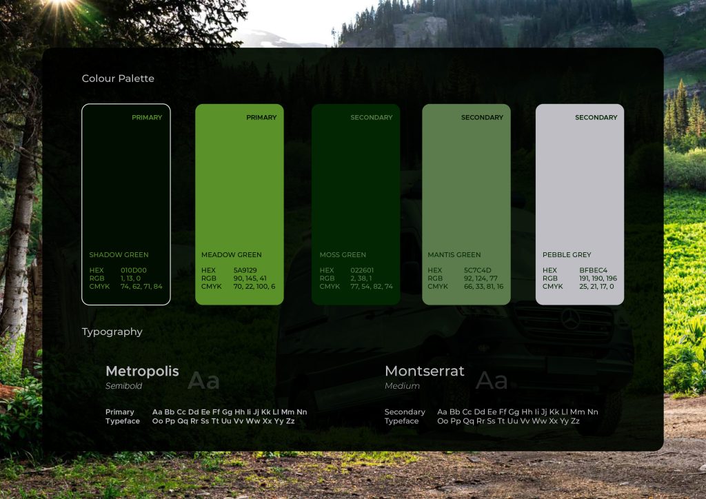
Colour Palette Selection for my immersive Camper Van experience
In designing an augmented reality (AR) experience tailored to the camper van industry, the colour palette is integral in conveying both functionality and the adventurous, nature-oriented lifestyle of camper van enthusiasts. Carefully chosen colours not only establish the aesthetic but also support user-friendly navigation, ensuring the interface is visually engaging and intuitively accessible.
Primary Colours
The primary colour scheme incorporates earth tones, selected to resonate deeply with the outdoor ethos central to the camper van community. These colours include:
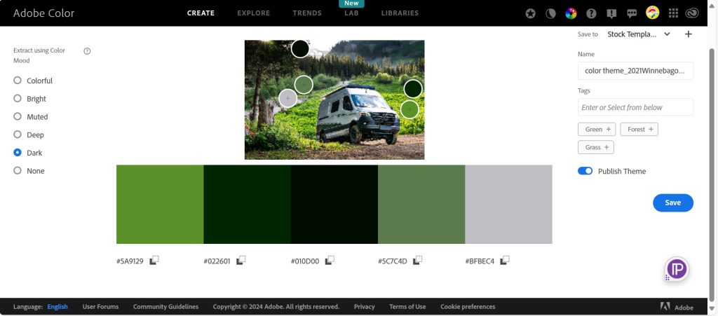
- Shadow Green: Symbolizing natural landscapes, Shadow Green connects users to the earthy, adventurous spirit associated with camper van travel.
- Meadow Green: Adding a vibrant yet calming touch, Meadow Green reflects lush outdoor environments and enhances users’ visual and emotional experience within the app.
These colours foster an emotional connection between users and the AR environment, promoting a feeling of immersion in natural surroundings while exploring camper van features.
Secondary Colours
Secondary colours are employed sparingly to maintain emphasis on essential interactive elements and calls to action within the AR app. The secondary palette includes:
- Moss Green
- Mantis Green
- Pebble Grey
- White
These accent colours are strategically chosen to balance the interface with neutrals and subtle contrasts, ensuring that interactive elements are easily distinguishable without overwhelming the primary earthy theme.
Refining the Colour Scheme
The colour scheme was inspired by an image I found online, which I then imported into Adobe Colour to capture the visual atmosphere I envisioned. Starting from this reference, I refined the palette to enhance clarity and visual appeal, selecting shades that provide contrast while aligning with the core design theme. This refinement process was essential in achieving a balanced, cohesive look that supports a user-friendly interface, enhancing interactivity through color-coded guidance. The interplay between neutrals and vibrant colours guides users intuitively, drawing attention to key interactive points within the AR experience.
Typography Selection
The typography choices for this AR experience were guided by principles of readability, modern aesthetic, and alignment with the adventure-centric, accessible branding of the camper van industry. The primary typeface, Metropolis Semibold, is characterized by clean lines and a balanced weight, lending an air of contemporary elegance suitable for prominent headings and titles. Its semi-bold weight offers visual clarity and immediacy, ensuring that key information is easily identifiable and enhancing the overall user interface.
For secondary text, Montserrat Medium was selected to complement Metropolis with its versatile, rounded forms and accessible design. Montserrat is particularly effective for body text, as its medium weight maintains readability across varying screen sizes and viewing conditions common in mobile and AR applications. The harmonious pairing of Metropolis and Montserrat facilitates a visually cohesive experience, guiding users through the interface without sacrificing functionality for style. This combination ensures that users remain engaged with content, enhancing navigability and interaction throughout the AR environment.
Logo concept development
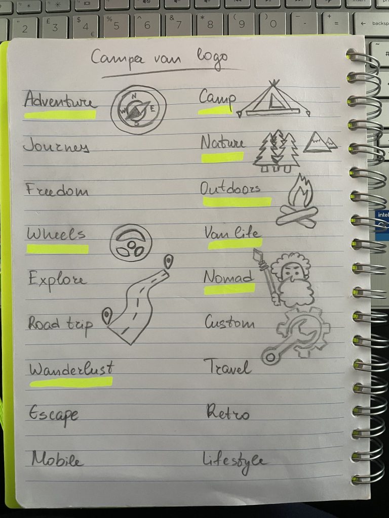
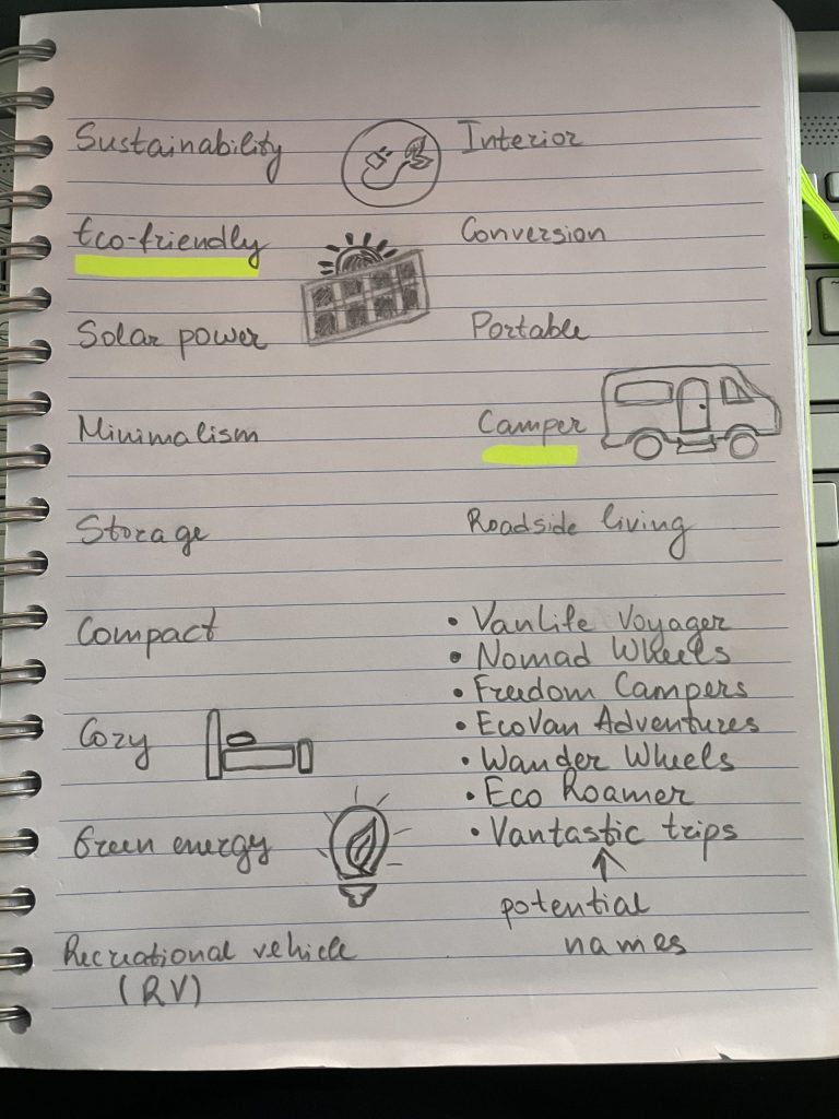
To develop a compelling brand identity for my camper van AR project, I began with a brainstorming session, listing words that instinctively resonated with the camper van lifestyle. This ideation process allowed me to tap into the core themes associated with camper vans—mobility, freedom, exploration, and nature. By writing these words on paper, I could visually assess their relevance and potential synergy with my project’s objectives.
Following this, I started sketching small icons that embodied these keywords, aiming to visualize abstract concepts in a way that could eventually translate into a logo. This step helped me connect with each word’s visual symbolism and begin the design process organically. I then selected the most relevant words, prioritizing those that captured the essence of a camper van adventure experience. From this refined list, I began contemplating possible brand names.
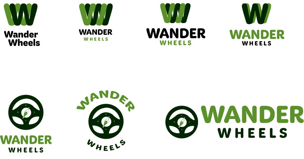
After evaluating several options and receiving feedback, I ultimately chose the name “Wander Wheels.” This choice was informed by its alliteration, which lends it a memorable and rhythmic quality, and its potential for strong visual branding. Specifically, the name “Wander” suggests exploration and discovery, while “Wheels” ties directly to the camper van and the freedom it represents. I then conceptualized a logo that incorporated a wheel and a compass, integrating elements that symbolize both movement and direction, enhancing the brand’s identity.
The simplicity and effectiveness of “Wander Wheels” make it an ideal name; it encapsulates the spirit of travel and adventure that appeals to my target audience while providing a strong foundation for visual branding.
During the logo design process, I conducted thorough experimentation by placing the conceptual logo on various background colours within my chosen palette. The goal was to identify which combinations would allow the logo to stand out clearly and maintain visual appeal across different contexts. My primary colours, shadow green (a dark, deep green) and meadow green (a lighter, vibrant green), served as the foundational shades for the logo itself. The secondary colours—moss green, mantis green, and pebble grey—were used primarily as background options to test for contrast and balance.
Through multiple iterations, I found that backgrounds in pebble grey and mantis green allowed the logo to “pop” most effectively. When paired with meadow or moss green for the logo, these backgrounds achieved an optimal contrast that enhanced readability while aligning with the brand’s earthy and natural feel. Pebble grey offered a clean, neutral base that kept the design minimalistic, while mantis green added a subtle vibrancy without overwhelming the primary logo colours.
Conclusion
In conclusion, using pebble grey or mantis green as background colours with meadow and moss green for the logo yields the best visual impact. This combination strikes a harmonious balance that allows the logo to stand out while reflecting the brand’s emphasis on nature and the outdoors. These findings will guide the visual identity for the project, ensuring a cohesive and visually appealing brand presentation across digital platforms.
Reference list:
Airstream (2024) [Website]. Available online at: Airstream.com | Iconic Aluminum Travel Trailers & Quality Class B RVs [Accessed 15 Oct 2024].
CVC Direct (2014) NEW PEUGEOT BOXER VAN [Photograph]. NEW PEUGEOT BOXER VAN – CVC Direct Business and Personal Car Leasing, Belfast, Northern Ireland [Accessed 08 Oct 2024].
GoCamp (2024) [Website]. Available online at: GoCamp | Campervan & RV Rentals for your Next Road Trip [Accessed 15 Oct 2024].
Ricard, J. (2022) Guide 101: Color Psychology In Website Design [Blog Post]. Klizo Solutions. 1 March. Guide 101: Color Psychology In Website Design – Klizos | Web, Mobile & SaaS Development Software Company [Accessed 29 Oct 2024].
Ronnie, J. (2024) 10 Best 4×4 Camper Vans Autowise. [Photograph]. autowise.com. Available online at: 2024 Volvo Camper Van – Jobi Ronnie [Accessed 29 Oct 2024].
Vanlife Customs (2024) [Website]. Available online at: Models — Custom Van Builder | Vanlife Customs [Accessed 15 Oct 2024].
Pinterest boards:
The links included on these Pinterest Boards were added for reference only, and no content from them was directly used in my work.
