Typography
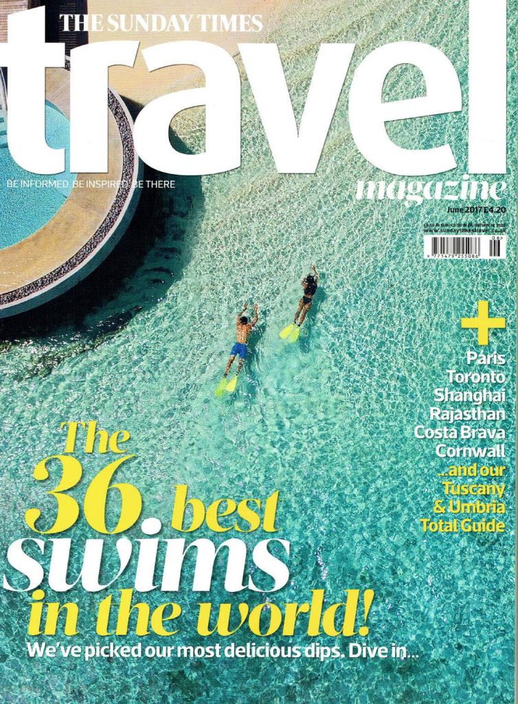
Good Example of the effective use of typography in online Editorial Design
People typically respond to visual culture in an emotional way, so designers allow themselves to manipulate the reactions of their viewers or readers by making informed choices about design features such as colours and fonts. The application of fonts in marketing is becoming an extremely important area in branding and advertising nowadays.
Here we see the combination of several fonts, such as serifs, and sans serifs.
Serifs fonts inspire us with confidence, and stability, they are traditional, intellectual, and formal. We’re usually used to seeing serif fonts as symbols of heritage (on historical artifacts), intellect (in books and academic papers), and formality (on fancy, high-end restaurant menus). From here it is implied and suggested that the destinations offered will be very expensive and luxurious.
The psychological associations we make with sans-serif fonts are friendly, open, and informal. They are progressive and emotional and popular as cool fonts for posters and advertisements. They make you feel welcome and comfortable.
There is a clear distinction between the headings and body text. They have picked three different typefaces that set each off, don’t fight the eye for attention, and harmonize without becoming homogenous and dull. The text contrasts enough with the background but doesn’t conflict and grabs the attention of the reader with its noticeably bold and larger size. The viewer knows where to look on each layout to find the descriptive copy and image captions.
The colours of the font are well combined and optimize the legibility of the advertisement.
There is enough white space to help focus attention on the text, and also give the viewer some breathing room.
Ampersandtravel (2017 Jun), The Sunday Times Travel Magazine. Available online: https://www.ampersandtravel.com/media/837556/the-sunday-times-travel-magazine-june-2017.pd
Wikipedia (n.d.) Available online: Typography – Wikipedia
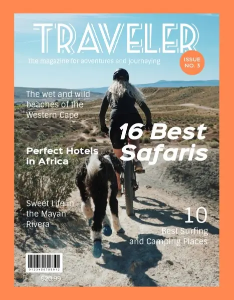
Poor example of use of typography in online Editorial Design
In the first image from left to right we see a poor example of the use of typography in online Editorial Design. It looks disorganized, the text is illegible and blends into the background image. The letters in the title are very close together and the subtitle is not positioned well and blends into the landscape. The colour orange does not look good for a background.
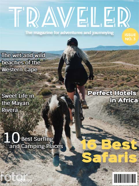
I started with the title by increasing the spacing between the letters to make it more legible and stand out. This generally creates a pleasing effect and gives your brain enough room to make out each letter. I moved the issue number to the right because it was on the title. I also changed its colour to yellow because I associate it with heat and desert safari.
The subtitle was placed too far to the left, so I aligned it and positioned it in the middle. I put shading to make it readable and not merge with the image.
I decided to change the position of the rest of the text to make it more organized and have more white space, also to not strain the reader’s eyes and lose interest. I put strokes on the text so that it doesn’t merge with the background. I changed the italic bold font to normal and changed its colour for the same reason I described above. Moved the bold shift to the lower right edge, because in the middle it disrupts the flow of the text. In this way, I also think that the attention of the reader is directed to what is important that he can discover if he buys the magazine.
Fotor (2021, Feb), Travel Magazine Cover Maker. Available online: traveler magazine fotor – Bing