Conceptual Design
A good example of Conceptual Design
Generating the same kind of cinematic excitement as the thunderous 20th Century Fox intro the Marvel Studios logo design has been a staple of the publisher’s comic book films since 2002. The format of the logo design has remained largely unchanged over the years. But the newest version breaks from tradition by including some of Marvel’s iconic superheroes that have graced the big screen recently.
The new Marvel Studios logo animation begins similar to the historic “flipping pages’ logo, honouring the studio’s history. In the animation of the logo, we see different scenes that are taken directly from the scripts of various Marvel movies. The team at Perception has selected the most fan-favourite quotes and lines that have helped establish the scope of the Marvel Universe. Also, they have gathered a vast archive of concept art and books to select the most iconic images for each beloved character, animating each image being drawn from scratch.
A key turning point in this logo animation is the link between concept and film. The perception team proceeds towards several different approaches, techniques, and characters to show these concepts coming to life in the movies.
In the process of creating the logo, the Perception team wanted to include all the emblematic moments and well-known characters that are adored by the viewers. So, they reviewed 13 films at the time of creation to carefully choose how to choreograph and compose the shots.
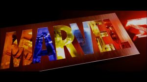
According to Perception (2016), “Altogether, there could be over 70 pieces footage that can be seen in the final logo. Editing, colour balancing, and getting clearances on everyone is no small feat. The creative team also explored numerous ways of arranging the footage within the form of the overall logo, ultimately leading to the “vault” where luminescent footage plays on the interior walls of the “MARVEL” logotype.”
Perception (2016), Introduction to the Marvel Studios rebrand. Available online: Marvel Studios Logo and Animation Design Case Study – PERCEPTION (experienceperception.com)
YouTube video
ScreenSlam (2016), NEW Marvel Studios Logo Released at Comic Con 2016 | ScreenSlam. Available online: NEW Marvel Studios Logo Released at Comic Con 2016 | ScreenSlam – YouTube
Bad conceptual design example
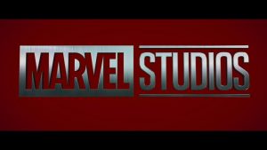
Today, many of us associate Marvel Comics with Stan Lee, who came up with many of the character ideas. Of course, Stan Lee wasn’t there at the beginning. Marvel was born in 1939 thanks to a Pulp magazine publisher by the name of Martin Goodman. And it became the biggest global comic book and entertainment brand. The brand started as Timely Comics until 1950, then it got renamed Atlas Comics until 1957 and finally, Marvel Comics was born. Since then, the Marvel logo has metamorphosed a number of times, but the core brand remained the same. Whether it’s the Marvel Comics logo or the Marvel Studios logo, the big and bold red and white fonts make it memorable.
This is one of the most recognizable logos in the movie industry and is a pivotal part of the entire brand. When creating the logo, designers should think to make it in a conceptual way. As we can see for ourselves the logo is quite ordinary, nothing creative or special. They used a nice typeface in metallic silver on a red background.
I would like to show the fans and those who are not so familiar with how big the Marvel universe is by redoing the logo. Fragments of the most iconic and well-known characters, excerpts from comics, or quotes can be included in the composition of the logo. Also, the typeface can be placed on a planet, for which something from the multiverse can be used as a colour to show how vast it is. Another thing that comes to mind is the letter A could be replaced with the Avengers logo, mega team of superheroes that are very famous in the film industry and among fans. So, I think many people will be intrigued and inspired to know more about the Marvel universe if we can get their attention through good conceptual design.
Wikipedia (n.d.). Available online: Marvel Comics – Wikipedia