Typographical Graphic Standards
According to Douglas Bonneville (2010) “By far, the most popular principle for creating font combinations is pairing a sans-serif font with a serif header. It’s a classic combination and it’s almost impossible to go wrong.”
I agree with what he says, but on the other hand, I wanted to refute him and show that a combination of two or more sans serif fonts works just as well as the one we already mentioned. Anyway, if the fonts don’t have different personalities so as not to create unnecessary attention to each font, they can work well.
When I decide to combine these three fonts: Tablet Gothic Bold, Futura Std Bold and Souvenir Light I saw that they did not create unwanted conflict and tension in the design and worked very good together. They are focused on bold clarity with beautifully readable glyphs due to their hight x-height and make the perfect combination for my Typographical Graphic Standards.
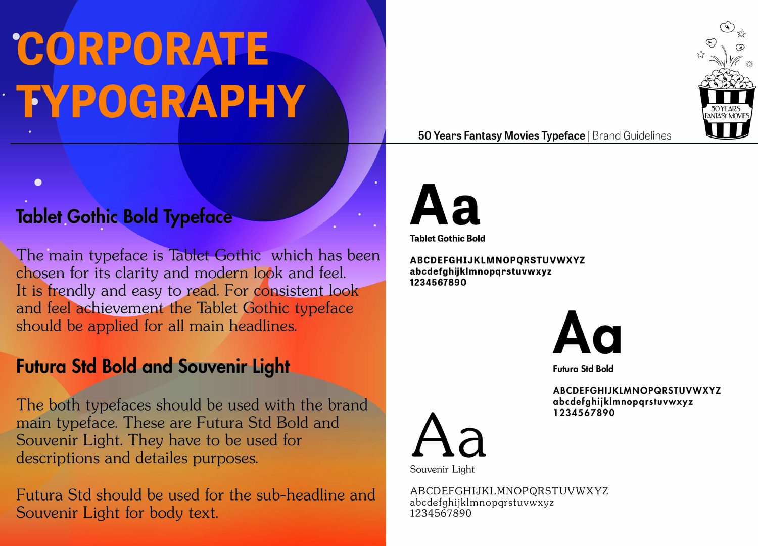
Futura is a geometric sans-serif typeface and is a very popular font worldwide. It’s clean, eye-catching and suitable for many areas because this font has ten styles. It is great for headlines.
The Souvenir font style has a clean and classic texture appearance that can easily provide the elegance of the design. It creates a feeling of comfort to the eyes; thanks to the soft and thin texture it has.
Both secondary typefaces have wide glyphs and very round letters, plus they have a subtle quirkiness to them. No one dominates the other. Both works to create a fun and upbeat mood that my audience needs.
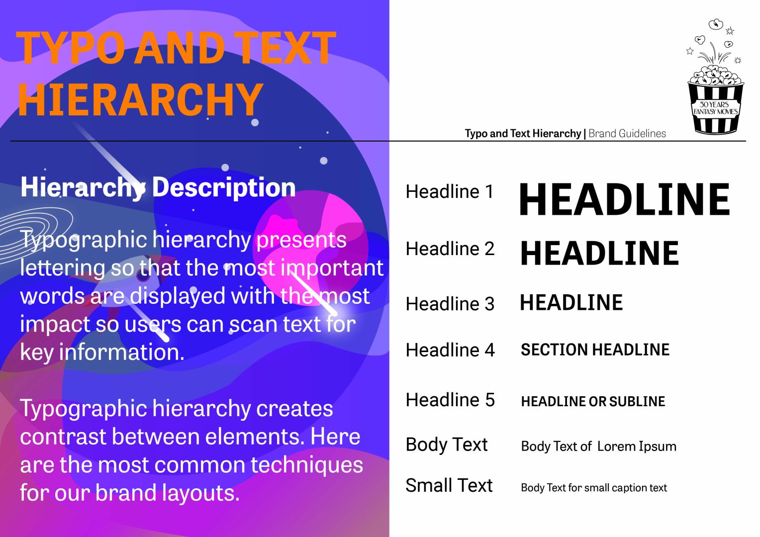
To create contrast and distinction, I used different point sizes. Using different point sizes helps to delineate typographic hierarchy and increase the variety of typographic colours. The font chosen for the titles Table Gothic should be the largest size, followed by Futura significantly scaled down for sub-headings, while Souvenir, which I use mostly for the description is scaled down to a legible but more complimentary size.
In addition to size variations, I needed to make sure I created clear differences in font weight to help direct the reader’s eye to my design.
Also, I want to point out that the fonts I used for the covers of the films I created are completely different from those I use for my Typographical Graphic Standards. They are fully adapted to the nature of each of the films and the audience that will watch them, which is teenagers and young adults. Accordingly, they had to be easy to read with friendly and open curves.
For reference please follow the link: