Colour
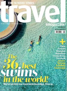
Example of the effective use of colour in Editorial Design
Colour is an essential part of human-computer interaction, and similar to other elements like typography, designers should select colours with care. Fortunately, we have a colour theory that helps us select balanced and effective colour combinations.
In this example of the effective use of colour, we can see harmony in colour combinations is well achieved, also a visual balance. The colour scheme is simple with a maximum of three colours and interesting visual combinations are created by playing with shades and tints of those colours. Two primary colours are used – yellow and blue as well two neutral colours – white and black.
The designer used one of the three popular types of colour schemes namely Monochromatic. This scheme uses a single colour but with different variations of shades, tints, and tones of colour. Since the colours naturally go well together, they create a soothing effect and its very eyes pleasing.
When designing a product, we have to carefully think not only about how things will look but it’s equally important to think about how they feel. Focusing on the psychological aspects of colour is an essential part because colour has a powerful psychological influence on the human brain, with each colour representing different meanings and emotions for the users.
These are some common feelings that colours evoke in most people used in my example of the effective use of colour:
• Blue: trust, comfort, calmness, embodying, coolness, dignity, power. Blue represents relaxation and comfort. Brands love this colour because it gives customers an impression of inner security.
• Yellow: happiness, attention, warmth, energy, brightness. Yellow denotes a sunny disposition; when combined with black, it will quickly command attention.
• White: cleanliness, health, innocence, lightness. White usually makes us think of health and cleanliness. Designers typically choose this colour to suggest a product’s safety.
• Black: power, sophistication, mystery, romance, elegance, strength. Most designers limited black to text and accents which we can see here.
Edward Wegman and Yasmin Said (2011 Feb), Colour theory and design. Available online: Color theory and design – Wegman – 2011 – WIREs Computational Statistics – Wiley Online Library (oclc.org)
Ampersandtravel (2017 Jun), The Sunday Times Travel Magazine. Available online: https://www.ampersandtravel.com/media/837556/the-sunday-times-travel-magazine-june-2017.pd
Poor example of use of colour in online Editorial Design
The first thing that catches our attention when we see a poster is the colour combination. Therefore, we could say that one of the most important things to make our poster design more attractive is choosing the right colour combination. Here we can see that the colour combination does not work very well and does not make it attractive at all. It looks like they used every colour of the rainbow here and that can be confusing.
If I were designing this magazine, I would stick to the three-colour rule or use а minimum number of colours as possible. In my opinion, white space should be left on the poster, so there will be better readability. There is no need to fill everything with bright colours or unnecessary information, because our audience will not be interested.
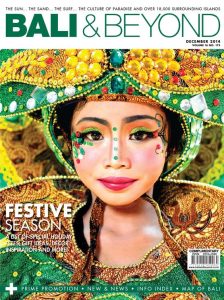
With the design (not mine) I chose as an example to represent a good choice of colour for this type of advertising magazine that would interest us to visit the country. We see a beautiful Balinese woman in traditional clothing and ornaments. The colours used are red (primary), black and white (additional) with a bright contrast so that the design stands out and attracts the attention it needs. We also see Yellow and Gold: The colour of the sun, yellow is associated with happiness and joy, which most customers feel when booking or researching a country for vacation. Super fun and approachable, ideally how you want your audience to feel. Gold colour: This is a warm colour that can be either bright and cheerful or somber and traditional. The gold is cousin to the yellow and the brown, and is also associated with illumination, love, compassion, courage, passion, magic, and wisdom.
All of the colours used in the picture will produce great design for travel magazine and will make it appealing.

Good example for Travel Magazine cover
Picture source
Emma E. (2018, Oct). Available online: balineese women traditional dress – Bing images