Four to Six Traditional or Online Editorial Information Pages
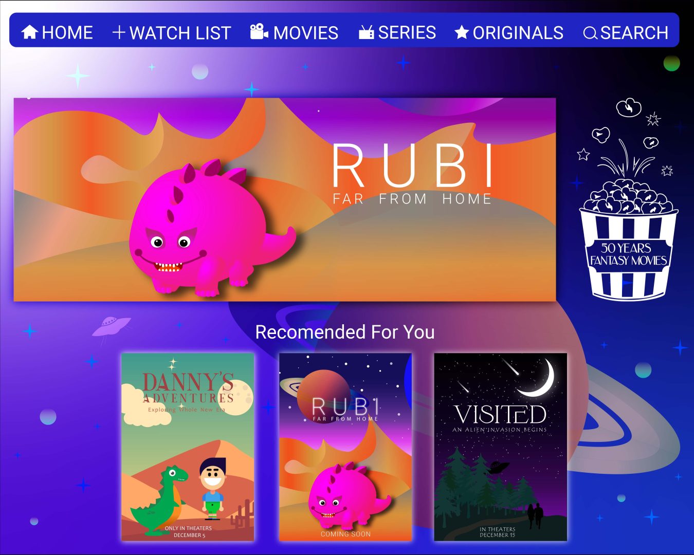
Disney lookalike Interface
My first editorial page I created is a Disney and Netflix like interface. In it I have included a menu, my three film covers and the logo of my project. For the font, I used a clean and readable sans serif, which is just right for web design. For the logo, I opted for white colour because it stands out well from the background. For my background, I used a gradient with darker colours to resemble the night sky. The focus is on one of the films which is positioned in the middle. For all movie covers I have used an outer glow effect.
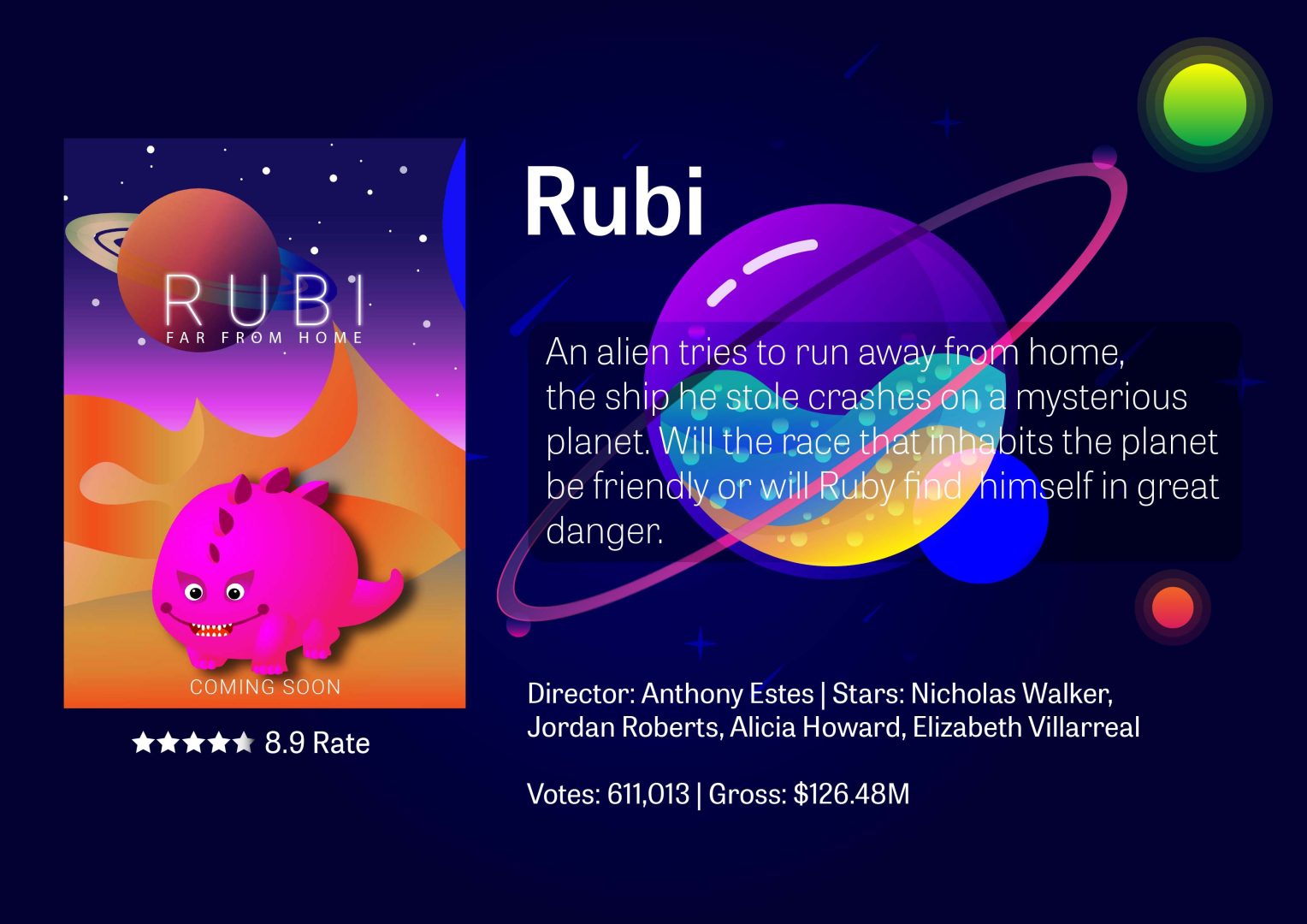
Second Editorial Page
My second editorial page is like an informational about the first movie itself. There is a brief description of what the plot of the film is, the director and the movie stars who participated, the rating and profit it received. The colour scheme is again related to the cosmos, which is what my background represents. I made a planet that looks like it’s made of glass, you can see how the dim planet behind it can be seen in one place. There is a lot of detail on it, as well as a lot of colours combined. There are also smaller planets around its ring, as well as several medium-sized and luminous ones. They are all surrounded by stars and a shower of shooting stars. Again, I have used this shift from my typographic standards.
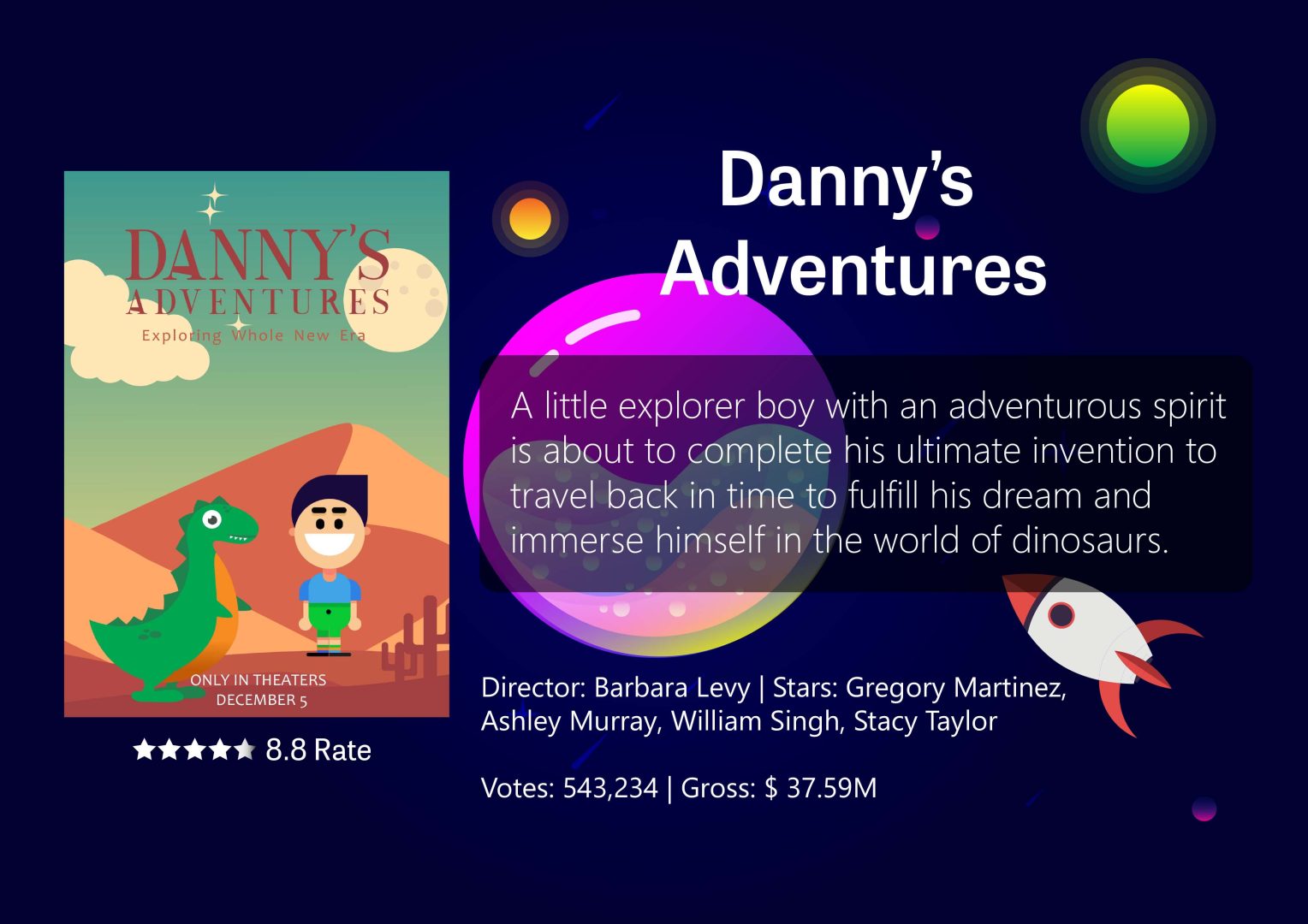
Third Editorial Page
My third information page is on the same principle as the second. I integrated the description of the film into a rounded rectangular shape, the transparency of which I made larger so as not to hide the interesting background. The positioning of the text and cover remains the same. For the title, I used Tablet Gothic font that has a good clarity and purity. For the description I used Qasimoda, because its light weight creates a fresh, modern feel and elegance when the text is longer. I have also kept the hierarchy same so that there is a contrast between the different elements. The graphic elements are quite similar to the previous ones, the interesting graphics here are the space rocket and the glass planet.
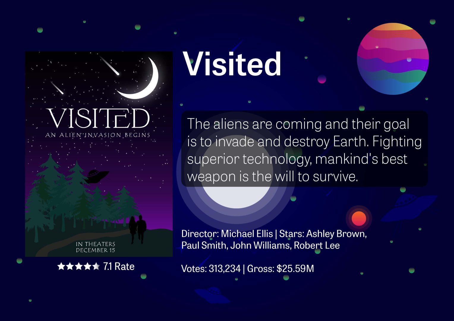
Fourth Editorial Page
My fourth informational page is about my latest movie cover. I remade it with the same background to make everything look connected. The new graphic elements here are the star which is in the centre as well as the new patterned planet. I also added a few unidentified flying objects that are also in the plot of the movie. Around them there are quite a few shooting stars and small distant planets on which I have reduced the opacity of the blue colour to 10% to blend with the background for more effect. Again, I stick to my typographic standards by using the same fonts. The positioning of text and elements remains the same as the rest of the movie cover information pages. I made the description of the movie on a rounded rectangular element, for which I used a multiple effect so as not to hide the background.