Traditional or Online Conceptual Editorial Masthead (Logo) Design
According to Logos by Nick (2019) “Compared to other types of design, logos are unique. The job of a logo is not to convey information, it is simply meant to be a memorable symbol that can be used to identify a brand. Because of this, it’s good for a logo to have a bit of mystery behind it. This is just a personal opinion, but logos usually work best when they conceptualize an idea rather than literally depict it.”
I totally agree with his opinion, it’s easy to distinguish professional graphic designers from amateurs when a client wants their logo to be conceptual and not literal.
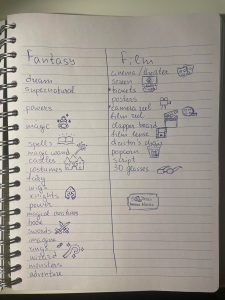
The first step was to come up with a name for my logo. I had to define my purpose and audience. And since I chose to change my subject from exotic travel to movies, I came up with the idea for the logo to be a celebration (this became my purpose). The number 50 seemed perfect for this purpose, half a century, a golden jubilee. For the audience, I chose to target teenagers and young adults, so I chose the movies to be fantasy because they are very popular with this group.
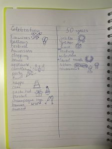
When I decided to start creating my concept logo, the first step I took was to take my notebook and write every single word of the title that came to mind, which is Celebrating 50 Years of Fantasy Films. Under each word I started listing the things I associated it with, anything that came to mind. It’s good when brainstorming to set aside a certain amount of time, for example 5 minutes, and then make simple sketches of the words you come up with. This is clearly visible from the picture that I decided to attach from the beginning. Accordingly, I tried to draw a simple image for the words that came to mind, and I had already seen the icons somewhere. Тhere is no need to spend too much attention and time on the smallest details of these sketches, because this is just to get some ideas that can be incorporated into conceptual at a later stage of the design. Unfortunately, not all words that came to mind can be drawn.
The next step I moved on to was looking for different words to connect and lead to something new. The ideas that came to me initially were to make a golden movie ticket, in which I would integrate a film reel on the edge and make a laurel wreath from the number 50 zero. These ideas were generally from the word movies, and it didn’t turn out to be a good concept and then I decided to change it.
Instead, I designed a popcorn box with them popping out of it, along with stars and other details. This symbolizes celebration, and popcorn is associated with the cinema, with watching movies. In the middle of the box, I integrated the name of my logo in a font that I think is appropriate for it.
Early design ideas
For reference please follow the link:
Literal vs Conceptual Logo Design – Separating Pros From Amateurs (logosbynick.com)