Self-Promotional Image Poster x 2
First Self Promotional Poster
The last part of my exam is for two Self-Promotional Image Posters. Perhaps of all the things I had to create this took the longest. For a long time, I wondered what exactly I wanted to promote, in which direction I wanted to develop most of all. After some ideas emerged, I started thinking about the design, how to best recreate it. After all, this will be my portfolio for future clients and employers, so I had to give my best now. I wanted to do something that would make me stand out from the crowd of graphic designers and I hope I did.
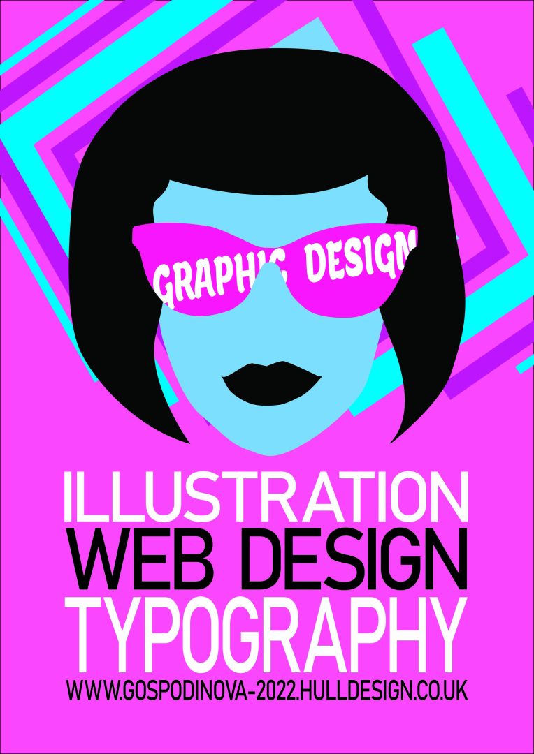
I made the first poster from two of my photos. I used the first one for the shape of my face and the second one for the shape of my glasses, combining them to create the final look. The hairstyle I decided to do is to look groovy and remind me of the times when I really had it and had a lot of fun. Overall, the look looks very fun and nice to me.
The things I would like to focus on and develop are Illustrations like this (fun and non-committal), Web design I like a lot, also typography. The fonts I used are two, the first one being included only in the glasses. I chose it to add playfulness to the design. The second font looks friendly and exudes a sense of trust. This says that I am someone you can trust to make your design.
Interesting is the graphic element behind my face, which I created with very simple shapes.
The colour palette I used consists of white, black, blue and pink. As for the last two colours, I used different shades. In many cultures, white and black are associated with life and death. I chose them because white symbolizes purity, innocence and peace, and I associate black with power, prestige and nobility. I chose pink because it is the colour of love, kindness and romance. It also creates a creative and artistic vibe. The colour blue can be found everywhere in nature, the blue sky, seas, rivers, oceans. It is a colour that brings calmness and serenity, stability and reliability. Just as pink is preferred by women, blue is preferred by men, so I included them both.
Second Self Promotional Poster
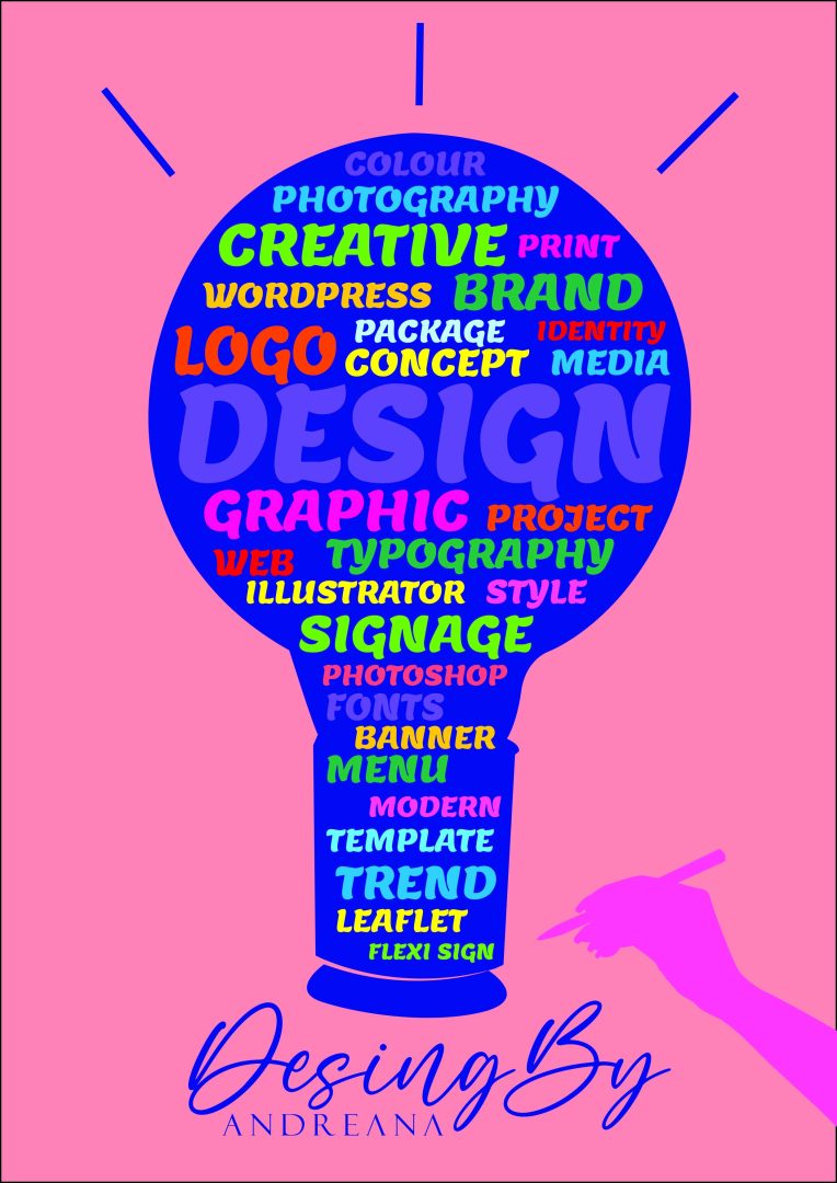
In the second design of the promotional poster, there is the idea of how a graphic designer’s light bulb should always be on regardless of the task at hand. Whether he needs to create a logo, design a package or create a banner for a website, it doesn’t matter, he needs to learn new things every day, practice what he has learned, just keep improving and developing himself.
In the design, I included many of the skills of the graphic designer, or at least those that I wish to develop in the future. The font I used is bold and playful. I used manual kerning and all capital letters for better readability.
When some people want to cheer themselves up, they eat something sweet like chocolate or ice cream. I chose to use colours in a good way to lift people’s mood. That’s why I used so many colours in the design to make it more cheerful and uplifting.
In my design I decided to include my logo this time. It is accompanied by my hand holding a pen, as I made a vector silhouette from the photo in illustrator.