Adobe Photoshop Self Portrait x 2
First Photoshop Self Portrait
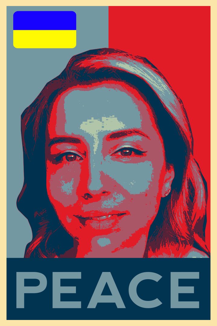
For the fourth part of the exam, I had to create two self-portraits in Photoshop.
Since it must be something related to our personal goals, dreams and causes, I had to recall the Power of Graphic Design lecture again. I was inspired by her for the idea of the first design. Then there was the war in Vietnam and that was one of the things that influenced Keith Haring. Every designer is inspired by things that happen in the time in which he lives. To my great regret, we are facing the same thing in the 21st century. War! This makes me so sad, thousands of people die, lose their loved ones and their homes. It is a pity that we must witness something like this even today. It is assumed that people, since we have advanced so much in technology and development, we must be so developed spiritually. I wish so much that I could contribute something to world peace that I thought of the poster of President Barack Obama during his presidential campaign. I immediately set out to find more information about the design and the people behind it.
When I finished reading the information, I decided that I wanted to make the same poster, but with my face. The portrait is a stylized stencil, and I kept the colour range the same. Red is a bold and impactful colour that, when used in design, is hard for the viewer to ignore. It is a warm colour associated with love, passion and blood. Red can be associated with danger, but in some cultures, it is associated with good luck. The design features blue, which is the opposite of red on the colour wheel. Most people associate this colour with calmness, trust and intelligence. Many cultures around the world associate the colour blue with gods and heavens.
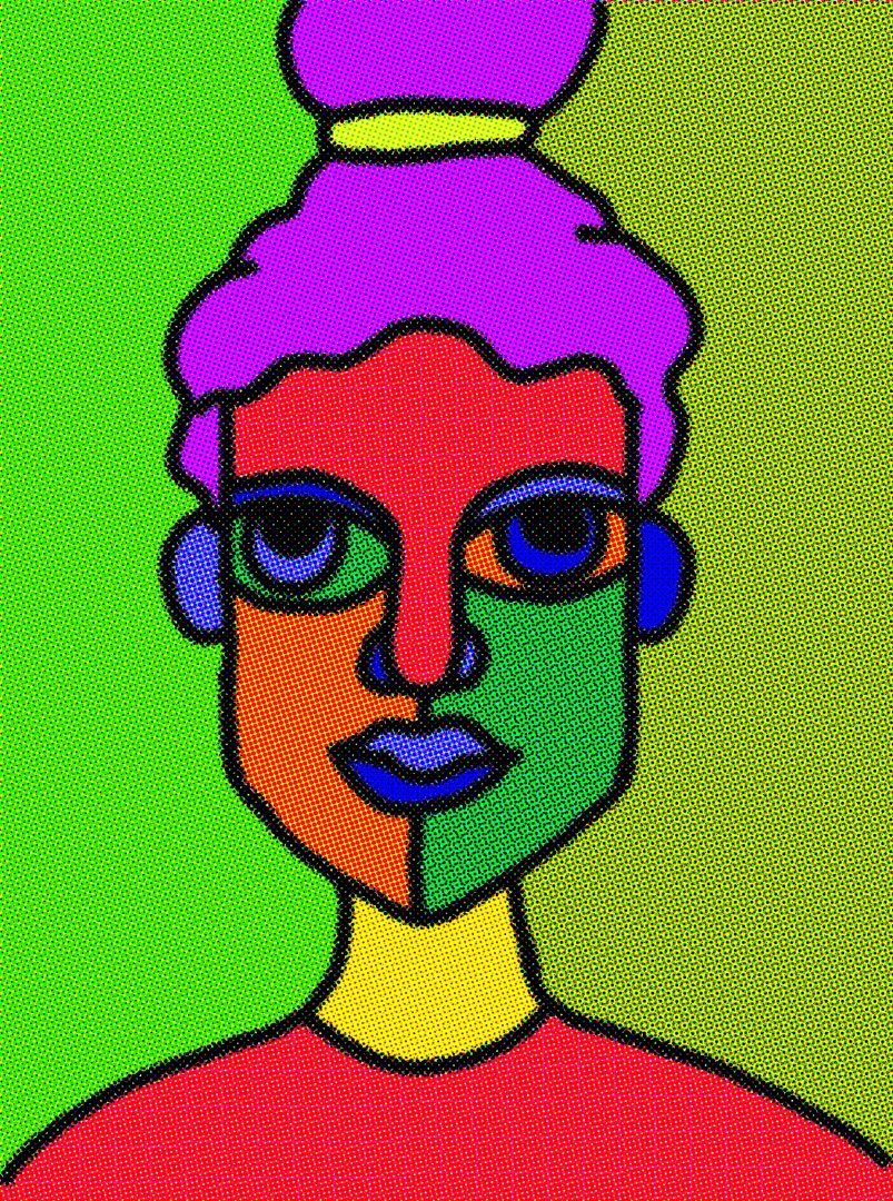
Second Photoshop Self Portrait
I wanted the second portrait to be a little different from the first. The first and most important thing I did was make a quick sketch of my face. So, I took my graphic drawing tablet and made an unrealistic portrait with the proportions it has. Then he put it in photoshop, and I thought about the colour scheme and how I wanted it to look in general. Because my life changed completely when I became a mother almost four years ago, I express myself and my feelings with this portrait.
The style in which it is made is abstract. Because I have been having trouble sleeping for a long time and sometimes, I feel very tired, as much as I look in the portrait. The world of the parent is woven from an awful lot of emotions. At times you feel so happy and at others anxiety and doubt take over. For this I made the colour palette rich to depict all these feelings. Another effect I used was Pixelate with Colour Halftone for more interesting look.