Composition
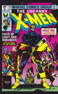
Example of the effective use of composition
Here we see the key element to any good composition which is a strong focal point, as it helps your eyes naturally settle on the important pieces of the design first. So, the focal point of this magazine is Cyclops and Jean Grey represent what is arguably the cornerstone relationship in the world of the X-Men, with the two superheroes close partners since their debut in the comics. They have been placed centrally and it looks like they are both the heart of the composition of the Marvel Comics magazine and especially their strong bond.
Scale and visual hierarchy are some of those creative fundamentals that can really make or break our designs, so it’s important to have a good hold on them to maintain a successful composition. Usually, the title or masthead is the boldest, largest piece of type as it is the most important piece of written information. Here, scale is used in the same way, with the logo being the largest and boldest, followed by the second important information.
Balance is a pretty important thing in many regards, and this cover is absolutely no exception. By reflecting certain design elements from left to right and top to bottom, we can create a strong sense of balance. By using symmetry, this design is well-made and beautifully balanced.
Eye flow is the movement the viewer’s eye takes when looking at an image. Leading lines are a great tool for eye movement that directs us first to objects in the foreground and then to those in the background.
This magazine repeats certain types of stylizations, graphics, and line weights throughout to maintain a cohesive and effective design. By keeping the graphics’ color palette extremely colorful and vibrant and the font styles bolder and more interesting the design is kept beautiful and strong.
Domestika (2021 Oct), What is composition in Graphic Design. Available online: What Is Composition in Graphic Design? | Domestika
X-Men Comic Cover (2014 Oct), Available online: Best Marvel Covers – Bing images
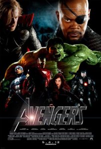

Poor example of use of composition
This is a typical bad layout design composition. As a viewer, I am confused about what to look at first, some of the characters are cut and not well positioned. In my opinion, it is not eyes pleasing when many of the subjects blend into the dark landscape.
Layout and composition are the foundation of the design. They give your work structure and make it easier to navigate. Without a good layout, the design work would basically fall apart.
In the redesigned work in order to try to make a successful composition I stuck to emphasis and visual hierarchy. The masthead is the largest piece of font, and the bolder font they chose for the design ties in perfectly and stand out. This is our focal point. Our eyes start with the largest font content and then continue to move up past the other characters until we reach the bottom where the most important anti-hero is. At the top of the composition, there is now much more negative space that is not occupied by different elements, thus giving us room to breathe.
I would like to use contrast in this composition because it draws the reader’s eye and can create an accent or draw attention to something that may be important. As a good layout strategy, I would use high-quality pictures from the movie. Moreover, I change their size to create a visual hierarchy and balance. In addition, will leave the font metallic grey as it is in the original design because I think it will make a good contrast with the background. For me, just as important as the font is the background color. The background color I chose was based on what I felt the film symbolized and what would combine well with the other elements.
The Avengers Poster (2012 May). Available online: avengers poster – Bing images