Conceptually Designed Personal Logo x 2

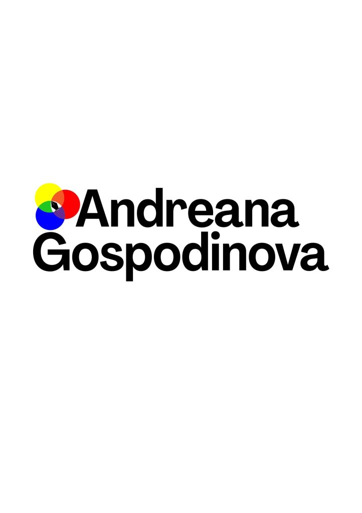
First Conceptual Logo Design
In the first conceptual logo design I created, I used an eye-catching font that looks convincing and reinforces the message of the text. The unique consistent typography I used would help me build trust with my users and thus help my development as a graphic designer. With my choice of font, I bet on readability, I also wanted it to be modern and bold at the same time stylish. I imagine how good this logo would look on my website and how it would enhance its personality. When users enter the site, this is the first thing they will see, I want to make them feel welcome and in a friendly atmosphere.
Another thing I used in making my logo is manual kerning, which is completely focused on creating legible text that will be visually pleasing. The other purpose I made it for is because I was thinking how it would look better if it was used for other purposes like signs, packaging, cups and other stationery.
The choice of colour for a logo is extremely important for the first impression a potential customer will have. Many reputable organizations and services use black. That’s why I chose it as the main colour, as it gives elegance and is also aimed at higher class customers. The colour represents sophistication and success. In that colour there is an element that attracts the customer’s attention.
I thought it was a good conceptual idea to include something in my design that represented me as a graphic designer. What better than one of the most important tools pen tool in one of the most used programs. I got the idea that it would be cool to add the pen tool in the middle of a colour palette. These are two things that every graphic designer cannot do without.

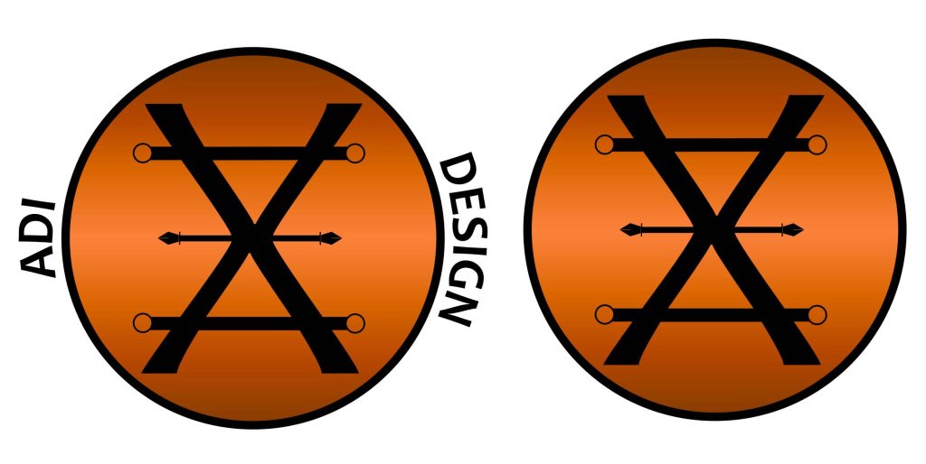
Second Conceptual Logo Design
For the second logo design I made, I will admit that I was inspired by the ancient Greek symbols of the alchemists. The main reasons that prompted me to do this are that I really love ancient Greek history, and everything related to their life and culture, and I also studied Greek in high school.
In the logo we see the first letter of my name, and which is a symbol of copper. Because this metal has been used so much over the centuries that I made my logo like a coin to recreate how valuable it is. There are two letters, they are glued to each other, and this shows that a coin always has two sides. In the middle for divided by a line that ends at both ends with a pen tool. I will not repeat myself about it, it is also present in my first logo, and there I explained the idea of it.
According to Native Trails (n.d) “As long ago as 10,000 years, ancient civilizations believed there was a connection between heaven and earth, between metals and planets. Named among the seven metals of alchemy, representing Venus, both the planet and the Roman goddess whose functions encompassed love, beauty, sex, fertility, prosperity and desire. The word copper comes from the word Cyprus, the island where the Romans obtained their supply. In pagan tradition, Venus washed up on the shore of Cyprus on a clam shell. In Roman times, copper was known as “aes cyprium.” Eventually they simplified it to “cuprum” and then anglicized into the English “copper.”
For the colour I again chose that of copper. Many ancient civilizations used it, and it is known to have a magical history. You can read a lot about the topic that captivated me to choose this colour. This extremely warm shade has a comforting, homely feel that makes him seem more approachable and down to earth, which I really am.
What Every Lover Should Know About Copper – Native Trails (nativetrailshome.com)
