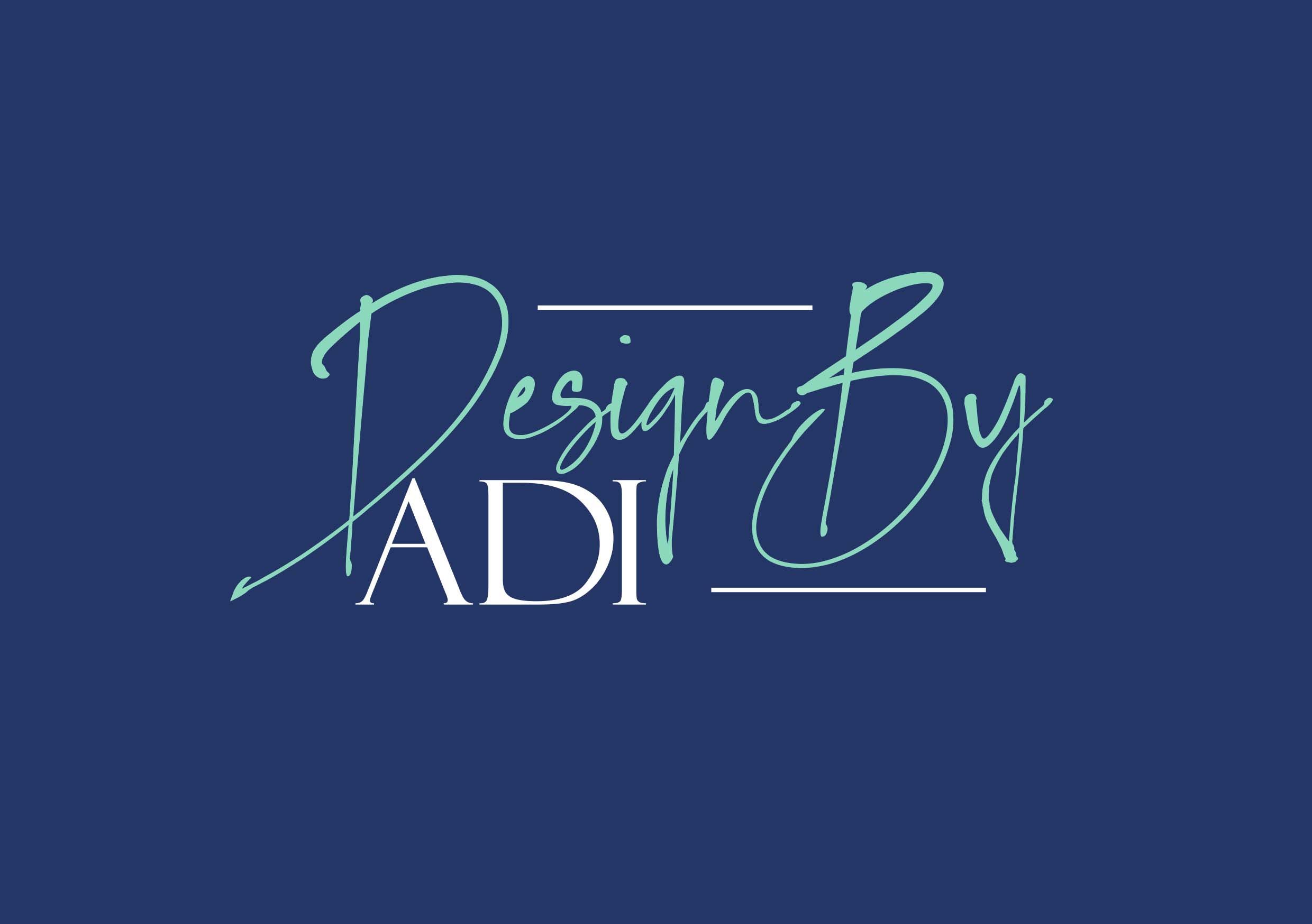
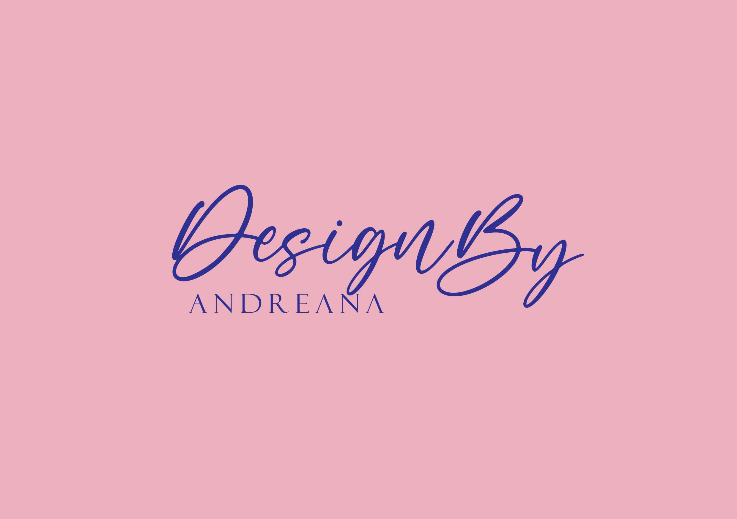
Typographical Name Logo x 2

First Logo Design
When I was thinking about creating the typographic logo, I wasn’t sure exactly what font to use. Should it be serif (with small decorative feet) or slab serif, maybe a script font or sans serif. There are thousands of fonts, and it becomes very difficult to choose the right one for my brand. That’s why it’s good to make a list of your favourite fonts that match your personality. I spent a lot of time searching and choosing the perfect one for me. Many questions popped into my head. What kind of graphic designer do I want to be. What reaction do I want people to have when they see my logo for the first time? What colours to use and how they will affect the people. I had to determine my brand personality, how will sounds and feels to my audience. I knew for sure that I wanted my brand to look classic, reliable and at the same time fun and playful. And so, it was time to choose exactly which fonts evoke those ideas and feeling that I am going for.
I decided to go with a serif font. They are especially useful for large blocks of text and make it easier for the eye to travel through the text. This font is beautifully designed and adds a distinctive touch to my logo. It has a very good readability, so most books, newspapers and magazines use these fonts.
In my opinion, Felix Titling is the perfect font for a logo, because it is reliable and beautiful. As well can be used for creating interesting and fun designs, covers, shops and store names. It’s also perfect for project branding and product packaging because it’s stylish at the same time. That’s why I chose it to be present in combination in both my typographical logos.

Second Logo Design
The second font I decided to combine is script. Script fonts are beautiful fonts that resemble handwritten and calligraphic letter styles. They can be either formal, where they will look elegant, or informal, where they will look more playful. I hope in my design they look more elegant and less playful. The typeface is connected and designed with a careful approach to ensure that each letter flows into the next in a smooth, continuous manner.
Let’s talk a little about my colour choices. Colour is an important element of our logo design. One of my favourite things is seeing a logo work in both colour and black and white.
In the first design, I used a combination of analogue colours Blue and Turquoise. It is a combination of two colours that are next to each other on the colour wheel. These colours generally create a sense of harmony and balance, as well as intelligence, confidence and trust. The colours are from same colour family, but different enough to create a striking duo. Bright teal pairs well with any darker muted colour. Analogous colours are often found in nature, where one colour dominates, and the others maintain its depth.
For the second logo I choose delicate pink paired with navy blue witch gives off a playful yet trustworthy vibe. The navy pops against the light background, creating beautiful contrast. Another thing I did because I wanted it to be different from the first logo was to remove part of the letter A from my name to make it personal and unique to me. It also looks timeless, which is important, so we don’t have to redesign our logo every year and lose the brand loyalty we’ve built with customers.