Three Cover Designs

First Movie Cover
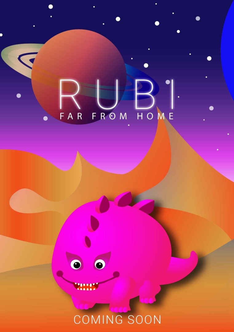
I’ll start with my favourite cover, which is the movie, Ruby. One of my most watched genres of fantasy movies is about extra-terrestrials, I also like to watch documentaries about them, and anything related to cosmos in general. A combination of all these things that I like inspired me to make this cover. Ruby’s character is colourful, I didn’t want her to look scary, but at the same time she has a very devilish smile that tells us she likes to get into mischief very often.
For the mountains in the background, I again chose warm colours because they look a lot like sand dunes. Highlight is the planet that is also Ruby’s home. She ran away from there to seek an adventure. I like how Saturn’s rings merge into one place in the front and look like they’re not there.
The font I chose is Roboto and it goes well with the plot of the movie and everything. I made letters kerning quite far apart and added a glitter effect to make the title stand out. The subtitle is in the same font but much smaller.

Second Movie Cover
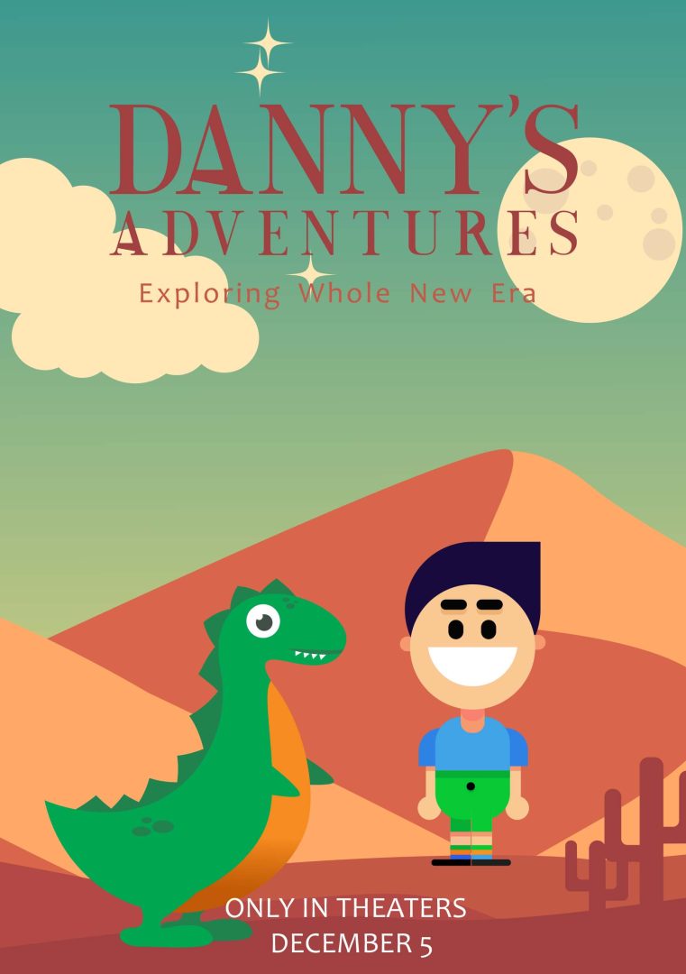
I already had a design of this cute dinosaur ready and decided to incorporate it into the plot of the second movie cover. It tells the story of a little boy named Danny, who is a great inventor and builds a machine to travel through time. That’s how he ends up with his new friend who tries to protect him from all evils. I made the boy look very excited about making his dream come true. With colourful clothes that make him stand out from the rest.
The colour palette I have used is earthy and pleasant and combines very well. I also included clouds, some stars and the moon.
The font I used is again different from my typographic standards. I have made small accents on the letter A with an illustrator to make it look more adventurous. For its colour, I chose it to be like the ground our heroes walk on.

Third Movie Cover
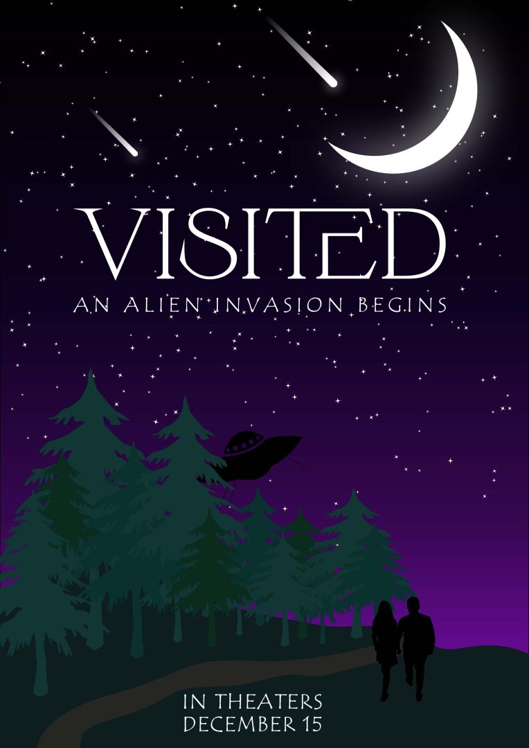
The last third cover of a film is about a couple who are walking in the forest and witness something incredible. A flying unidentified object lands a few kilometres away from them.
All this happens late at night, so the colour palette is quite dark. I made the moon shine brightly, put a lot of stars and made some of them falling for more effect.
For the couple, I used a photo of my friends from which I made these two silhouettes. I created the flying saucer with the simplest shapes in illustrator.
I wanted to find a font that was mysterious bold and completely different from the previous ones I used. This serif font immediately caught my eye because of its clean look and the interesting connection between the letters T and E, just what I needed.